

![]() Canada Goose Logo PNG
Canada Goose Logo PNG
The Land Rover of winter coats, Canada Goose has a memorable roundel logo, which is very visible on the clothes. The bright emblem “makes people feel like they belong to a club,” claimed the company CEO Dani Reiss.
Meaning and history
![]()
The history of the brand started in 1957 when Sam Tick founded Metro Sportswear Ltd. in a small warehouse. Currently, the company is best known for its jackets, parkas, and vests.
1957 – 1985
![]()
The original Canada Goose logo, introduced by the brand in 1957, was bright and funny, depicting a brown hand-drawn bear set on a background with a red maple leaf. The composition was accompanied by black uppercase lettering from the sides and under the image, with the bottom line thickly underlined in red.
1985 – 2000
![]()
The redesign of 1985 has created a darker and more professional badge for the brand, with the golden embroidered lettering placed above the light embroidered gooses. All elements were set on a glossy brown background and underlined by the full name of the company and its location.
2000 – 20??
![]()
In 2000 the Canada Goose logo was redesigned again, now it was one goose, embroidered in gold on a brown background and accompanied by bold uppercase lettering in white, executed in a heavy and modern geometric sans-serif font. The wordmark was underlined by a title case “Expedition Clothing Outfitters” in a lighter sans-serif.
20?? – now
![]()
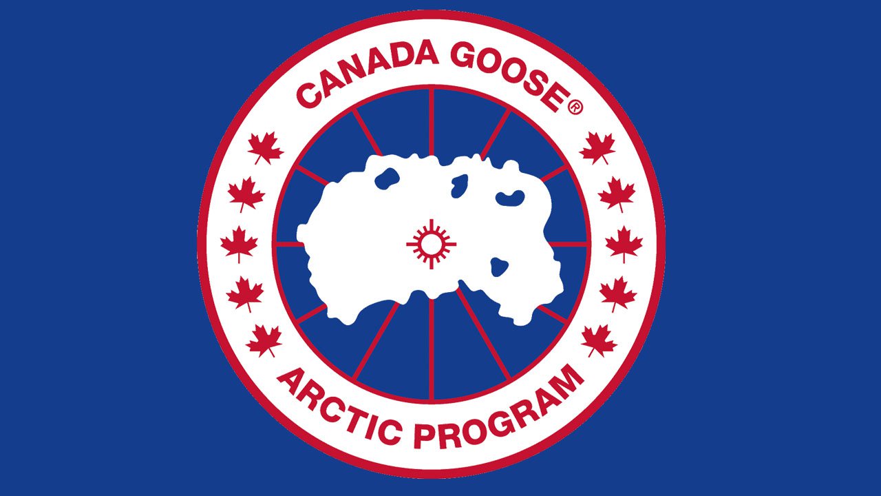
The latest redesign of the Canada Goose logo has brought a completely new image to the company. The rethought logo of the brand is composed of a white, blue, and red roundel in a thick frame and red outline with uppercase lettering around it, separated by several solid red maple leaves. As for the central part of the badge,!85 depicts a white silhouette of Canada with small blue accents, set against a blue and red background.
Symbol
The Canada Goose logo was created by David Reiss in the 1980s.
If the emblem could talk, it would say: “These clothes are so warm you could wear them on the North Pole” or “These clothes will keep you warm even at the coldest place on the Earth.”
How did the designers communicate the message?
To begin with, they depicted the coldest place on the Earth, the North Pole, right at the center of the emblem. The problem was that the North Pole is covered by the ocean. Depicting it in blue would have ruined the “frozen” look – you can hardly get to it without using white with (possibly) light blue or pink accents. The problem was solved by reversing the colors: the ocean on the North Pole was given in white, while the islands were light blue. This gave the impression of a snow cap and “froze” the logo well enough.
Behind the white ocean, there’s a navy field with red lines of longitude and latitude. Due to this, the logo becomes more like a traditional Arctic Map.
The image is encircled by the text “Canada Goose” (top) and “Arctic Program” (bottom). The two phrases are separated from each other from both sides with the help of five maple leaves.
Typically, the emblem is positioned on the upper arm of a coat or jacket.
While the visibility of the logo is often perceived as a benefit, the brand also has a more discreet collection, where it’s not as conspicuous. It’s the Black Label Collection with a monochrome all-black Arctic patch.
Emblem authenticity
Analyzing the logo on the sleeve is an important step in defining whether the coat is authentic. Here’re some of the details to check:
- the patch should have clean embroidery
- the type should coincide with the official logo
- the name of the brand and the maple leaves on the authentic emblem have the same width and height
- the elements on the outer ring should look neat and clean
- the colors should be exactly the same
Font

The type is a classic sans with traditional proportions.
Colors
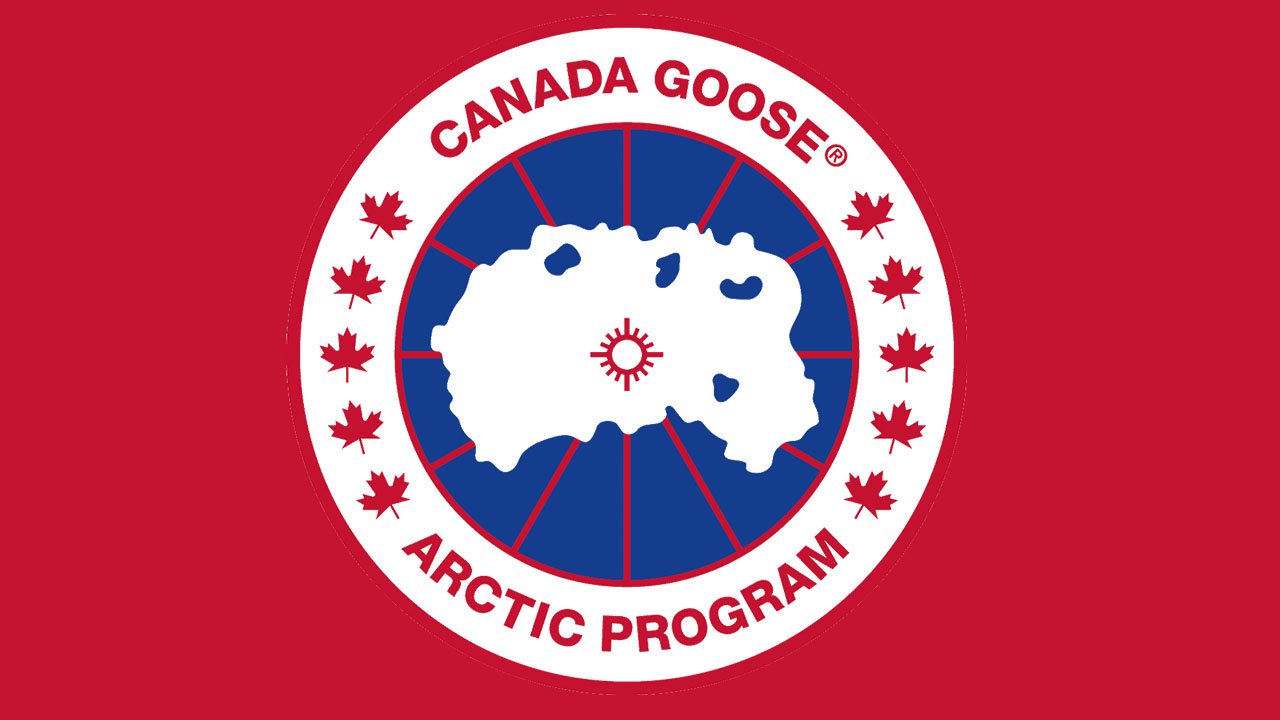
![]()
The Canada Goose logo features a combination of red, white, and two shades of blue (navy for the background, light blue for the islands).


