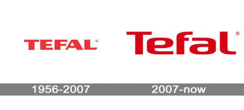
The most notable redesign of the Tefal logo took place in 2007.
Meaning and history
Tefal is a world-renowned company specializing in the production of cookware and appliances. It was founded in 1956 by French engineer Marc Gregoire, who a couple of years earlier had invented a method of applying a special non-stick coating, Teflon, to aluminum.
Gregoire’s wife, Colette, helped him invent Teflon. Gregoire was an avid fisherman and for the first time, he tested Teflon coating on his spinning rod. Thanks to the innovation, the retractable mechanisms began to work smoothly, and Marc told his wife about his invention, and she, though she was an ordinary housewife, was able to see another practical benefit of Teflon.
By 1968, Tefal had become the largest cookware manufacturer in France. In the same year, the company became part of the SEB group, which was engaged in the manufacture of household appliances. Under the Tefal brand, Tefal began to produce both frying pans and a variety of small appliances.
What is Tefal?
Tefal is the name of a European kitchenware and cutlery brand, which was established in France in 1956. Today Tefal is an international company, which distributes its products all over the globe. Since 1968 Tefal is owned by Groupe SEB (also the owner of Rowenta and Moulinex).
1956 — 2007

The original wordmark was given in solid capitals based on a square shape.
It looked perfectly legible. The heavy glyphs apparently symbolized the reliability of the products made by the brand. And yet, the company eventually decided to update its logo and make the message somewhat different.
If you compare the old logo with the current one, you will notice that the latter looks more dynamic, more up-to-date, and innovative. It emphasizes convenience and style without sacrificing the “reliability” theme.
2007 — Today

The current insignia is sleeker and more rounded looking close to the Head Pro Black font. There’s a tendency towards softer and simpler shapes, which can be seen, for instance, in the way the “a” and “f” look – each has lost an element of its traditional shape. However, the uppercase “T” looks more like that on the original logo emphasizing that both the logos belong to one and the same company.
Colors
One more way of accentuating the brand’s visual heritage is to preserve the same color. The shade of red has been only slightly modified to make the contrast brighter.
Font and Color
The bold title case lettering from the primary Tefal logo is set in a heavy custom sans-serif typeface, which looks very stylish and futuristic. The closest fonts to the one, used in this insignia, are, probably, FF Signa around a pro Extended a bold, or Vartek Semi Expanded Bold, but with the contours of the letters even more softened and extended.
As for the color palette of the Tefal visual identity, it is based on a deep and bright shade of red, a color, which stands not only for power and passion but also for love and warmth, the qualities, which reflect the main values of the French company at their best.
Tefal has now moved from Sarsel to Rumiyi. The production facilities, also formerly based in France, are now mainly concentrated in Asian countries, and the company’s products are available in more than 120 countries worldwide.


