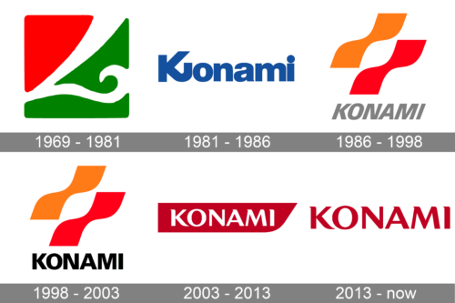
One of Japan’s best-known entertainment and gambling conglomerates, Konami has had not less than seven logos over its more than 50-year history. Konami hasn’t been afraid to reinvent its brand identity from scratch and introduce dramatically different shapes and palettes.
Meaning and history

Konami is the Japanese Corporation, which is best known for its games Contra, Metal Gear, Pro Evolution Soccer, Silent Hill, and Ninja Turtles. It is the twentieth largest game company by revenue in the world. Today they produce not only games but also movies and anime. There is also a chain of fitness centers under the Konami label operating across Japan.
The company was founded on March 21, 1969. The name Konami was formed from the names of the four founders: Kagemasa Kozuki, Yoshinobu Nakama, Hiro Matsuda, and Shokichi Ishihara. They sold and repaired jukeboxes in Osaka, Japan. In the 1970s, the friends turned the business into making arcade game machines. Their own first game was released in 1978, after which the company expanded beyond Japan into the United States.
What is Konami?
Konami is the name of a Japanese corporation, which was established in 1969, and is engaged in the entertainment industry, being one of the world’s most famous manufacturers of gambling machines and video games. Konami machines can be seen in casinos all over the globe.
1969 – 1981

This logo features a bright color palette, which Konami is well known for. It consists of a square with rounded corners. The upper left corner is done in red while the opposite side has a saturated green. The two colors are separated by a white decorative line, which has one of its swirls go into the green half. The colors in this emblem are very appropriate for the entertainment industry where red represents the risk and adrenaline one would get and green is the color of growth, success, and prosperity.
1981 – 1986
The history of the brand started on March 21, 1969. Yet, the official website states that the official Konami logo was introduced only in 1981. Some sources show older logos, which look pretty much the same as the
1981 version but have minor differences.
The old wordmark showcased the name of the brand in a simple and bold sans. Only the initial was capitalized. What made the design unique was the pair of the letters “K” and “J,” which formed a single glyph. The main version was blue on the white background, but you could also come across other colors.
The Konami logo resembled that of Panasonic both due to the palette and font.
1986 – 1998
The era of the so-called bacon strips logo started, which lasted almost two decades.
The emblem was dominated by a pair of identical curvy shapes (orange and red or yellow and orange) placed one above the other.
The name of the brand below was set in an italicized version of the Univers Black font. It was grey and far smaller than the symbol.
1998 – 2003
While the designers stuck to the Univers Black font, they now used its regular version (without the italics). The letters were black, which made them more prominent.
2003 – 2013
The new version showcased the brand’s name in white inside a red shape.
The name was set in the Optima Pro Bold font. It looked perfectly legible yet memorable due to the unusual elegant serifs. The red shape could be described as a horizontally-oriented rectangle with its lower right angle replaced by a curve.
2013 – Today

The red shape was removed from the background. Due to it, the typeface now shines with each of its elegant details, from tiny sharp serifs to the strokes of varying thickness.
Font
The customized bold type of the 1981 logo was replaced by the Univers Black Italic font five years later. Ten more years later, the letters were straightened. The Optima Pro Bold font introduced in the logo in 2003 has been used ever since.
Colors
The oldest known wordmark is of a cool blue shade. Since 1986, though, the Konami logo has featured warm tints. We can’t say that the brand has been that consistent in its palette.


