Kentico is CMS for content management, which allows creating websites of any difficulty. It was released in 2006 and had its last update in 2018. The software is one of the competitors of Microsoft Azure.
Meaning and history
Kentico is a Microsoft Gold Certified Partner founded in 2004, headquartered in the Czech Republic, with offices in the United States, United Kingdom, Netherlands, Singapore, and Australia. Kentico Software has a thousand digital solutions partners and supports 30,000 websites in 120 countries. Its clients include Gibson, Starbucks, Ingram Micro, Mazda, Kingspan, Hyundai, Vogue, and Allergan.
The main product of the company, Kentico CMS, is an open and flexible platform for building internet and intranet sites and portals. It was created in the United States in 2006, and today is considered the main competitor of Microsoft Azure.
What is Kentico?
Kentico CMS is a content management system for creating and managing websites, online stores, intranets, and community sites using Web 2.0 technologies. Today Kentico, developed in 2006, is used by more than 7 000 web portals in 84 countries.
Old Logo
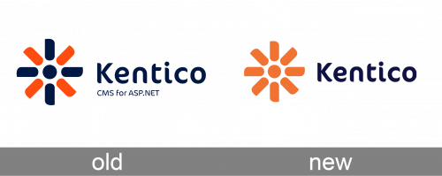
A bright orange color was a perfect contrast to a dark blue. The latter was used to print the name and “CMS for ASP.NET” inscription in smaller font underneath it. The designers used a font that looked surprisingly similar to FF Cocon Regular font and added a unique touch to this emblem. The rounded ends of the strokes were complemented by the rounded elements of the flower petals. The flower was placed to the left and featured petals of alternating blue and orange colors with a blue dot in the center. These colors have highly contrasting meanings. The orange color is bold and energetic, while blue establishes a more trustworthy brand image and a sense of serious business. The flower resembles a windmill, which adds dynamics to the overall positive impression.
New Logo
Kentico has a bright and recognizable visual identity, which is composed of an emblem and a wordmark in its right. The wordmark is executed in a custom typeface with sleep bold lines and slightly curved rounded edges of the letters. It is soft and smooth, which evokes a friendly and warm feeling.
The Kentico emblem is a graphical representation of the flower with eight petals, replaced by equal rectangles with three corners rounded and one-pointed, it creates a sense of movement and resembles a windmill. The circle inside the flower is a great balance to a dot above the letter “I” in the wordmark.
The color palette of the Kentico logo is bright orange and white. The company experimented with colors, using orange and blue for quite a long period of time, but the last logo redesign simplified it and the logo became brighter and more confident.
Font and Color
The smooth and friendly title case lettering from the official Kentico logo is set in a modern and fancy font with the sharpened and slightly curved ends of the bold bars of the characters. The closest fonts to the one, used in this insignia, are, probably, Fruitygreen Pro Bold, or Congenial Medium, with some pretty noticeable modifications of the letters’ contours.
As for the color palette of the Kentico visual identity,!85!8/is based on two intense colors, blue and orange, where blue symbolized stability, confidence, and professionalism, and orange represents motion, energy, and progress. Together the two hues create a very memorable and lively image.


