Kayak is the name of one of the world’s most famous travel agencies, which was established in 2004 and is headquartered in the United States. Today the company operates online across the globe and has its website available in more than 10 international languages.
Meaning and history
KAYAK is an online service, which helps you find and plan trips online. This technology company was founded in 2004 in the United States by three partners. A year later a website appeared, becoming very successful. Having received various awards and nominations, KAYAK has been recognized by Time magazine as one of the 50 best websites in America, and the apps have regularly appeared in lists of top travel apps.
In 2011 the company decided it was ready for an international expansion; and opened its first European office in Switzerland. In 2012, Kayak went public and was bought by travel corporation Priceline for 1.8 billion USD.
What is Kayak?
Kayak is the name of a travel metasearch engine and a mobile application, which provides an online service to search for airline tickets, hotel reservations, car rentals, tour packages, and cruises. The service was launched in 2004 in the United States and today is owned by Priceline Group.
2004 – 2017

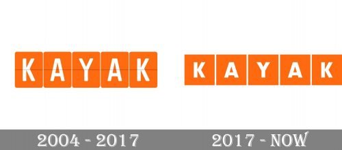
The very first Kayak logo was more similar to the airport flights board, showing departure and arrival. The orange square with the white sans-serif letters on them was a bit higher than today’s ones. They also had a thin gray horizontal line crossing all squares in their middle. Another difference was in the corners of the solid orange figures — they were rounded, just like the corners on the letters of the Kayak logotype.
2017 – Today
The visual identity of one of the most popular travel online agencies in the world is minimalist, yet super modern and instantly recognizable due to the use of a bright color palette.
The Kayak logo was first designed in 2004, and only slightly modified in 2017, as it was a perfect concept from the very beginning.
The logo is composed of a wordmark, where each letter in white is placed inside an orange rectangle. On the original logo version the inscription was executed in a smooth and rounded sans-serif typeface, and there was a very thin horizontal line in gray coming through the whole logo and making it look like the flight tableau in the airport.
After the redesign of 2017, the gray line is gone and the typeface of the wordmark became stronger and sharper. Now the “Kayak” inscription is executed in a bold geometric sans-serif with straight clean lines and traditionally cut edges and angles.
As for the most important part of the Kayak logo, its color palette, the combination of orange and white symbolizes the passion and energy of the company, which main aim is to help people across the globe to travel and open new places and emotions. Orange is a color of movement, while white evokes a sense of reliability and loyalty, showing Kayak as a trustworthy and confident agency, able to give their clients everything they may need.
Font and Color
The heavy uppercase lettering from the primary Kayak logo is set in a modern geometric sans-serif font with the capital characters executed in thick lines with straight cuts and distinctive corners. The closest fonts to the one, used in this insignia, are, probably, Achates Heavy or Marat Sans Extra Bold, with some minor modifications.
As for the color palette of the Kayak visual identity, it is based on an intense combination of orange and white, with orange represented in its very bright medium-dark shade, evoking a sense of energy and motion. White is here to create a bright contrast and symbolize the reliability and loyalty of the company.


