Karma is the name of the young American automaking brand which was established in California in 2015 with the idea of designing and manufacturing electric cars. Today the company, owned by Wanxiang Group; has two models in production and four concepts.
Meaning and history
Karma is a young but very promising company, which was only formed in 2015, but has already impressed the market with its stylish electric cars of superior quality. As for the visual identity, the brand did not disappoint its fans here either, and its remarkable futuristic logo is one of the examples of the emblems, which you never forget after you see them for the first time.
Karma was born as Fisker Automotive in 2008 and started the production of its hybrid Fisker Karma car in 2011. Though it did not last long, and the production of the car got suspended a year after. In 2014 the company was bought by the Chinese Wanxiang, and this is when the new life for Karma begins.
2008 – 2015
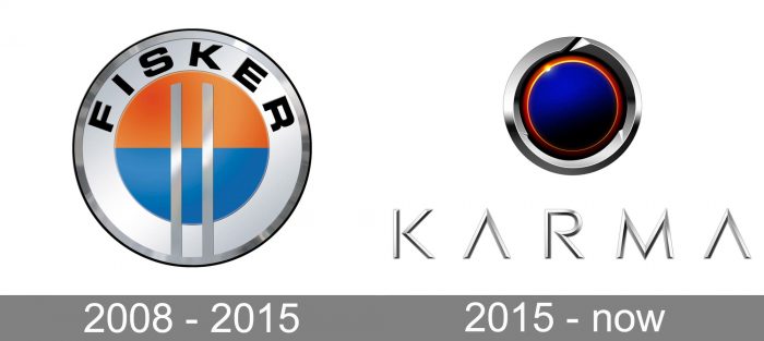
The Fisker logo looked very traditional and usual for the industry. It was a light circular badge with a voluminous silver frame and white inner outline. In the middle of the badge, there was a bright circle with the upper half in orange, and the bottom one — is blue. Two vertical silver lines were placed on the badge, starting from the bottom part of the frame and ending on the orange half of the circle. The black “Fisker” inscription in all capitals was arched on the upper part of the badge, on its thick white outline.
2015 – Today
With the new life and new name of the company, the new logo was created in 2015. This is a completely different style and composition and it differs not only from the Fisker badge but from everything you can see on the market. The Karma emblem is unique and extremely stylish.
The visual identity of a progressive brand consists of a circular emblem and thin elegant logotypes which can be used under the emblem, or on its own. The Karma circle is outlined in a glossy silver ring with a sharp diagonal cut in its upper part. Inside the ring, there is a voluminous dark blue, with a touch of purple, circle in a thin orange and red outline. The element looks like a precious stone or as an eye of a snake, evoking a sense of courage, luxury, and precision.
The orange and red outline resembles a flame and stands for the passion and determination of the company, which values innovations and design above everything.
As for the logotype, its three-dimensional letters are executed in thin and sharp lines in gradient and glossy silver. Both letters “A” have their horizontal bars removed, which balances the “M” and adds sharpness to the whole image.
Font and color
The custom typeface, used for the uppercase Karma logotype is thin yet strong, delicate yet sharp, a perfect representation fir a contemporary company with futuristic aims and values. The type of the Karma visual identity is pretty close to Posterama Pro 2001 Light and had the “R” in the middle as the only smooth element of the inscription.
The deep blue, orange, and silver color palette of the Karma logo represents creativity and chic, showing the brand as a unique and professional one. This purple shade of blue evokes a sense of mystery and imagination, elevating the look of the logo and looking sleek with its glossy surface, while orange details strengthen the look, adding dynamics and energy to the badge.


