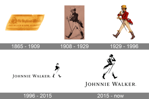
Johnie Walker is a brand of Scotch whisky, first brewed in the 1820s by John “Johnnie” Walker in Kilmarnock, Scotland. The company joined Distillers Company in 1925 and became a part of Diageo Group in 1997. Johnnie Walker is the most widely distributed brand of Scotch whisky in the world.
Meaning and history
The Johnnie Walker man is one of the most iconic drink-related logos in the world. A logo that has been a part of the brand for over a century, the Striding Man was first created by Tom Browne in 1908. This iconic logo has been often edited and refined by many designers, cartoonists and illustrators over the years.
This is a great example of logo evolution and proof that you have to keep reinventing yourself over time to appeal to society or your newfound goals in your business.
What is Johnnie Walker?
Johnnie Walker is one of the world’s most famous whiskey brands, which was established in 1820, and today is owned by one of the global leaders in the beverage industry, Diageo. Today the brand, founded in Scotland, has its products for sale in hundreds of countries across the globe.
1865 – 1909
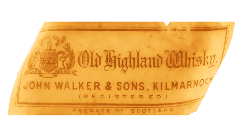
In the early years, the label of the Johnnie Walker brand used a golden color with reddish brown inscriptions and other details. In the upper left corner, the emblem featured an exquisite heraldic symbol with a shield in the center, two creatures on either side and ribbons above and below with inscriptions. The remaining upper portion of the label had “Old Highland Whisky” printed using an old English typeface. The name of the founder and location are specified right underneath using a basic, sans-serif font. The label had a double line frame and “Produce of Scotland” printed at the very bottom in smaller font. This emblem was surely a worthy sign of a high-quality product.
1908 – 1929
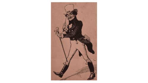
This logo features the iconic walking man with a hat, pince-nez, cane, and boots to complete the look. It is speculated that this is a caricature drawing of John Walker himself, but it is hard to confirm this today. Nevertheless, the gentleman looks happy and full of energy. This version is done as a black-and-white pencil drawing, although it looks quite realistic. There is even a shadow behind him and a wall in the background.
1929 – 1996
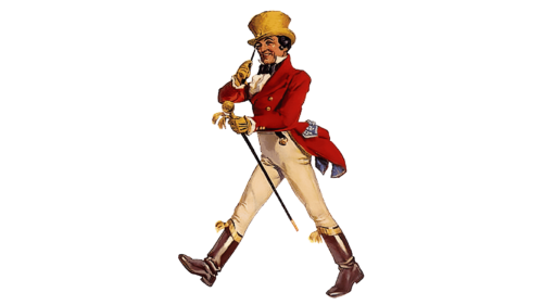
A colored and more detailed gentleman was presented in 1929. The tailcoat is done in red with golden buttons. The golden color is also used for other elements, including the hat, gloves, and the top of a cane. White trousers create a contrast, while the brown boots look shiny and new. The new illustration of a walking gentleman presents a more poised young man. The fact that the man who drinks this whiskey looks well-dressed makes it clear that this is a high-quality drink that is worthy of serving even at the table of the upper class. You can also find a version with a slogan that says “Born 1820 – Still Going Strong” printed in blue on either side of the man.
1996 – 2015
An abstract black-and-white version of the walking man is used in this logo. The man is now walking in a different direction and one can see only his boots, tailcoat, hat, and cane, while other elements blend with the white background. This image is now accompanied by the brand name. The latter is also done in black and features a font very similar to Combi Serif Medium with serifs and contrasting thickness of strokes. All the characters are uppercase, although the first letters are made taller to appear capitalized.
2015 – now
Although the company kept the name inscription unchanged, it drastically changed the look of the gentleman. Besides being placed above the name, he is now touching the rim of his hat and has a more defined look with facial features, hands, and so on. He has a friendly and at the same time chic appearance. The Johnnie Walker gentleman illustration has surely become closely intertwined with the visual identity of the brand.
Font and color
The elegant uppercase logotype with two enlarged letters at the beginning of the two parts of the wordmark is set in a classy serif typeface, with medium-weight lines, a delicate curl on the end of the “J” and the small yet visible serifs on the ends of the letters’ bars. The closest fonts to the one used in the Johnnie Walker primary logo are, probably, Arlt Blanca Versalita and Hess Old Style RR Expert, but with some contours modified.
As for the color palette of the Johnnie Walker visual identity, it is based on a classic combination of black and white, but can change depending on the packaging, thus you can see it drawn in white or gold, on a red, black, or dark green background. As for the primary version, it looks timeless and sophisticated in its black-and-white color scheme.


