Joann is an American retail chain, specializes in the distribution of goods for arts and crafts. Established in Ohio in 1943, today the company has more than 850 physical stores all over the United States, where almost 25 thousand people work.
Meaning and history
The Joann visual identity has always been simple and modest, and always based on just lettering, with no additional graphical details, as the company provides people across the country with goods for creating masterpieces in various fields of arts, and its logo should look balanced and confident on various backgrounds.
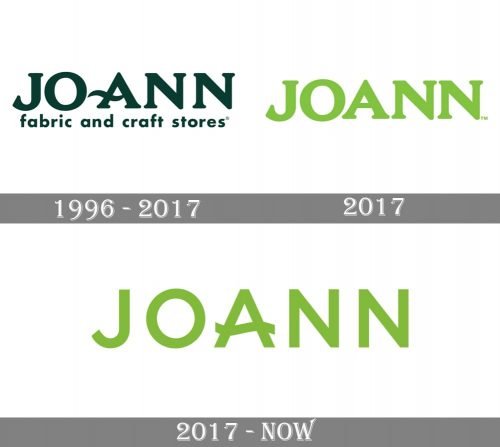
1996 – 2017
The Joann logo introduced in 1996 was composed of the main wordmark with the tagline, where the company’s name in thick enlarged capitals was executed in a traditional serif font with the horizontals bar of the “A” elongated and curved to the left. As for the “Fabric and craft stores” tagline, it was written in the lowercase and used a bold sans-serif font. The dark green color of the logo was a reflection of growth, progress, and success.
2017
The company decides to change its logo in 2017 and comes up with a trial version first. It is a simple capitalized “Joann” inscription in a light green shade, written in the same serif typeface as the previous logotype, but without any curved of the “A”. This version only stayed with the brand for a few months.
2017 – Today
The logo we all know today was designed later in 2017 and is composed of a sans-serif inscription in the same light green color, which looks fresh and evokes happy and friendly feelings.
The only decorative detail of the logotype is the horizontal bar of the letter “A”, which is not elongated this time but is in the wave shape, adding softness and peacefulness to the whole image.


