Lidl is a German brand of a food retailing company, which was founded in the 1930s as a grocery wholesale firm. Today the brand has more than 10,000 stores across Europe and the USA and is one of the world’s leaders in this segment.
Meaning and history
Lidl, the well-known international discount supermarket chain, was founded by Josef Schwarz in the 1930s in Germany. Initially, it was a part of the Schwarz Gruppe, which included a fruit wholesaler. The first Lidl store was opened in 1973, marking the beginning of a new era in affordable grocery shopping.
The company’s journey has been marked by significant achievements. In the 1990s, Lidl began its international expansion, entering markets outside of Germany. This expansion was pivotal in establishing Lidl as a key player in the global retail market. The company’s approach of offering quality products at low prices, combined with efficient store operations, has contributed to its success. Lidl has also been proactive in embracing eco-friendly practices, such as reducing plastic waste and offering more sustainable product options.
Currently, Lidl operates in numerous countries across Europe and the United States, with thousands of stores and a strong online presence. Its current position in the retail sector is one of prominence, with continuous growth in various markets. The company’s commitment to affordability, convenience, and sustainability continues to attract a wide customer base, reinforcing its status as a leading global supermarket chain.
What is Lidl?
Lidl is a European chain of supermarkets, which was established in Germany in the 1930s, and by today has grown into one of the world’s largest retailers with more than 10 thousand locations on different continents.
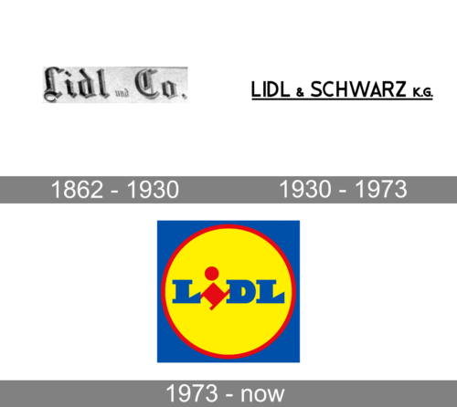
1862 – 1930
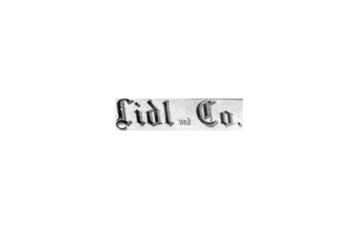
This logo features an inscription done using a rich classic font with gothic elements. Although there are no other details besides “Lidl und Co.” printed in German, the logo looks grand and elegant. The main color is black, which is a very traditional choice for logos of all times. It is accompanied by gray, which adds a three-dimensional appearance to the letters.
1930 – 1973

After a while, the company decided to create a more simple logo. It was done using black color and a sans-serif font that resembled Mensionery Extra Black by Creative Fabrica. The new name, Lidl & Schwarz K.G., reflected that the company expanded. The whole inscription was underlined by a black line of the same thickness as the strokes used for the letters. It added a feeling of importance and served as a strong base.
1973 – Today
The brand was named after its founder, professor Ludwig Lids. Lidl is a huge brand, the main European food retailer. And its visual identity is strong and bright.
The Lidl logo is composed of a circle, placed on a square, with a wordmark inside.
The main element, which makes the Lidl logo stand out is its color palette. The combination of yellow, blue and red is happy and friendly. It is a very bright logo, which evokes a sense of warmth, joy and reliability.
The square blue background of the logo symbolizes quality and authority, when the yellow circle is optimistic and uplifting. The red frame of the circle balances the wordmark.
The Lidl nameplate is composed of three blue capital letters “L”, “D” and “L”, with the red “I” in the lower case, but similar to others by size. The signature “I” is located diagonally with the dot above the angle, which resembles of the man’s abstract figure.
The Lidl logo is a perfect reflection of all the brand’s values, and shows its customers as the main interest of the company. The logo is king and eye-catching, evoking a sense of authority and expertise.
Font and color
The bold geometric lettering from the primary Lidl logo is set in a heavy custom serif typeface, with the massive characters executed in extra-wide lines, decorated by the enlarged serifs. The closest fonts to the one, used for the Lidl insignia are, probably, Big Boy Sm Cap and Saddle Tramp, but with the serifs more triangular.
As for the color palette of the Lidl visual identity, it is based on blue and red, which are sometimes accompanied by bright yellow. This color scheme stands for quality and professionalism and points to the company’s expertise and energy, showing its progressive approach to business.


