James Bond is the name of a character, which first appeared in the books of Ian Fleming in the early 1950s. Today this name is synonymous to secret service agents and the character is definitely one of the most popular heroes ever created. Numerous films, series, and even comics about James Bond were released and keep coming out.
Meaning and history
The visual identity of the world’s most famous secret agent is fully based on his second name, which is Agent 007. The iconic 007 logos was created at the beginning of the 1960s and hasn’t changed much throughout the years, only became more sophisticated and elegant.
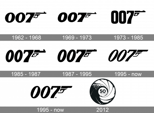
1962 – 1968
The logo, designed in 1962 was composed of three bold and sleek black digits “007” with a black gun coming out of the “7” and pointing to the right so that the digit became a handle of the gun.
The numbers, executed in thick lines with smooth contours have some of the edges slightly curved, which added a sense of luxury and style.
1969 – 1973
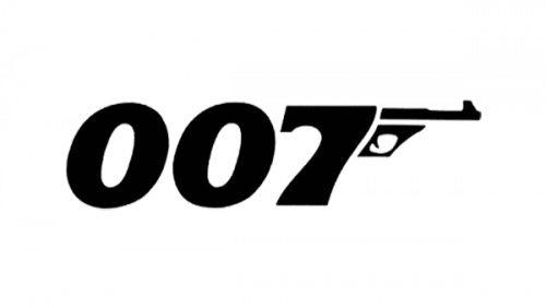
This one was just marginally different from the previous design in that the numbers were somewhat shorter.
1973 – 1985
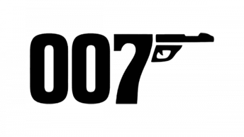
This time, the numbers became taller, straight and also rather narrower than before. The front sight on the pistol was also cut down.
1985 – 1987
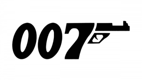
A ‘View to Kill’ logo is much like the ones from the 60s, except the numbers are elongated and look more like ovals. Moreover, pistol became bulkier and more geometric.
1987 – 1995
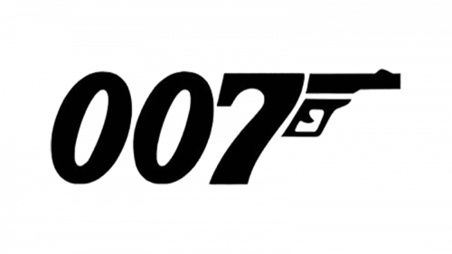
For the ‘Living Daylights’ movie, they tilted the numbers even more to the right and made the pistol part even more square.
1995 – Today (Alternativ)

This is the alternative version for the main logo used since 1995. Compared to the 1987 design, the numbers on this one are thinner and skewed even stronger sideways. The pistol also lost much of its nuance and was greatly simplified.
1995 – Today
As the years were passing, the logo has been changing, becoming thinner, taller, and more inclined. But the composition and monochrome color palette have never been touched.
The current version of the James Bond visual identity was designed in 1995. It is still the “007” nameplate with the “7” as the gin’s handle, but the numbers on this logo are thin and elegant, while the gun has become shorter and bolder. Now the image looks more balanced with smooth sophisticated lines of the digits, and short geometric lines of the emblem.
The black and white color scheme of the James Bond logo is a perfect choice, as allows placement on any possible surface and pattern, and the 007 Agent has a very wide presence in different segments across the globe.
2012

An anniversary one-off logo of the 2012 uses a completely different design. It’s a circle that represents the pistol’s barrel, or rather a point of view from inside of it – a trick used in the intro of most Bond movies. In its middle, instead of the agent, there’s an inscription saying ’50 years’ in a strict style.


