The comic book superhero called Superboy has had more than one incarnation. The most popular of them are Kon-El, a teenaged clone; the young Superman; and Jonathan Kent, the child of Superman and Lois Lane. Comic books were published by DC Comics and Adventure Comics.
Meaning and history
The Superboy logo has always borne an uncanny resemblance to the emblem of Superman, which is pretty natural, taking into consideration the concept behind this hero.
The character was conceived by Jerry Siegel, who wanted Superboy to be a sort of a prankster. In 1938, he suggested his story to Detective Comics, Inc. Having been rejected, he decided to make a more detailed version and introduced it to the same company in 1940. However, this one was rejected again. Mort Weisinger, who was editor in Detective Comics, was afraid that such a character could have a negative effect on the way people perceive Superman. To make matters worse, it could have set an undesirable role model for the younger audience.
However, in 1944, the company began to publish comics about Superboy. In contrast to the original concept, here, Superboy was a positive hero. In a way, he was meant to be a version of Superman developed specifically to appeal to younger readers, hence the use of the same emblem.
What is Superboy
Superboy is one of the most popular heroes of comic books. In fact, this name belongs not to a single hero but to several ones. There have been five comic book series devoted specifically to him, and he also could be seen in other series.
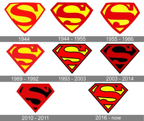
1944
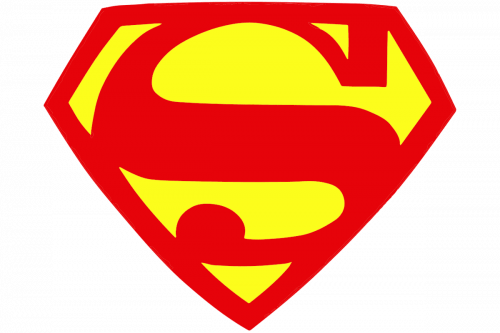
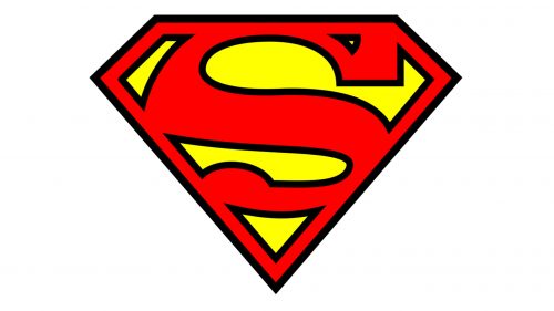
In the original issues, Superboy already wore the same emblem as Superman. It was a diamond housing a large red “S.” The border of the diamond was red, while the filling was yellow. This version of the logo was designed by Wayne Boring, who was the primary penciler of Superman back then.
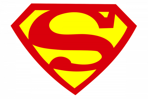
1944 – 1955
The Superboy logo was slightly tweaked. The top of the “S” became heavier. The left-hand side curve now touched the border of the diamond. At the top end of the letter, there was a small yellow patch, which made the overall style slightly edgier. The lower end of the “S” adopted a rounded element.
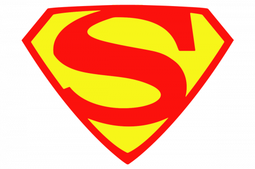
1955 – 1986
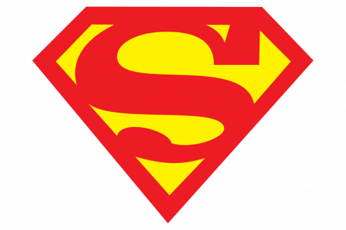
Some weight was added to the central part of the “S,” while the top part of the curve grew lighter. The element at the end of the lower end of the “S” was now plumper, closer to a circle than its predecessor (although still not a circle, of course). The shape of the diamond was slightly altered, which is specifically notable in its top part.
1993 – 2003; 2016 – present
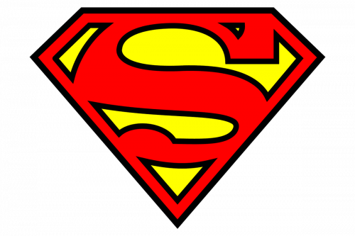
This one resembles the Superman badge drawn in 1968 by Curt Swan. Here, the shield was straighter, and the patch of yellow in the area of the upper serif grew smaller. This logo has been widely used in merchandise and films, and you can still come across it in various sources.
2003 – 2014
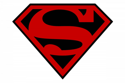
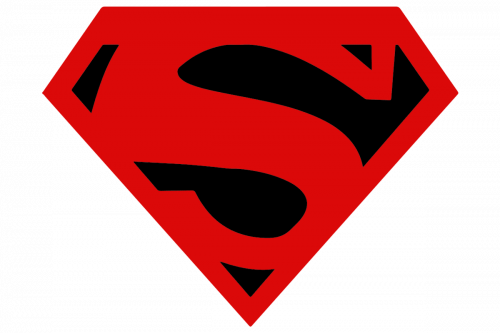
The gold filling became black. This logo came from Superman (Vol. 2) #175, and it was originally used to symbolize the mourning connected with sad events through which the main hero had gone.
TV series (1989 – 1992)
The logo looked pretty much like the one from 1993, except that the black outline disappeared.
Smallvile (2010 – 2011)
The filling here was black, like in the 2003 logo. And yet, the shape was different, so we can say that we’re talking about a new modification.
Colors and font
For most of its history, the Superboy logo has been based on the vivid combination of bright red and yellow. The “S,” which has been the only letter in the emblem, was custom artwork created specifically for the comics.


