

![]() Fantastic Four Logo PNG
Fantastic Four Logo PNG
The Fantastic Four is the name of a superhero team, generated by Marvel in 1961. That was the first collaborative work of Jack Kirby and Stan Lee, the fathers of all the Marvel characters. The film uses the same name that was released in 2015.
Meaning and history
What is Fantastic Four?
Fantastic Four is one of the most famous superhero teams, which was created by Marvel at the beginning of the 1960s. The Four consists of the Invisible Woman, Mister Fantastic, the Thing, and the Human Touch, who all became the main characters of The Fantastic Four movie, released in 2015.
Emblem evolution in the comics
![]()
The Fantastic Four visual identity has always been minimalist and recognizable. Its laconic logo looks modern and actual, even if we look at its original version, created in the 1960s.
1961 – 1962
![]()
The initial logo was created for the first edition of Fantastic Four comic books. The name of the team was written using uneven, grotesque letters in two lines. Moreover, there was a tiny ‘the’ part stuck to the writing’s left side. The color of most of the logo was dark blue, the reference to the iconic suits of the team.
1962 – 1970, 1980 – 1981, 1992 – 2002
![]()
In the following logo, they used the same appearance of the letters. That being said, they bleached the coloring and aligned the words centrally. The color blue moved to the shadows behind the letters.
1970 – 1972, 1981 – 1987
![]()
This version was still the same text, although the coloring changed again – this time to yellow letters with red shadows. This was due to the sudden focus shift towards the Human Torch in the contemporary editions.
1972 – 1975
![]()
The 1972 edition saw a new design. The word ‘Fantastic’ here was curved, and ‘Four’ was placed inside the resulting arch. The font was more orderly and this time had some integrity. The coloring was this time blood-red with black outlines.
1975 – 1980, 2009 – 2012
![]()
In this following logo, they simply wrote the name using bold, capital letters of a soft sans-serif font. It was notably given some perspective, which resulted in the face of the letters being colored white, while the underside was covered in blue.
1985 – 1992, 2004 – 2008
![]()
This emblem is a lot like their old logotypes from the 60s-80s. Except, they use blue with a black outline here, and nothing else.
2002 – 2004
![]()
For the 2002 logo, they wrote the team’s name in thin, tilted letters using the color red and some white outline. The two lines were separated by a red ring, which is coincidentally a part of the logo’s foundation – a wide round badge with a silver ‘4’ in its middle.
2008 – 2009
![]()
This logo is more like a corporate sign. They used a very basic sans-serif font with the word ‘Fantastic’. The ‘Four’ part is represented by a big circle with the white ‘4’ in it. The two parts are actually joined, because the former word is driven right into this blank space inside the circle. Both the letters and the figure are dark blue.
2013 – 2014
![]()
Interestingly, this one is also based on an older logo – this time, the red-and-black one. They slightly changed the font and switched the letters to blue with the double outline of white and black. Other than that, it’s the same logo.
2014 – 2015
![]()
The 2014 logo is a weird experiment. They wrote ‘FANTSTK’ in linear futuristic letters and put the big number ‘4’ where the second ‘A’ should’ve been. This entire composition was then colored white and given some grey outline.
2018 – Today
![]()
The latest version of the Fantastic Four logo is composed of a golden-yellow number enclosed in a circle of the same thickness and the lines of the “4”. The “Fantastic Four” inscription in an elegant bold typeface is drawn in white with a blue and gold outline.
Symbol evolution in the a
nimated series
![]()
In addition to the main part of the Fantastic Four’s visual identity, the logo, the franchise has had a graphic component throughout its history, a symbol. It makes sense that the graphic part of the logo was built around the number “4”, but that was not always the case, and in 1978 the visual identity of the Fantastic Four consisted only of the text part.
As for the other three versions, there was a number in each of them. The very first image was as bright and exaggerated as possible, and from the mid-1990s, Gustave’s Four was depicted inside a round medallion with a contrasting background.
1967 – 1968
![]()
The very first Fantastic Four logo was designed in 1967 and consisted of an enlarged yellow “4” with a small rectangular badge, containing “Fantastic” lettering in all caps of a thin sans-serif typeface. It was a bright and bold visual identity design, which looked super futuristic for its time.
1978
![]()
For this one, they actually used one of the older comic book logos. It has the same font, although the letters are colored red. There’s also an article ‘the’ written above the main part with the same font. The background was usually pale yellow.
1994 – 1996
![]()
The 1994 logo also uses the old font, although here it has more integrity and system. Moreover, the letters look metallic on this picture. There’s also a silvery-blue ring on the text’s left side with the big number ‘4’ in it. The background, for its part, is filled with various cosmic and metallic elements, as well as the same ring from the left part, except bigger and colored in white and blue.
2006 – 2007
![]()
During the years, the style of the lettering was slightly changed, and by the 2000s the “4” symbol gained a circular frame. Now the emblem replaced the lettering on almost all the placements.
Fantastic Four Film Logo 2015
![]()
For the movie, another logo was designed — it is a strict and strong wordmark in silver with the “4” in a square frame, replacing the second “A” of the nameplate. The film logo is three-dimensional and looks futuristic and powerful.
Font and Color
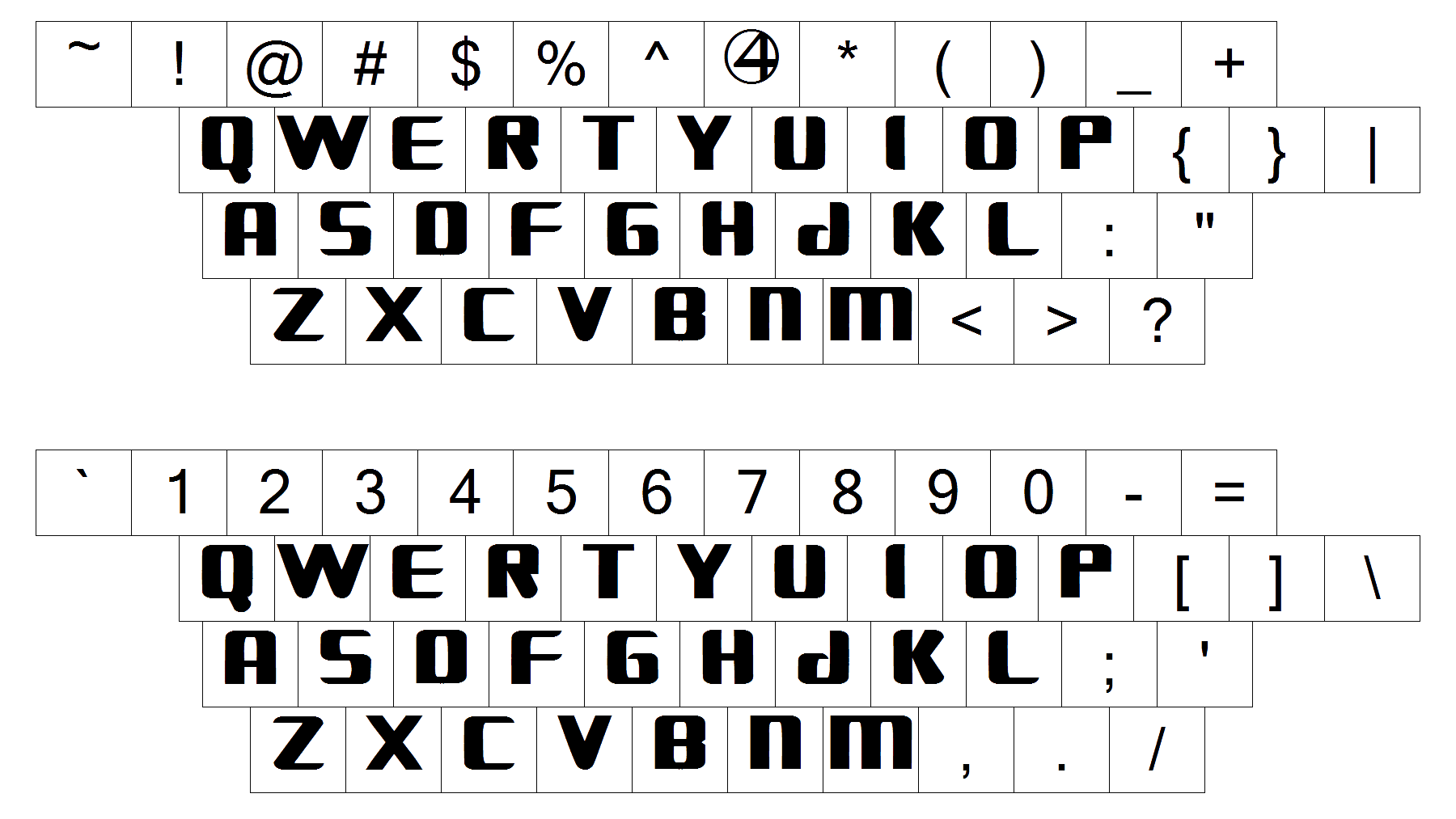 The custom stylized title case lettering from the primary Fantastic shout badge is set in a wrong and clean designer typeface with geometric contours of the heavy characters. The closest fonts to the one; used in this insignia, are, probably, Bronzier Shadow, or Sync College, but with significant modifications of the contours of the characters.
As for the color palette of the Fantastic Four visual identity, it is based on the combination of white, gradient turquoise, orange and yellow, which makes the lettering and the emblem on the logo look fresh and bright, at the same time evoking a sense of stability and reliability, with orange and yellow elevating the look of the badge and representing such qualities as energy and motion, brilliantly reflecting the adventurous character of the franchise.


