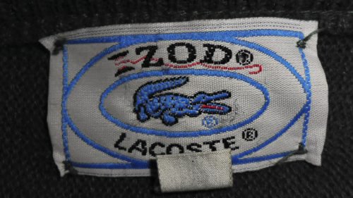
While Izod does have a crest of its own, in fact, it’s by far less popular than the alligator logo the clothing company placed on the iconic polo shirts manufactured in collaboration with Lacoste. Back in 1977, The Washington Post called it “the longest-running status clothing item for men.”
Meaning and history
IZOD is a brand, aiming to provide people across the globe with affordable, fancy, and comfortable clothing, and its logo is as simple as the brand’s physiology, yet represents its confidence and its “quality for quantity” philosophy.
1938 — 2004
The original IZOD logo was composed of a strict and massive capitalized logotype in a monochrome palette, with letters executed in a bold and solid serif typeface, which is very close to such fonts as LTC Bodoni Bold Extended and Speakeasy Modern. The logo represented the confidence and timelessness of the brand, pointing to the elegance, quality, and seriousness of its approach to fashion.
2004 — Today
The redesign of 2004 brought a new image to the IZOD visual identity, keeping logotype as the main and the only element. The wordmark in all capitals changed its color palette into red on white, which sometimes turns monochrome, especially on the official documents of the company.
The new lettering is written in a modern serif typeface with thick straight lines and massive square serifs. The font is pretty close to Coltan ages Extra Bold, with a very strong character and a touch of brutality.
The clean contours and straight lines of the letters with distinct cuts evokes a sense of expertise and professionalism, and shows the brand’s reliability and trustworthiness, along with a passion for what it does.
Izod Lacoste symbol
Why the crocodile? “The Alligator” was the nickname Lacoste gained as the result of a wager. The tennis player was proud of the nickname stating that it described his “tenacity on the court.” Later, the word “alligator” was replaced by “crocodile.”
While Lacoste used the emblem on several clothing items, it was only in 1951, when he partnered with the Izod company, that the crocodile logo started its way to global fame. The company belonged to Vin Draddy, who called it after the London tailor Jack Izod.
By the 1960s, the shirt was recognized as an essential part of the preppy style and preserved its status until the late 1980s. In 1993, Lacoste split with Izod. Both brands still sell polo shirts. Lacoste shirts bear a crocodile logo, while Izod uses its own crest.
Emblem
Throughout its more than 80-year history, Izod has used a variety of crests. Apart from the iconic alligator, you can come across a logo featuring six panther muzzles in green. The muzzles are placed inside an intricate botanical pattern.
Also, we can mention the Izod logo featuring a large capital “I” inside a shield. The shield has a red outline, while the space inside it is broken into two fields (blue and white). Above the crest, there’s a crown, while below it a banner can be seen featuring the year when the brand was established, 1937. From both sides of the crest, there’s a laurel wreath.
The newer version of the logo looks by far simpler, although it still can’t be described as minimalistic. Here, you can see the interlacing letters “I” and “Z.” This logo can be seen on the polo shirts currently manufactured by Izod.
Font
As there’re only two letters on the emblem, it’s hardly possible to describe a typeface they belong to. The letters have classic proportions and serifs, which seems to remind of the fact that the brand is more on the “heritage” and “tradition” side.
Colors
The Izod logo can be given in various colors depending on the color of the item it’s placed upon.


