Etam is a famous underwear fashion brand, which was established in 1916 in France. The company is known for its advertising campaigns with the world’s celebrities and is one of the most recognizable lingerie brands across the globe.
Meaning and history
The Etam brand is the leader among the most popular designers and manufacturers of women’s underwear in the world. It was initiated by Max Lindemann in Paris in 1916.
In 1928 the first Etam store opened in Paris, and only in 1963 the brand released its first full clothing collection. Success came quickly, and in 1964 the owners of the brand decided to start producing underwear from cotton and became the first in this segment. Then Etam discovered the fashion world – it happened in 1975 when Etam began using jerseys for creating comfortable pajamas and nightgowns. And in 1985 Etam made another breakthrough in the world clothing market – its designers created the very first seamless bra.
What is Etam?
Etam is the name of a stylish and elegant women’s lingerie and home wear, which was established in France at the end of the 1910s. Today the boutiques of the brand can be found in the most iconic shopping streets of the world, as well as in the most visited shopping malls.
1992 – 2002

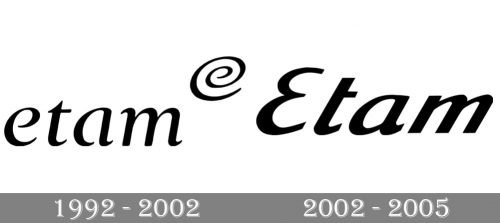
The older logo was partly inspired by the growing popularity of the Internet and emails. The stylized “e” seen at the top right corner, looks very much like the “at sign” (@), which became immensely popular in the 1990s.
The wordmark showcases an elegant type with strokes of varying thicknesses, which added classic chic. However, the fact the word is given in lowercase letters made it more in line with the logos of the digital era.
2002 – 2005

The Etam visual identity is delicate and elegant, reflecting the brand’s nature and feminine character.
The logo is composed of a sophisticated wordmark, where the lettering is executed in an italicized sans-serif typeface with clean and neat lines.
The two most memorable elements of the Etam nameplate are letters “E” and “T”. The Etam “E” is the only capital letter of the inscription and is written as a mirrored “3”, which looks smooth and sleek in its curves. The “T” of the wordmark has its vertical bar precise and clear-cut, with the horizontal bar shortened and coming out only to the right.
Etam uses monochrome or red on white color combinations for its visual identity, in order to add more elegance and style and to show the smooth and sophisticated character of its products.
The Etam logo is fine and timeless, its simplicity makes it a quality mark for the women lingerie and shows the company’s values of comfort and design.
Font and Color
The smooth and elegant title case lettering from the official logo of the Etam brand is set in a fancy custom sans-serif font with bold lines, straight cuts, and distinctive contours of the characters. The closest fonts to the one, used in this insignia, are, probably, Linex Sans Italic, or Beatrix Antiqua Medium Italic, with some significant modifications of the contours.
As for the color palette of the Etam visual identity, it is based on a smooth yet vivid shade of red, which looks passionate and feminine, brilliantly reflecting the essence of the brand, and establishing its audience as women of all ages.


