Itzy is a vibrant South Korean girl group that debuted in 2019 under JYP Entertainment. Known for their energetic and empowering music, the group consists of five members: Yeji, Lia, Ryujin, Chaeryeong, and Yuna. Their music style blends K-pop with elements of hip hop and EDM, creating catchy, upbeat tracks. They quickly gained popularity with hits like “Dalla Dalla” and “Wannabe,” showcasing their dynamic dance performances and unique fashion sense. Itzy’s message often revolves around self-confidence and individuality, resonating with a global youth audience.
Meaning and history
Itzy, a South Korean girl group formed by JYP Entertainment, made a powerful entrance into the K-pop scene in February 2019. Comprising Yeji, Lia, Ryujin, Chaeryeong, and Yuna, the group’s debut single “Dalla Dalla” instantly captivated audiences with its message of self-love and nonconformity. The song broke several records, heralding Itzy as a significant new force in K-pop.
Their follow-up releases, such as “Icy” and “Wannabe,” continued this trend, combining catchy hooks with messages of empowerment and individuality. Each member brought a unique flair to the group, from Yeji’s charismatic leadership and dance prowess to Lia’s vocal finesse, Ryujin’s edgy rap skills, Chaeryeong’s dance expertise, and Yuna’s vibrant energy.
Itzy’s music, often infused with elements of EDM, hip hop, and pop, resonated globally, leading to numerous awards in their debut year, including Rookie of the Year. Their dynamic performances and distinctive style set new trends in K-pop, particularly among younger fans who found inspiration in their lyrics and fashion.
The group expanded their reach with the 2020 release of “Not Shy,” which showcased a more mature sound while retaining their signature confidence. This evolution was further evidenced in their mini-albums and their 2021 full album, “Crazy in Love,” featuring the hit “Loco.”
Itzy’s influence stretched beyond music. They became fashion icons, with each member developing a distinct style that influenced fans worldwide. They also engaged in various global events and collaborations, enhancing their international appeal.
Despite their relatively short history, Itzy has left a significant mark on the K-pop industry, known for their empowering messages, distinctive style, and energetic performances. They continue to evolve, promising to push the boundaries of K-pop and inspire their growing fanbase, affectionately known as ‘Midzy.’
What is Itzy?
Itzy is a dynamic South Korean girl group, debuted in 2019 under JYP Entertainment, renowned for their electrifying music blending K-pop, hip hop, and EDM. The quintet, consisting of Yeji, Lia, Ryujin, Chaeryeong, and Yuna, is celebrated for their empowering themes and trendsetting performances, resonating strongly with a global youth audience. Their hit tracks like “Dalla Dalla” and “Wannabe” have solidified their position as influential icons in the K-pop world.
2019
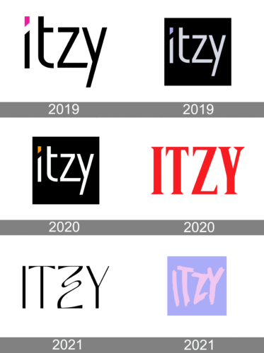
The logo cis a minimalist yet bold typographic representation, featuring the word “Itzy” in a clean, sans-serif font. The letters are black, with sharp angles and straight lines, emphasizing a modern and cutting-edge aesthetic. A notable quirk in the design is the stylized ‘T’, which cleverly integrates with the ‘Z’, giving the impression of continuous, flowing movement. Above the ‘I’, a vibrant pink quadrilateral adds a pop of color, suggesting innovation and a touch of playfulness. This geometric element could symbolize forward-thinking and upward momentum, resonating with the youthful and energetic identity of the brand it represents. The overall simplicity of the design ensures high visibility and recognition, suitable for diverse applications from digital media to merchandise.
2019
The new version features “Itzy” on an all-black background. The letters are white, creating a stark contrast that captures attention. A notable addition is the light blue accent on the ‘i’, injecting a subtle yet striking splash of color that breaks the monochromatic scheme. The font maintains its sans-serif, clean-lined nature, yet the ‘t’ and ‘z’ appear more integrated, enhancing the visual flow.
This design choice suggests unity and connectivity within the group’s identity. The overall look is sleek and contemporary, with the use of negative space around the typography giving it a pronounced and bold silhouette. The logo retains its minimalist charm but with an added depth that reflects a maturing brand.
2020
This logo variation maintains the strong, contrasting color scheme of its predecessor but introduces an orange dot above the ‘i’, replacing the previous light blue. The orange accent provides a warm, energetic pop of color, infusing the design with a fresh and vibrant feel, potentially signifying creativity and enthusiasm. The white letters against the black backdrop remain, ensuring the logo’s striking visual impact. The typography continues to convey a sleek, modern aesthetic, with the interconnected ‘t’ and ‘z’ suggesting unity and flow. The orange element adds a distinct and memorable twist to the logo’s identity, keeping the overall design clean and bold while subtly evolving the brand’s visual narrative.
2020
This rendition of the logo stands out with its bold, crimson hue, a stark departure from the previous black and white motif. The red color is associated with passion and energy, aligning with the vibrant and dynamic image of the brand it represents. The letters are uniform in color, eliminating the previous version’s accentuation above the ‘i’, which presents a more cohesive and assertive look.
The font style appears more traditional with serifs, which adds a touch of elegance and formality to the overall design. This change could signify a nod to classic aesthetics while maintaining a modern edge. The serifs on the letters anchor the design, giving it a sturdier and more grounded appearance. The absence of additional color accents focuses the viewer’s attention solely on the boldness of the red and the strength of the lettering.
2021
In this logo variation, we see a dramatic shift from serif to sans-serif typography, which imparts a more modern and streamlined appearance. The ‘Z’ in the center is notably stylized with a fluid, curved line that contrasts with the straight edges of the other letters, adding a unique artistic touch to the design. The color reverts to a classic black, which offers a versatile and timeless quality.
This design eschews additional color embellishments for a clean, monochromatic look, focusing the viewer’s attention on the interplay of line and form within the letters. The ‘I’ and ‘T’ stand tall and upright, while the ‘Y’ stretches out with a slight curve at the base, providing balance to the ‘Z’s’ dynamic swoop. The overall effect is sleek, conveying a sense of sophistication and contemporary flair.
2021
The latest logo eschews the previous stark black and white for a pastel palette, exuding a softer, more playful vibe. The letters are rendered in a brushstroke style, with a gentle pink set against a tranquil lavender background, suggesting creativity and a more approachable, friendly brand personality. This hand-painted effect adds a human touch, perhaps reflecting the group’s personal connection with their audience. The ‘Z’ and ‘Y’ are particularly stylized, with the ‘Z’ stretching out and the ‘Y’ flaring at the bottom, adding to the logo’s dynamic energy. The overall look is less formal and more inviting, signaling a shift towards a more intimate and artistic direction for the brand.


