

![]() Iron Man Logo PNG
Iron Man Logo PNG
Before the Iron Man logo acquired its present look, it went through a long history of identity development, which started more than 50 years ago.
Meaning and history
![]()
Unlike many other famous superheroes, Iron Man has always used visual identity, based on the logotype. Sometimes it was accompanied by a graphical element, but most designs featured bold and bright letters, which looked confident and powerful.
1968 – 1969
![]()
The very first Iron Man logo, introduced in 1968, featured a bold red uppercase logotype with a thin black outline and a distinct shadow, which added strength to the straight and narrowed lines of the letters. Above the main wordmark, “The Invincible” inscription was added in an extended sans-serif, using only red color with no black accents.
1969 – 1984
![]()
The redesign of 1964 brought a new design to the superhero’s visual identity and this logo stayed with the brand for fifteen years. It was a red and blue composition, with the three-dimensional letters, featuring their front parts red with black, and all the sides of their square shapes — in blue. The additional “The Invincible” was executed in the same typeface as on the previous version and used a light blue color for its wide letters.
1984 – 1985
![]()
In 1984 the color palette of the logo was changed to white, yellow and red, and the image of the Iron Man was added to the left of the wordmark. The “Marvel” in the black custom font was set above the image, while the “The Invincible” part of the badge was completely removed.
1985 – 1987
![]()
In 1985 the logo was redrawn in a more progressive and modern way, changing the color palette of its massive letters to white and orange and placing the inscription in two levels on a black background. This version of the logo only stayed with the superhero for two years.
1988 – 1996
![]()
The redesign of 1988 changed the color palette of the Iron Man visual identity to yellow and blue, with its massive letters in a thick white outline placed on a black background. The outline and the white dots, set in each letter, reflected the “iron” part of the superhero and made the logo look unique and strong.
1996 – 1997
![]()
In 1996 the logotype was executed in a new silver and black color palette with the gradient surface of bold letters resembling metal and the numerous rounded screws placed along with the bodies of the symbols.
1997 – 2002
![]()
“The Invincible” inscription comes back to the Iron Man logo in 1997. It was a new bright and fresh emblem, with the yellow rounded letters of the main wordmark and smooth blue additional lettering placed above it. Both parts of the badge were placed in a calm gradient green background.
2002 – 2009
![]()
In 2002 the logo was redesigned again, placing the custom bold lettering in a gradient red outline on a white background. The bodies of the letters were drawn in light yellow and complemented by thin red lines and dots.
2008 – 2012
![]()
In 2008 the logotype was written in bold black letters and had a sleek glossy silver outline in gradient shades which made it look like a real metallic badge. The inscription has a delicate gray shadow, which added volume and made the whole composition look airy and three-dimensional.
2013 – 2014
![]()
After the monochrome logo, used by the brand for four years, a bright version was introduced in 1013. It was a sleek red logotype placed in a blue background, with the letters in a light outline and slightly uneven pattern. The new inscription was executed in a bold and geometric sans-serif typeface, where each letter was solid and strong.
2014 – Today
![]()
The Iron Man logotype was redrawn again in 2014. The new style featured a custom typeface of the letters, which are glued and even slightly overlap each other. Executed in dark red, the letters boast a light yellow and black outline and have their edges geometrically cut. The middle part of the “M” is sharpened and elongated, adding a sense of danger and determination to the inscription, and the “O” is replaced by an iconic octagon with a light yellow circle inside, the main superhero’s signifier.
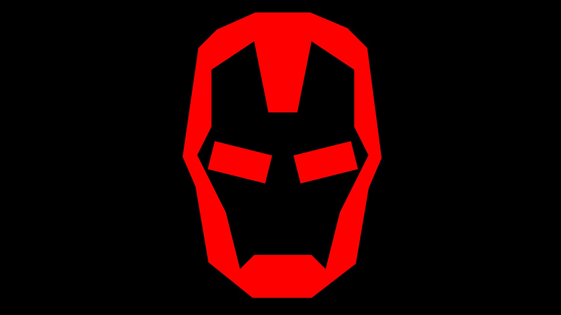
Symbol
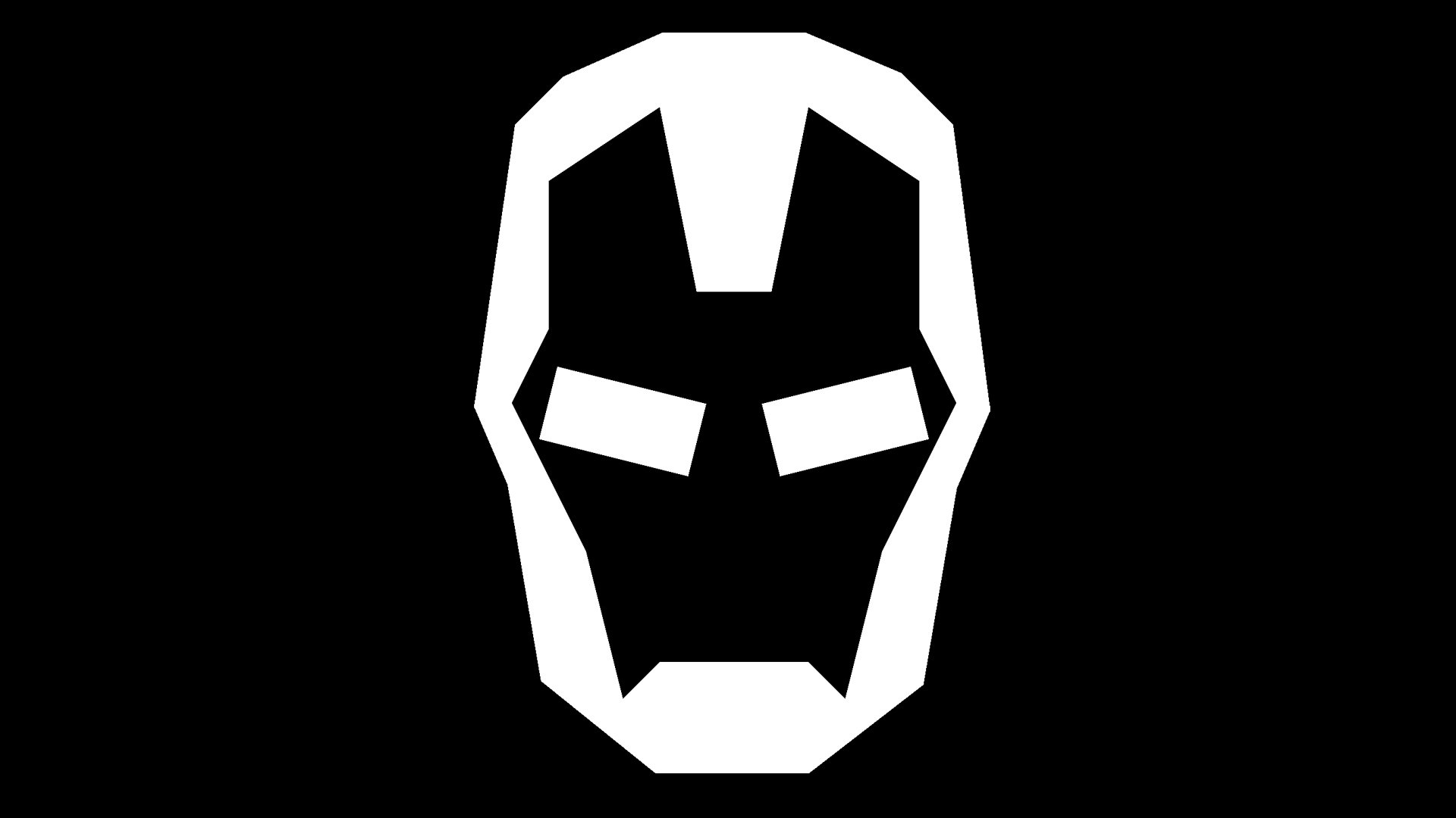
As a series of Iron Man sequels has been introduced since 2008, the original logotype has been replaced by other versions. However, they stayed rather consistent in terms of the overall letter shapes.
Rejected emblems
Before Marvel Studios got to the final version of the logo, it had to go through many drafts, some from well-known authors. For instance, you may find a series of wordmarks created by graphic designer Fede Ponce for the movie “Iron Man and Thor: The Dark World.” Ponce mentioned that some of the concepts he was supposed to represent in his work were “redemption,” “being broken and then re-born.”
One of the ways to represent all these in the design was metal textures and gradients – the approach that Ponce used and that was also used, in a modified form, in the final version of the wordmark.
Font
The typeface featured on the Iron Man logo appears to be a custom artwork, although it is possible to find quite a few fonts looking rather similar.


