Like many other carmakers, the British brand Invicta uses stylized wings as its emblem. And yet, the Invicta logo has a unique style.
Meaning and history
The company was established by Noel Macklin and Oliver Lyle. From 1925 to 1933, it was based in Cobham, Surrey, England. During the following five years, it was based in Chelsea, London, while in 1946-1950, it was located in Virginia Water, Surrey.
Between 2004 and 2012, the brand was revived and used for the S1 sports car.
Emblem
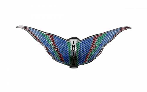
The logo features a pair of wings with the name of the brand placed in between. The word “Invicta” is positioned vertically: the letters follow each other downwards. The type is an unpretentious sans.
What makes the emblem stand out is that it has a lot of “feathers” created with the help of dimensional details. The “feathers” make the wings look more true-to-life than in the majority of other “winged” car logos. The central part of the design reminds the back of a bird, which also adds a realistic touch.
Another unusual nuance of the Invicta logo is the palette – it is pretty diverse for a car badge and, in addition to silver, includes red, blue, and green.


