Invader Zim is not a company but an American animated television series created by comic book writer and cartoonist Jhonen Vasquez. Produced by Nickelodeon, the show centers around an extraterrestrial named Zim from the planet Irk, and his mission to conquer Earth. Originally airing from 2001 to 2006, the series is characterized by its dark humor, distinct animation style, and unique characters. Set in a fictional version of Earth, the plot predominantly unfolds in the city where Zim, disguised as a human boy, schemes to establish dominance but is constantly thwarted by his nemesis, Dib.
Meaning and history
Jhonen Vasquez, a renowned comic book writer and cartoonist, created Invader Zim, an iconic American animated series. It was produced and aired by Nickelodeon starting in 2001. The show gained significant acclaim for its distinct animation and memorable characters, mainly focusing on Zim, an alien from the planet Irk trying to conquer Earth. Over its run, the series won multiple awards, including an Annie Award, reflecting its influential impact on animation and pop culture. Today, while Invader Zim is no longer in active production, its legacy continues with merchandise, a dedicated fanbase, and periodic special episodes.
What is Invader Zim?
Invader Zim is an American animated TV series created by Jhonen Vasquez. Produced by Nickelodeon, it follows an alien named Zim who attempts to conquer Earth. Aired from 2001-2006, it’s known for its unique animation and dark humor.
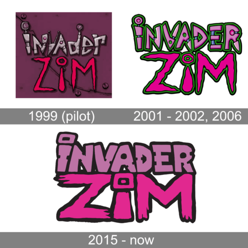
1999 (pilot)
This emblem embodies a retro-futuristic aesthetic, drawing heavily from the universe of steampunk and cyberpunk genres. With a dusty purple backdrop, the metallic silver letters with rivets and hatches are reminiscent of robotic constructs. Randomly placed mechanical appendages, such as screws, add to its quirky and chaotic allure. The bold “ZIM” in fiery red at the base is intentionally chaotic, exuding an alien or extraterrestrial vibe, emphasizing the show’s otherworldly and quirky narrative.
2001 – 2002, 2006
This emblem exudes a playful, techno-galactic appeal. Against a pristine backdrop, the juxtaposition of neon green and pastel pink breathes life into the design, evoking the sense of a futuristic arcade. The lettering, almost gel-like with its glossy finish, features stylized and elongated forms. Noteworthy is the ‘I’ in “ZIM”, capped with a playful eye, hinting at the alien-centric theme of the show. The overall composition, while modern, exudes a touch of retro charm, paying homage to sci-fi pop culture.
2015 – Today
Evoking the rebellious spirit of street art, this logo stands out with its chunky, hand-painted letters. The deep purple merges effortlessly with the pop of hot pink, creating an edgy and youthful look. The rough brushstrokes and splatter details resonate with graffiti styles, while the extended ‘Z’ in “ZIM” adds a dynamic touch. The overall design, rugged yet stylish, encapsulates the unpredictable nature of the show, appealing to fans who appreciate a touch of urban grit in their favorite brands.


