Innocenti is an Italian machinery company initially known for producing scooters. Established in 1920 by Ferdinando Innocenti, the firm expanded its operations and was acquired by British Leyland in 1972. It’s headquartered in Milan and has a strong presence in Europe, producing vehicles under the Mini marque for a period.
Meaning and history
Founded in 1920 by Ferdinando Innocenti in Milan, Innocenti began as a producer of two-wheeled transport, notably the Lambretta scooter. As years progressed, the company transitioned into the automotive sector, notably collaborating with British Leyland to manufacture the iconic Mini in Italy. The 1980s and 1990s saw the company undergo ownership changes, with de Tomaso taking control for a while. Today, the Innocenti name is not as dominant in automotive production, but its legacy in European transport is undeniable.
What is Innocenti?
Innocenti is an Italian company, originally recognized for its Lambretta scooters. Founded in 1920, it later ventured into car manufacturing, notably producing the Mini for a time.
1947 – 1963
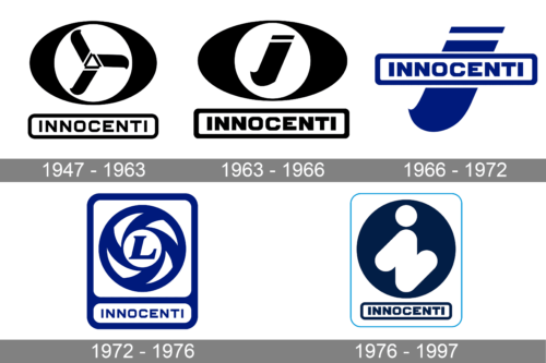
A black oval shape with a white circle in the center, which was divided into three parts and resembled a fan, instantly caught the attention in this logo. They reflected the movement and similar parts in the machinery. The eye then moves lower to see an inscription taken into a rectangular frame with rounded corners. The latter carries the name printed using all uppercase letters and a font similar to Bladi One Wide 4F Bold. It is a well-designed logo with a hidden meaning.
1963 – 1966
Not much has changed since the last logo was created. The fan pattern was replaced by an italicized, lowercase “i”, the first letters of the name. The oval shape was made longer to be the same length as the inscription below. The latter still featured the same font, only now the characters and the border featured notably thicker lines to match the bold symbol above.
1966 – 1972
Gone were the black color and oval base. Instead, the designers used the lowercase “i”, seen in the previous version, as a background by making it significantly larger. The rectangular frame with the name ran across it and created an association with an already established brand image. The company now used a rather popular blue color to make an impression of a stable and trustworthy company.
1972 – 1976
It was not long before the round shape and even a fan pattern, although updated, were brought back. The center was now round and had a large “L” in the center. Instead of an oval shape frame the round symbol was now placed on a white square with a blue frame and rounded corners. The rectangular shape with an inscription was tacked right at the bottom, creating a vertical rectangular emblem. The company continued to use the same blue color, which further enhanced the recognition of this brand.
1976 – 1987
The logo was redrawn in 1976 to create a more minimalistic image. The bold frame was replaced by a thinner line and lighter blue color. The elements inside this delicate frame, on the other hand, featured a dark blue, almost black, color that contrasted well against the white background. The circle now featured had a bold “i” with rounded elements and diagonal lines that created an illusion of a letter “N” placed on an angle. Since 1947, the company continued to use the same font for an inscription that is placed on a rectangular background with rounded corners. This created a very strong brand image despite the changes that the logo went through over the years.


