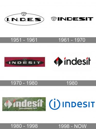
Indesit is a brand of major domestic appliances manufacturer. It was established in 1975 in Italy by Vittorio Merloni. The company’s first name was Merloni Elettrodomestici and it was mainly focused on industrial scales and heaters production.
Meaning and history
Indesit is a European brand of large household appliances manufacturer. The company is a successor of Industria Elettrodimestici Italia, founded in the 1930s, and later renamed Merloni Elettrodomestici.
In 1930 in Fabriano, Italy, Aristide Merloni opened a company for the manufacture of scales. During the Second World War, the factory was destroyed, and Aristide had no choice but to start producing liquefied gas cylinders and electric water heaters in his company Merloni Elettrodomestici in 1945. Then Merloni Elettrodomestici began to produce household appliances as well.
As for the company Indesit, it appeared in Italy in 1975 and became popular in Europe fast enough. In 1989, Merloni acquires the Indesit brand.Under the Ariston and Indesit brands, the company produced gas and electric stoves, washing machines, dishwashers, refrigerators, and other appliances year after year.
In 2005 the name Merloni Elettrodomestici was changed to Indesit. It is an acronym, formed from letters of the words in the original name of the company “Industria Elettrodomestici Italia”.
Today, Indesit is an international brand under which four basic types of home appliances are produced: refrigerators, washing machines, dishwashers, and cooking ovens.
What is Indesit?
Indesit is the name of an Italian manufacturer of domestic appliances, which was established in 1975. Today the brand is very popular not only in Europe but all over the globe, offering its customers large home appliances, such as washing machines, dishwashers, and refrigerators.
1956 – 1961
The first name of the brand was Siprea, in 1956 it was changed to Indes, abbreviation for Industria Elettrodomestici Spa.
1961 – 1970
The brand got its current name in 1961 when the company added “IT” to celebrate the Italian background and heritage of the brand.
1970 – 1980
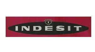
The logo, created for Indesit in the 1970s was based on the two previous versions, but this time executed in color. The horizontally stretched oval became black, while the lettering on it — silver. The elegant triangular crest was contoured in silver and placed on top of the oval. The whole composition was set on a sleek burgundy background, which evokes a sense of elegance and timelessness.
1980

In 1989 a modern and trendy logo was introduced by the brand. The lowercase logotype in a classy sans-serif typeface was executed in black and had some red accents in it. The geometric abstract emblem, featuring a rhombus with rounded angles and a striped white and red combination in the middle, was placed on the left from the inscription. The dots above both letters “I” in the lettering were replaced by two red parallelograms, and the vertical bars of the letters had their upper edges cut diagonally.
1980 – 1998
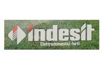
The logo was set in white and red and placed on a green background in 1980. All the black elements from the previous version were switched to white ones and made bolder and softer. The first parallelogram above the “I” remained red, while the second one was colored white now.
1998 – Today
The Indesit logo is a wordmark custom typeface and deep blue color with an emblem on its left.
The emblem is an open circle with a lowercase “i” in it. This brand’s icon is placed on every product’s knob, and is very recognizable.
The Indesit logo is simple and elegant, with a remarkable brand sign and stylish typeface. It evokes the sense of quality and confidence.
Font and Color
The fancy modern lettering from the primary Indesit badge is set in the mixed-type of a clean sans-serif typeface with distinctive contours of the characters. The closest fonts to the one, used in this insignia, are, probably, Scorno Demo Medium, or Amfibia Demo Bold Wide, but with some modifications of the characters’ contours.
As for the color palette of the Indesit visual identity, it is based on a fresh and cold shade of medium blue, which looks very clean and bright. This color perfectly emphasizes the purpose of the brand and makes the company look professional and reliable. Blue is the color of safety, responsibility, and stability.


