Grundig is the name of the electronic home appliances brand, which was established in 1945 in Germany and today is owned by the Turkish Arcelik corporation. Named after its founder, Max Grundig, the brand offers a wide range of consumer electronic goods but is best known for its TVs.
Meaning and history
Grundig is a pretty old European brand, which unfortunately is not very famous on the international market. The company was founded in the middle of the 1940s by Max Grundig, hence the name of the brand. Like many other businesses, which are successful today, Grundig began as a small workshop, which high was mainly involved in the repair of radios. The business became pretty profitable and the founder decided to expand the activities of the company.
In the middle of the 1940s, Max Grundig registers his company and hires more than 500 employees, who were engaged in the production of radio units. By the 1970s Grundig has become a very reputable brand, but in the 1980s it got too hard to compete with the Asian manufacturers. Since that time the company had many ups and downs, but it is still operating today, manufacturing not only radios but also TV sets and accessories and devices for hair and beauty.
What is Grundig?
Grundig is a German company, which was established in 1945, and is specialized in the production of home audio and video equipment. The main products of the company are TV sets, DVD devices, Hi-Fi equipment, audio equipment, and radios, as well as hair and body care devices.
1945 – 1950
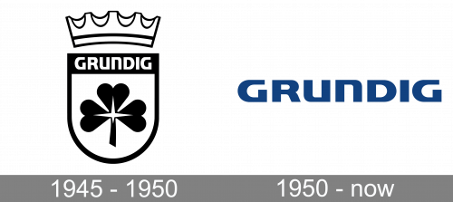
The original Grundig logo was created in 1945 and stayed with the German brand for almost five years. It was a bold heraldic badge with the black-and-white coat of arms as the central element. The crest had its bottom part rounded, and too — straight. In the middle of the crest, there was a Solid black trefoil drawn in smooth lines, and accompanied by a white uppercase logotype, written over the narrow black rectangular on top. The coat of arms was complemented by a geometric contoured crown, which was slightly arched above it.
1950 – Today
Like a truly German brand, Grundig prefers stability and confidence, and it can be seen not only in the high quality of its products but also in its visual identity, which hasn’t been changed for years and brilliantly reflects the values and character of the company.
The official Grundig logo is an uppercase inscription in a bold modern sans-serif typeface, which looks pretty similar to such fonts as FF Signa Pro Extended Black and Francker Paneuropean Extra Bold, but with contours extended and some lines modified.
The inscription looks solid and stable, which reflects the character of the company and its values of green quality and customers’ satisfaction.
The color palette of the brand’s visual identity only elevated the sense of reliability and confidence, as the combination of calm intense blue and white is the commonly known symbol of protection, responsibility, and quality.
Though the Grundig logo is more often executed in blue and placed on a white background, sometimes it is used in a reverse color scheme, and for some lines of the company’s products, the logo can be executed in monochrome or in a very fancy and stylish terracotta and white palette, which looks unusual and makes the brand stand out in the list of its competitors.


