Smeg S.p.A. is a company producing domestic appliances and based in Italy. It was established in 1948 by Vittorio Bertazzoni.
Meaning and history
Smeg is an Italian manufacturer of premium-class household appliances, which was founded in 1948 as a metallurgical plant in the town of Guastalla, located in the north of Italy in the province of Reggio Emilia. The founder of the brand, Vittorio Bertazzoni, named it after the original specialization: SMEG itself is an abbreviation for the Italian Smalteria Metallurgica Emiliana Guastalla (Metallurgical Factory Emiliana Guastalla).
Originally, the company was focused on the production of gas stoves, later the range was expanded to washing machines, refrigerators, and dishwashers, as well as other appliances for the kitchen.
Currently, Smeg is one of the largest manufacturers of kitchen appliances worldwide. Its representative offices are located all over the world – in France, Portugal, the USA, Russia, UAE, and other countries.The company’s main production facilitiesare concentrated in three large plants in Northern Italy.
Smeg products are a perfect combination of high technology and timeless style. Each new series of appliances is a harmony of well-thought-out functionality, bold shape, and stunning convenience.
What is Smeg?
Smeg is an Italian brand of home appliance manufacturer, which was established in 1948, and today is considered to be the producer of one of the most stylish domestic electronics in the world, having its products distributed internationally.
1956
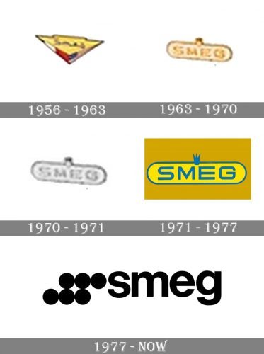
The first cooker, nicknamed Elizabeth, was introduced in 1956. It bore a colorful logo featuring the arrowhead. The arrowhead was mostly a yellow triangle housing the name of the brand in a rather light type paired with a red, blue, and white trim.
1963
The first washing machine, Leda, already featured a different emblem. It looked simple and, at the same time, more refined due to the golden hues. The emblem was based on a square with rounded corners. The word “Smeg” inside was set in a comparatively unpretentious all-caps type.
1970
The world’s first 14-place setting dishwasher, Niagara, was introduced. The emblem on it looked pretty much like its predecessor, except that it was black and white.
1971
Print ads of this time capture a bright logo with the brand’s name in blue on the yellow background. A small blue crown is added above. The type is a minimalist, highly legible all-caps one.
1977
A new emblem is created by Franco Maria Ricci, an Italian publisher and graphic designer. The six circles you can see next to the name of the brands represent the burners of a gas hob and the round knobs of an oven. While the word “Smeg” looks as simple as it does on the previous version, it now comprises only the lowercase letters.
While the brand’s website still features the iconic Smeg logo created by Franco Maria Ricci, many of the products have a different emblem. It includes the name of the brand in capital letters with plenty of space between them.
Font and color
The minimalistic lowercase logotype from the official badge of the Italian household appliances manufacturer is set in a bold and stable sans-serif typeface with traditional full-shape letters and distinct cuts of the lines. The closest fonts to the one, used in the Smeg logo are, probably, Sequel Sans Display Bold and Afical Neue Bold.
As for the color palette of the Smeg visual identity, it is set in a classic and timeless combination of black and white, the powerful contrasting scheme, which is always actual and stylish.


