Vaillant is a German company, which is specialized in water heating and cooling systems development and production. The company was established in 1874 and today is one of the largest European corporations in its segment, which has almost 15 thousand employees and operational offices all over the globe.
Meaning and history

The company, named after its founder, has an instantly recognizable and funny visual identity, which was created at the end of the 19th century and is still based on the original concept, despite several redesigns.
The iconic Vaillant logo was inspired by the fairytale motif with cute gnomes and hares. Johann Vaillant was fascinated by those series of drawings and decided to use the hare as the company’s symbol.
What is Vaillant?
Vaillant is the leading company in the heating industry in Europe. The company, established in 1874 and named after its founder, today is the epitome of advanced technology and quality in the world of heating technology. The company operates in more than 60 countries around the world.
1899 – 1930
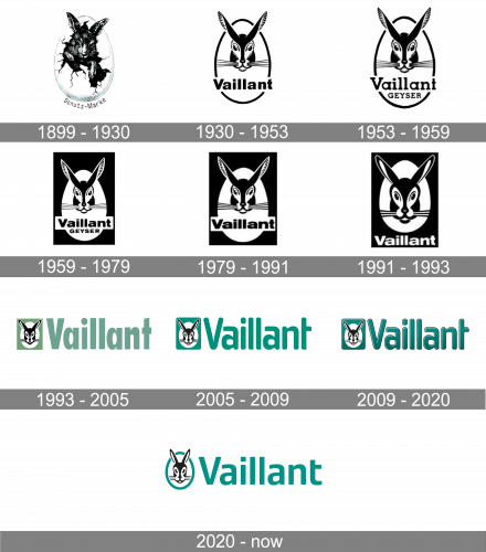
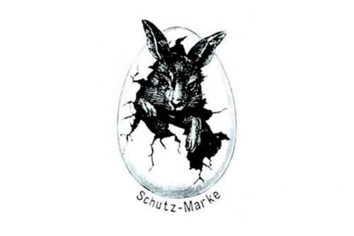
The original emblem was created in 1899 and was composed of a very detailed image of the hare in an egg. The “Schutz Marke” lettering was placed under the egg, around the perimeter of its bottom part. It was a strong and remarkable visual identity, which was unique and made the brand stand out.
1930 – 1953
In the 1930s the contours of the emblem were modernized and the image itself was simplified. Now it was a graphical hare’s head in black, placed on a white background and enclosed in an egg-like frame. The company’s name was written under the head in a bold sans-serif typeface, also in black.
Throughout the years the emblem was refined and made bolder, and there were several experiments with the typeface of the nameplate.
1953 – 1959
In 1953 the logo of Vaillant was refined, with the bunny’s head getting slightly enlarged, and the inscription changed significantly. Now it was a two-leveled logotype, with the “Vaillant” in a wide bold serif typeface, written in the title case above the uppercase “Geyser” inscription in small capitals of the same font.
1959 – 1979
At the end of the 1950s, the logo was redesigned but kept all the basic principles and ideas. The main change was in placing the logo into a black rectangle, keeping the shape, image, and wordmark untouched. But the contrast made the whole picture look more powerful and solid than ever.
1979 – 1991
The redesign of 1979 removed the “Geyser” part of the lettering on the logo, made the head of the bunny larger, and rewrote the “Vaillant” logotype in a bolder band wider sans-serif font, which was quite close to the one, used on the previous badge.
1991 – 1993
In 1991 the nameplate was taken off the “egg” and placed under it, executed in an extended bold sans-serif font, using white color.
1993 – 2005
The new concept of the brand’s logo was born in 1993, and the first bright color appeared in the company’s palette.
The emblem from 1991 remains almost untouched, but now “hare in the egg” is placed inside a turquoise rectangle, with the nameplate written on its right in the same color. The size of the letters is now equal to the emblem’s size, which aims to emphasize the professionalism and authority of the company.
2005 – 2009
In 2005 there was one more redesign of the Vaillant visual identity. The emblem’s angles were softened and the typeface was changed to a friendlier, rounded one.
2009 – 2020

The current Vaillant logo was created in 2009 and is fully based on the previous version. The logo was refined and got more volume, due to the use of gradient colors, outline and a very thin shadow of the inscription. The logo from 2005 is still in use by the brand as a secondary one.
The turquoise, black and white color palette of the brand’s visual identity symbolizes balance, harmony, and reliability of a huge company, which values traditions and has a rich and interesting history.
2020 – Today
The redesign of 2020 has made the Vaillant logotype flat and modern, with all the gradients removed from the composition, and the typeface of the logotype switched to a cleaner and more full-shaped one. The shade of turquoise has become brighter and the whole badge gained a fresh and cool look.
Font
The company’s wordmark is executed in a neat and friendly rounded sans-serif typeface, which is pretty close to a narrowed Cholla font, with the letter “T” slightly modified — its horizontal bar shortened.
The inscription in a rounded front looks clean and welcoming, evoking a kind sense and being a great accompaniment to the bunny emblem. The rounded lines of the typeface reflect the caring approach of the company and its customer as a center of the value system.
The wordmark also reflects a responsible and confident company, which is reliable and loyal, with a huge accent in the quality of its products.
Review
Vaillant is an internationally recognizable and respected company, which is considered to be one of the world’s market leaders in fields of heating and ventilation systems. Founded almost 150 years ago, today the group has its subsidiaries and production facilities across Europe and China. This enables a more efficient manufacturing process and simplified logistics.
Various heating, air-conditioning and ventilation systems for both commercial and residential use are produced under the company’s brand. The range of products includes thermostats, radiators and heat pumps, as well as boilers and power systems.
The company was a pioneer in the production of wall-hung boilers and keeps manufacturing them today, using innovative technologies. Being a technologically centered and progressive company, Vaillant aims to develop new systems and solutions in its segment in order to satisfy all the possible needs of their customers.


