The computer-animated film the Incredibles released by Walt Disney Pictures became very popular globally. It was created by Pixar Animation Studios and featured the voices of several well-known personalities. It was rather commercially successful, grossing $633 million globally during its initial theatrical run.
Meaning and history
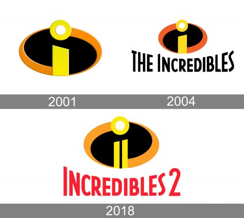
While the movie was released in 2004, the history of the Incredibles logo started three years earlier with the prototype.
2001
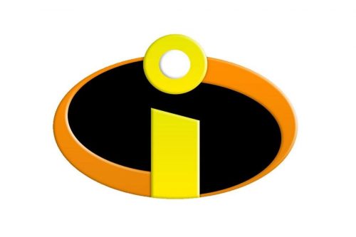 The prototype featured a stylized lowercase “i” inside an ellipse. The lower part of the letter was yellow, while the dot, which was rather big, had the white center and the yellow outline. The ellipse was black, with two orange curves on the sides.
2004
The first official logo looked almost the same as the prototype, except that it was its mirror reflection. On the prototype, the left side of the “i” was higher, while the right side was lower. Vice versa, on the official logo, the left side was lower, while the right side was higher. The orange curves were also placed in the opposite way.
Also, the dot seemed to pop out more on the prototype.
Additionally, the first official logo featured the name of the film in a sans serif type. The letters were stretched vertically on the left and on the right, while the letters in the middle were lower. The lettering was given in black.
You could come across a black-and-white alternative and a version, where the icon was placed inside a dark orange square.
2018
In 2018, a sequel was released under the name of Incredibles 2. The computer-animated superhero film was written and directed by Brad Bird.
The overall look of the second version is pretty close to the original one. The most notable difference is apparently the long black gap dividing the “i” into two parts. Also, the name of the movie is given in red.
Colors
Due to the shape of the letter “i,” the Incredibles logo resembles a candle. The choice of colors only reinforces the impression. Orange and yellow are the colors traditionally associated with light and flame, while black symbolizes the darkness of the night.
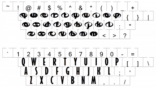
Font
While the type on both the versions seems mostly the same, we should still point out that the way the letters have been stretched vertically slightly differs. That’s because the name of the 2004 movie includes “the” at the beginning, while the name of the 2018 movie has the number “2” on the right.


