Hughes Aircraft Company was a major American aerospace manufacturer, established in 1932 by industrialist Howard Hughes. Owned for many years by Hughes, the firm was later acquired by General Motors and eventually became part of Raytheon. Primarily based in Southern California, it played significant roles in the aerospace and defense sectors, pioneering advanced technologies and systems.
Meaning and history
Founded in 1932 by the visionary aviator and filmmaker Howard Hughes, Hughes Aircraft Company swiftly rose to prominence in the aerospace domain. Notably, the company championed innovations like the first working laser and the air-to-air AIM-54 Phoenix missile. During its peak, Hughes Aircraft was a technological titan, making significant contributions to both civil and military aviation. In later years, after several ownership changes, the company was acquired by General Motors and then merged into Raytheon in 1997, marking its evolution into a major defense contractor.
What is Hughes Aircraft?
Hughes Aircraft Company was an American aerospace manufacturer founded in 1932 by Howard Hughes. It pioneered many aerospace technologies and later became a part of Raytheon.
1932 – 1976
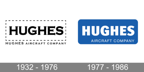
The aircraft manufacturing company chose to have a rather simple, yet timeless emblem. It features “Hughes” printed in black using a serif font called Calverton Regular. Instead of a solid frame, the designers added a stitch line, creating a rectangular shape. Right underneath, there was a line of the same length that clarified what the company was doing. It said “Hughes Aircraft Company” in small, all uppercase letters using the same font as the one for the name. This minimalistic logo reflects the fact that the company focuses on precision and perfection.
1977 – 1986
In 1977, the company went for a more colorful emblem, replacing black with blue. The latter has always been associated with reliability, stability, and trustworthiness, which are sought-after qualities when you deal with aircraft. Moreover, this color is associated with the sky – a perfect match for an aerospace manufacturer. The designers changed the font for a bolder, sans-serif option and printed it in white on a blue rectangular background with rounded corners. The new font looked more like Fira Sans Black but with the diagonal cut in the “E” being done in the opposite direction, flaring towards the center. Instead of adding a tagline outside the frame, they printed “Aircraft Company” in a smaller, finer font of the same color at the bottom, aligning the line to the right. The update reflected that the company does not stand still and is constantly working on improvement and new developments.


