Leatherman is a brand of knives and tools manufacturing company, established in 1983 in the United States. The company is known for its multifunctional products, which are very popular all over the globe.
Meaning and history
Leatherman Tool Group, or simply Leatherman, is one of the world’s leaders in the production and distribution of multifunctional tools for home improvement and gardening.
The brand was created by Tim Leatherman, who has been having the idea of creating a universal multifunctional knife since the middle of the 1970s when he was having a road trip with his family. Tim has been keeping his dream for more than six years, and finally opened the Leatherman company in 1983. The first Leatherman store was opened in Oregon only in 2007, but by that time the name of the brand has already been known all over the world.
What is Leatherman?
Leatherman is the name of an American manufacturer of knives, saws, and multitools, which was established at the beginning of the 1980s, and named after its founder, Tim Leatherman. Today the products of the brand are sold all over the globe.
Before 2019


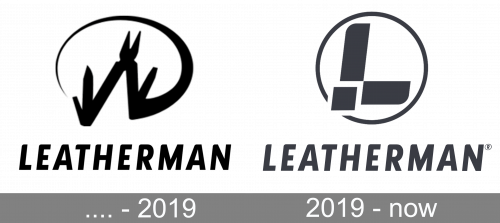
The original Leatherman logo could be seen in two color options: solid black on white, or yellow on white, and even though both versions used the same elements, they looked completely different. The logo was composed of a graphical emblem with the stylized image of the pliers, inscribed into an open oval frame, drawn in a thick smooth line, and a bold uppercase lettering in a modern sans-serif typeface with the slightly narrowed and italicized glyphs looking cool and progressive.
2019 – Today
The Leatherman visual identity is remarkable and elegant. Composed of a wordmark with an emblem on its left, the Leatherman logo looks good on any placement and is perfectly balanced.
The Leatherman wordmark in all the capital letters is executed in a bold italicized sans-serif typeface with confident and sleek lines and all the left corners of the letters rounded, which adds movement and dynamics to the lettering.
The Leatherman emblem depicts a professional tool image enclosed in a circular frame. The symbol has been with the brand for the most part of its history, yet it was refined and modernized in 2019.
The thick distinct lines of the brand’s icon are placed inside a thin circle frame, which looks light and sophisticated, adding freshness to the whole logo. The silhouette of the tool repeats the contour of the letter “L”.
The monochrome palette of the Leatherman logo is timeless and strong. It shows the professional brand which values design and quality.
Font and color
The bold and elegant uppercase lettering from the Leatherman primary badge is set in a sleek and modern sans-serif typeface with softened angles and thick lines of the characters. The closest fonts to the one, used in this insignia, are, probably, Lisboa Sans Heavy Italic and Auto Pro Black Italic Small Caps, but with the contours slightly softened and modified.
As for the color palette of the Leatherman visual identity, it is composed of a dark and rich shade of gray, used in a combination with white background. The color looks very brutal and professional, evoking a sense of confidence and excellence.


