

![]() HoYoverse Logo PNG
HoYoverse Logo PNG
HoYoverse is a virtual world, created by the Chinese studio miHoYo, which was founded in 2012 but became world famous with the release of the online RPG Genshin Impact in 2020. The HoYoverse was launched in 2022, catching the attention of the whole world.
Meaning and history
Chinese studio miHoYo, which became world-famous thanks to the release of the RPG Genshin Impact, announced the creation of its own meta world. Following the example of Facebook, the company renamed itself HoYoverse and in February 2022 presented a virtual world of the same name, uniting all its products.
HoYoverse is intended to become not just a brand, but a new virtual meta-world for the studio’s projects. The authors of Genshin Impact plan to create a vast and content-filled virtual world with games, anime, and other entertainment. And players are promised a high level of freedom and immersion.
In addition to Genshin Impact, miHoYo currently has Honkai Impact 3rd, Honkai: Star Rail, and Tears of Themis, the live wallpaper app N0va, virtual actress Lumi, and a number of anime, manga, and music tracks.
What is HoYoverse?
HoYoverse is the name of a single virtual world for all miHoYo brands, created by the authors of Genshin Impact in 2022. Its mission is to produce more content and create a single virtual world that will unite the company’s products.
In terms of visual identity, HoYoverse is extremely stylish and futuristic. The badge is very simple in its idea and composition, but all the elements are drawn with extreme elegance and confidence, and the color palette of the badge perfectly reflects the innovative approach and essence of the platform.
2022 – Today
![]()
The HoYoverse logo, designed in 2022 by the official launch of the project, is composed of a stylized uppercase lettering, set in solid black characters against a white background, and a three-dimensional geometric element, replacing the first “O” in the wordmark.
The inscription is set in a custom sans-serif font with some parts of the lines cut out, which creates a very futuristic look, even though the contours of the characters are very sleek and sophisticated. The medium-weight inscription has its elements placed pretty far from each other, which makes it look harmonious.
As for the only graphical element of the badge, the “O”, it is drawn as a voluminous ring in blue and pinkish gradients, with some light accents on the glossy surface. The element adds a pleasant bright accent to the logo and perfectly represents the purpose of the new virtual universe.
Font and color
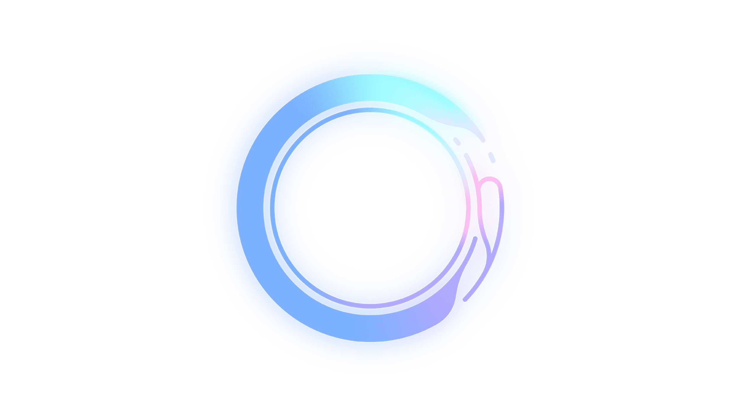
The unique custom lettering from the primary badge of HoYoverse is set in a very sophisticated yet progressive typeface with the smooth contours of the uppercase characters and pointed ends of the lines. the closest fonts to the one, used in this insignia, are, probably, Researched Regular, Sean Henrich ATF Bold, or Exmachino Semi Bold, but with significant modifications of the contours.
As for the color palette of the HoYoverse visual identity, it is based on a traditional black-and-white combination (which can be used in two ways, with the black used for the lettering, or the background), supported by a light and shiny gradient blue-purple-pink scheme for the three-dimensional ring. Blue is the prevailing shade of the emblem, and it is usually used by tech-connected and IT companies, symbolizing reliability, innovations, and professionalism.


