Turkcell is among Turkey’s largest mobile phone operators. The company is headquartered in Istanbul. TVF Bilgi Teknolojileri İletişim is the largest shareholder (26.2%), while IMTIS Holdings has a 19.80% stake. 53,95% of shares are publicly traded.
Meaning and history
Despite multiple updates, the Turkcell logo has been always based on the same anthropomorphized character. The current version is playful and cute without being cartoonish. It leaves room for imagination.
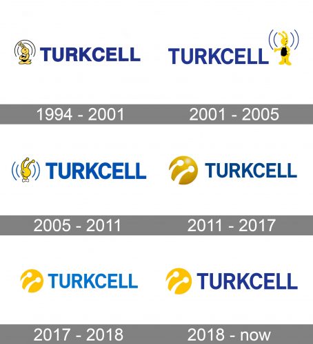
1994 – 2001
The original logo was probably the most detailed one. Its highlight was a cartoonish yellow bug or wasp. The character had long, prominent antennae with yellow points at the ends. It symbolized man-made antennae used in telecommunications for receiving the signal. To make the symbolism more apparent, designers drew a stylized signal above the creature’s head.
The character was smiling. Its body was black, and it was wearing something that looked like a white bow tie. The bow tie was probably used to convey “service.” The addition of black made the palette aggressive. As there was a lot of blue in the logo and the creature was looking unmistakably friendly, the “aggressive” was diluted to “eye-catching.”
2001 – 2005
The creature stood up and moved to the right of the wordmark. This time, its facial expression was different, although it remained friendly. The insect seemed to be explaining something and supported the explanation with a gesture of one of its upper paws.
The signal was still there, but it was more minimalist and more refined. It also became dark blue, which softened the overall impression.
What is Turkcell
One of the most popular mobile phone operators in Turkey, Turkcell was founded in 1994 by Mehmet Emin Karamehmet and Murat Vargı. The number of subscribers is well over 70 million.
The wordmark became a tad lighter. The shape of the “R” was simplified.
2005 – 2011
Only the insect’s head was left. This move helped to make the design more emotional – now all the attention of the viewer was drawn to the smiling muzzle. The creature retained its antennae and the bow tie.
The heights of the emblem and the wordmark became closer, although the emblem remained slightly higher.
2011 – 2017
Starting from 2011, the Turkcell logo adopted a sleek, minimalist, and modern look. The bug was simplified to such an extent that it lost almost all its body and even the head. Only parts of the antennae were left. This was the part that bore the core of the symbolical meaning of the whole logo, which is the link between an insect’s antennae and an aerial. So, this move seems fully justified.
The antennae were white. They were placed inside a 3D yellow circle with a gradient.
2017 – 2018
The circle lost the gradient and highlights and now looked flat. It became smaller, too.
The wordmark went lighter. Its color became closer to sky blue, although it was somewhat muted.
2018 – present
The company returned to the dark blue wordmark. The emblem was slightly tweaked, but it’s difficult to notice the alterations unless you compare the two versions side-by-side. For instance, you can see that the lower left-hand border of the circle was slightly rounded. In other words, designers put a couple of finishing touches to the logo.
Also, the emblem was slightly larger than in the previous logo, thus stealing some of the attention from the wordmark.
Colors and font
The blue color in the 2018 logo seems more saturated than in older versions. It now has the mysterious hue of the night sky. As a result, the design looks more vivid as this color creates a jazzy combination with the yellow of the emblem.
The Turkcell logo features a minimalist and highly legible sans serif font.


