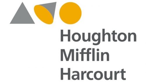
 Houghton Mifflin Harcourt Logo PNG
Houghton Mifflin Harcourt is an American publishing company, which was established in 1932 and named after its founder. The publishing house is headquartered in Boston and specializes in tech and educational books, as well as non-fiction for all ages.
Meaning and history
 The Houghton Mifflin Harcourt is an educational and learning company, and its visual identity, designed in 2012, is a perfect representation of the company’s philosophy — inspire curiosity.
1880 – 2007

The very first logo of Houghton Mifflin Harcourt featured a fine and sophisticated combination of an emblem and a logotype executed in a blue and white color palette. The emblem boasted an image of a dolphin with a silhouette of a human playing kazoo. As for the lettering, it was set in the uppercase and used an elegant serif typeface.
2007 – 2012

The redesign of 2007 enlarged the emblem of the brand, drawing it in thicker lines. The logotype was now set in three levels on its right, and its typeface remained almost the same as the one from the previous logo, just got bolder. The color palette was also elevated, the company started using a darker shade of blue.
2012 – Today
The three levels of the wordmark are complemented by an emblem on the top of the logo. The nameplate in a traditional sans-serif typeface looks modest and simple, yet evokes a sense of professionalism and authority.
The most interesting element of the logo is the emblem. It is composed of three geometric figures, placed in one line. A triangle, a cone, and a circle. The brand wants to say, that if you look at one thing from the different angles you see a lot of new and curious details.
The “evolution” of the triangle is executed in two colors — gray and dark yellow. This color palette symbolizes creativity, imagination, and reliability.
The Houghton Mifflin Harcourt logo is one of a kind and is a perfect example of a “clever” logo, which is also elegant and contemporary. The modest spaces and color palette of the publishing house’s visual identity adds sophistication and confidence to the brand.


