 Action Against Hunger Logo PNG
Action Against Hunger is a French foundation that was established in 1979 and today operates internationally in order to help people get access to safe drinking water and food.
Meaning and history
Action Against Hunger is a non-profit organization, which helps people in 52 countries worldwide to feed their children. The organization has its headquarters in seven countries on different continents, and more than 7 thousand staff working around the globe and helping more than 10 million people.
Action Against Hunger works in such directions as Nutrition and Health, Water provision, Sanitation, and Hygiene, Food Security, and Livelihoods.
What is Action Against Hunger?
Action Against Hunger is a global humanitarian organization that fights world hunger. It helps malnourished children and provides communities with access to drinking water. The organization was established in 1979 and today operates in more than 50 countries across the globe.
1979 – 2016
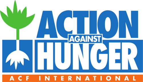
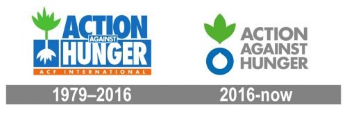
The very first logo for the Action Against Hunger foundation was introduced in 1979 and featured a bold bright rectangular badge, horizontally divided into two equal parts — white and blue. The lettering was executed in a bold sans-serif typeface with the “Action@ in blue set on a white background, “Hunger” in white on a blue background, and “Against” in small letters, written over a blue rectangular badge in a white outline, in the middle of the logo. The left part of the insignia featured a green and white abstract image of a plant, a symbol of life, health, and progress. The whole badge was underlined by an orange banner with a white “ACF International” lettering on it.
2016 – Today
The Action Against Hunger visual identity is bright eye-catching and meaningful. It is composed of a wordmark with an emblem on its left.
The classic gray of the all caps lettering features a strict and straight sans-serif typeface with square-cut tops of the letters. Gray shows the stability and reliability of the foundation, evoking a sense of trust.
The green and blue emblem of the organization depicts a fruit, where the leaves are aspartame’s from the body, and the blue circle has a white drop of water on it. The emblem is a symbol of both water and food, and its calm yet strong colors represent the energy of nature and its power.
The Action Against Hunger logo is strong and laconic. It shows the main beliefs of the institute and its professional and confident approach to what it does in order to provide people in need with all the necessary products.
Font and color
The light-gray bold uppercase lettering from the official logo of the Action Against Hunger non-profit organization is set in a modern geometric sans-serif typeface, which is pretty close to such popular fonts as Futura Maxi Pro Bold or Klein Text Extrabold.
As for the color palette of the Action Against Hunger visual identity, it is set in green, blue, and white for the emblem, and light gray for the lettering. The colors of the emblem stand for life and growth. Green is also a shade, associated with well-being, while blue is a symbol of responsibility and confidence. Gray here only elevated the meanings of the shades in the emblem, adding a professional and serious touch to them.


