Just Eat is the name of a British food-delivery company, which was established in 2001 in London, and today expanded to an international chain, with its subsidiaries across the globe, including European, North American, and Asian countries. The yearly revenue of the company is about 800 million GBP.
Meaning and history
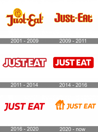
Just Eat is a relatively young company, but has already had several major redesigns of its visual identity, in order to make their brand more recognizable and memorable. The company has been trying to find its unique style and signature and used red color as the main for almost twenty years until the last rebranding of 2020.
2001 – 2009

The earliest Just Eat logo was their wordmark, written in red letters with yellow contours. The font was a sort of cursive, artistic sans-serif (the forms here are unusual and seem hand-made). There was also a small emblem above the first word – a yellow circle with a round, red face with a chef’s hat on.
2009 – 2011
The original Just Eat logo was introduced in 1001 and featured a bold bright wordmark, executed in a custom sans-serif typeface with soft lines, rounded angles, and straight cuts of the letters’ ends. The inscription was written in red color with a wide yellow outline, which created a sense of passion and happiness. This was the only version where two parts of the brand’s name were separated by the “-“ sign.
2011 – 2014
The redesign of 2011 brought a sleeker and a more modern look to the company’s logo. It was a white inscription in a bold red outline. First of all, in this version, all letters were capitalized, which created a completely different image. Secondly, the typeface was switched to a cleaner and stronger one, which made the whole logo look more professional and authentic. The renewed color palette represented the service provider at its best, showing its power, confidence, and dedication.
The main detail of the new logo was a “mouse” arrow drawn in red and replacing the triangle of the letter “A”.
2014 – 2016
In 2014 the whole capitalized lettering was placed on a red horizontal rectangle with its angles rounded. The image with an arrow became more distinct and solid, showing the progress and growth of the company and its ability to change with the world and clients’ needs.
2016 – 2020
The redesign of 2016 simplified the Just Eat visual identity to just a red wordmark placed on a white background. The arrow image was removed from the logo, and the italicized smooth inscription became the only element.
2020 – Today
In 2020 Just Eat merged with Takeaway Com service and the logo is being changed in order to reflect the merger. The wordmark remains the same but changed its color to orange, and the emblem appears on the left part of the logo.
The graphical part of the visual identity depicts a solid orange silhouette of a house with a vertically oriented fork and knife, drawn on it in white.
Font and color
The modern and bold typeface of the Just Eat wordmark is a modified version of one of the following fonts: Jano Round Bold Italic, Caldina Bold Italic, or Amfibia Bold Expanded Italic, but with the contour of the letter “J” customized.
The orange and white color palette of the current logo represents love, attention, and caress. It shows the warmth and friendliness of the service, which provides people across the globe with high-class dinners or affordable snacks right at where and when they want it.


