A successful home improvement retailer, The Home Depot offers a diverse range of tools, construction products, and services. It was established in 1978. The retailer has stores in all the 50 states in the US and all the 10 provinces of Canada. THD is based in Cobb County, Georgia, while its most famous store is located in Vauxhall, New Jersey.
Meaning and history
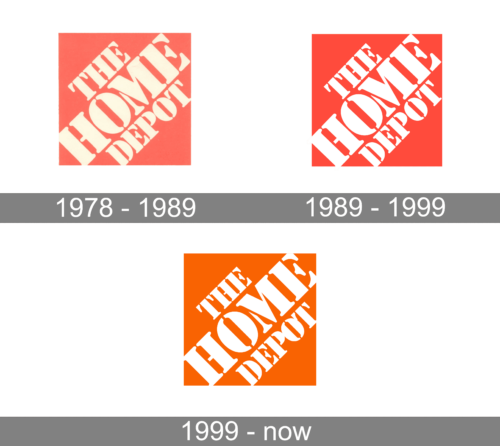
The Home Depot logo has stayed unaltered for over three decades. In 2013 the home improvement retailer was rumored to have refreshed its logo, but this information turned out to be just a successful April Fool’s joke.
1978 – 1989
The first Home Depot logo, designed in 1978, featured a muted-red square with heavy diagonally-placed three-leveled lettering in a bold geometric serif font with thick bars and massive elongated serifs on their ends. The inscription was set in a light cream shade.
1989 – 1999
The redesign of 1989 has switched the color palette of The Home Depot logo to a brighter one, with the red background of the square and white characters, making up a strong contrast of the two shades, and creating a strong and memorable composition.
1999 – Today
Another redesign, held by the company in 1999, has adopted a new color scheme for The Home Depot badge, keeping the style and typeface untouched. This time it was only the background color that was changed, and in the new version, the square of the logo became intense orange.
Symbol
The retailer is often criticized for its generic logo, yet we can’t but acknowledge that the company’s emblem is instantly recognizable. We can safely state that it’s one of the most well-known emblems in retail. This is partly due to the inscription and partly due to the characteristic orange color.
Emblem
The Home Depot emblem is rather minimalistic and has a DIY feel, which goes with the company’s core values pretty well. A stenciled wording (negative) is placed over the orange background. There is nothing else apart from the company’s name and the registered trademark symbol.
Colors
Bernie Marcus, one of the company’s founders, told that the first THD signs were painted on bright orange circus-tent canvas. So that is the reason why the retailer ended up with PMS 165. There are psychological reasons for this choice, too, as, according to THD, orange can boost a person’s activity and it is also associated with affordability.
Font
The logo features a stenciled typeface angled at 45 degrees. Interestingly enough, the font is actually called Stencil. Unlike many other companies, THD didn’t commission a customized font but used one of those that are bundled in Microsoft Office.


