HIT Entertainment Ltd. is a British-American entertainment company. It has three locations, including London, New York City, and Los Angeles. Its parent company is Mattel Television, which, in its turn, is part of Mattel.
Meaning and history
HIT Entertainment was established by Mattel Television in 1982 under the name Henson International Television. Throughout its history the company has been working in both American and British markets, having offices in London and New York.
The most famous programs, released by the HIT Entertainment company from 1982 to 2016 were Barney and Friends, Pingu, Bob the Builder, and many others, loved by little kids from all over the globe.
What is Hit Entertainment?
Hit Entertainment is the name of an international entertainment company, which was established in 1982 and ceased all operations in 2016. The British-American company had focused mainly on programming for kids and teenagers, having its series and films broadcast worldwide.
1983 – 1989 (Henson International Television)
The company was established in 1982 as Henson International Television.
The original logo showcased the word “hit!” in lowercase letters. The letters belong to a classic serif type. Below, there is the full name of the company in a more modern sans. Above and below it, there is a horizontal line. The logo made a debut in The Muppet Show in 1983.
1989 – 1996 (HIT Communications PLC)
The logo was redrawn to reflect the new name.
The design is dominated by the word “HiT” in a minimalist sans. The lowercase “i” has been moved under the cap of the “T,” which adds a unique touch. Below the right part of the cap, there is the lettering “Communications PLC” oriented vertically.
1994? – 1995 (HIT Entertainment PLC)
This version could be seen on international prints of Season 1 Reboot. The word “HiT” looks lighter. The lettering “Communications PLC” was gone, as was the dot above the “i.”
1994 – 1996
The weight of the font in this version was the same as in the one described above (1994?–1995). The difference is the addition of the lettering “Entertainment PLC” – it is now placed instead of the words “Communications PLC.”
The centerpiece of the design is the dot above the “i,” which is in fact not a dot but an oval. The two perpendicular lines add a “cinematic” feel.
In addition to the black-and-white version, this logo was also available in full color. Here, “Hit” was gray, while all the other elements were blue.
1996 – 2001
The word “HiT” put on some weight. It is now of grayish shade of blue. The dot above the “I” has been replaced by the planet Earth, which is at the forefront. This is the most prominent modification as it reflects the company’s global ambitions.
The words “Entertainment PLC” are black and also look bolder.
When the Bob the Builder pilot was released in 1997, it showcased a very bright blue logo with a larger Earth. This version wasn’t used commercially, though.
2000 – 2008
The most obvious innovation in this HIT Entertainment logo is the shade of blue, which is solid and looks much darker than on the 1996 logo.
The earth has grown smaller, while the white ring above it is thicker. This version could be last seen on some Thomas and Friends DVDs from 2Entertain from 2008.
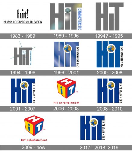
2001 – 2007, 2008 – 2010, 2017 – 2018, 2019 (HIT Entertainment)
The new emblem was unveiled on HIT Consumer Products. Here, the blue becomes darker and more saturated. The earth has grown smaller and brighter, too. The lettering “PLC” disappeared, which made the rest better legible.
While the company typically uses a different logo, this one can still be sometimes seen.
December 2006 – 2008, 2009 – present
This is a totally new design dominated by a 3D cube. On its sides, you can see the letters “H,” “i,” and “T.” The full name of the company in smaller red letters can be seen below.
This version first officially appeared on DVDs in early 2007.
Font
The friendly type with rounded corners looks perfectly appropriate in the logo of the entertainment company. The same shapes are used in both the cube and the writing below.
Colors
The “cube” version of the HIT Entertainment logo is very bright. This is partly due to the vivid shade of red, and partly due to the addition of saturated shades of blue and yellow.


