Hero is an Indian brand of motorcycles manufacturing company, which is a part of Honda Group. The label was named one of the most respected in the world and is highly recognizable across the globe.
Meaning and history
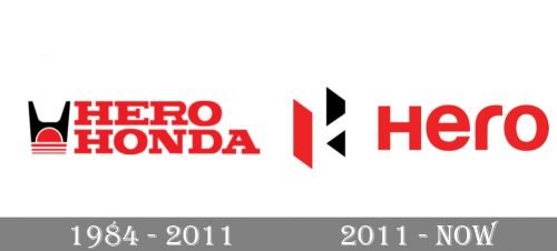
One of the most famous motorbikes manufacturers has a short and modest visual identity history. Its logo was redesigned just once after it was created, keeping the signature brand’s colors.
1984 – 2011
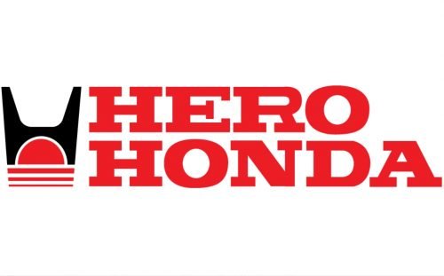
The first Hero logo was designed in 1984 when the company’s name was Hero Honda. The logo was composed of a wordmark built on two floors and an emblem on its left.
The wordmark in all capital letters features a classic serif typeface with thick confident lines, which looked massive and powerful in a bright red brand’s color.
The Hero Honda emblem comprised a Honda’s stylized “H” symbol, sitting on the red sun with three parallel horizontal lines underneath it.
The original Hero Honda logo was bright and strong. The color palette was a reflection of the company’s power and influence, while the lettering showed the brand as passionate and progressive.
But in 2011 Honda decided to leave the brand and the need for the new corporate identity occurred.
2011 – Today
The Hero logo redesign of 2011 was made by a famous design bureau Wolff Olins. The agency created a new contemporary and stylish look for the brand.
The new Hero logo is composed of a wordmark and an emblem, located above it.
The wordmark features lowercase lettering with the first “H” capital, but equal to other letters in its size. The sans-serif typeface of the nameplate is clear and neat and similar to Harabara font.
The bold smooth lines with a rounded “r” make the nameplate sleek and modern.
The new Hero emblem is geometrical and sharp. It is composed of the letter “H”, which is turned on one third and looks three-dimensional due to the use of three colors — red, white and black. Executed in a Closure-technique, it is a great graphical symbol, whose sharp angles make the logo look more energetic and dynamic.
The classic color combination was taken by the brand from its original visual identity design, the dot was the right choice, as the red-black-white color palette is the strongest possible tricolor, which shows the confidence, progress, and strength.
The Hero logo is a celebration of the brand’s progress and innovative approach. It is a great symbol of a powerful company with a bright future and values of its heritage.


