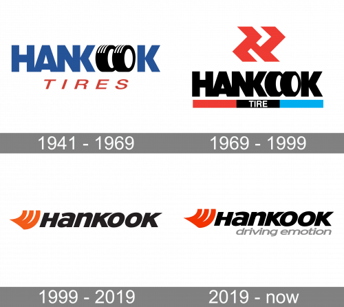
While the Hankook logo has gone through a complete overhaul more than once during the company’s 80-year history, most of the versions have alluded to the company’s core product, the tires, in one form or another.
Meaning and history

The Hankook Tire & Technology group is headquartered in Seoul, South Korea. It is among the ten largest tire companies in the world.
Hankook Tire was founded in 1941 under the name of the Chosun Tire Company. In 1968, the name was changed to Hankook Tire Manufacturing, “Hankook” literally meaning “Korea.”
What is Hankook?
Hankook is the name of a South Korean automobile tire manufacturer, which was established in 1941, and by today has grown into the world’s seventh largest company in this segment. Hankook is headquartered in Bundang-gu and operates all over the globe.
1941 – 1969
The very first logo for the Hankook Tires company was designed in 1941 and stayed with the brand for almost thirty years. It was a confident and bright badge with simple clean shapes and literate graphical elements. The main hero of the badge was the heavy uppercase logotype in blue, executed in a geometric sans-serif font withboth “O”s replaced by two black tires. Another interesting detail about the inscription is its merged letters “N” and “K”, which shared one vertical bar. The blue and black part was underlined by a slanted uppercase “Tires” wordmark in red.
1969 – 1999
In some of the older logos, the double “o” was replaced by a pair of tires placed next to one another. Another distinctive feature was that the right vertical line of the “N” and the vertical line of the “K” overlapped, so the two characters formed a single glyph. This logo existed in several colors.
Also, you can come across a Hankook logo featuring zigzag tire tracks. In this logo, the wordmark can be given in two ways: either with a single “NK” glyph or with two separate characters, the “N” and “K.”
1999 – 2019
The centerpiece of the logo is the word “Hankook” in an italicized all-caps sans serif type. To the left, there is an orange symbol representing stylized tire tracks.
While the emblem and the wordmark can be used without any additions, the version with the “driving emotion” tagline is also popular. The tagline is given in light grey.
2019 – Today

In 2019, the previous logo was slightly updated. Beneath it, there was the new motto – ‘driving emotion’ – written in grey lowercase letters. Aside from that, the orange emblem also took on a brighter look, and that’s it.
Font and color
The heavy mix-case lettering from the primary badge of the Hankook Tires manufacturer is set in a slanted modern sans-serif font with thick bars and straight cuts of the lines. The closest fonts to the one, used in this insignia, are, probably, EconoSans Pro 94 Black Expanded Italic, or Neue Plak Extra Black Italic, but with some slight modifications of the contours.
As for the color palette of the Hankook visual identity, it is based on a traditional and strong combination of red, black, and gray, which stands for professionalism, quality, confidence, and reliability of the brand’s products.


