Jysk is the name of a Danish company, which was established at the end of the 1970s, and is engaged in the production and distribution of furniture and household goods, including textiles, decoration, and small accessories.
Meaning and history
Jysk is a Danish multinational company that belongs to the supplier of furniture for the Danish royal family. The main activity is the production of furniture, mattresses and textiles, fittings, accessories, and home goods. The company was founded in 1979 in the city of Aarhus, where the headquarters are still located. There was opened the first store, where the products were sold. This store is still in operation today.
Larsen then opened several successful Jysk Sengetøjslager stores (as they were called until 2001) all over Denmark, and in 1984 began to develop the chain outside the country, in Germany. Today Jysk has more than 2,900 locations worldwide, with almost 25 thousand employees.
The name of the company, “Jysk”, can be translated from Danish as“modesty, diligence and honesty”, the three qualities that the founder of the brand, Lars Larsen has always been associated with. JYSK is the epitome of reliability and faithfulness to one’s word. And this meaning finds a reflection in every product, offered by the company.
What is Jysk?
Jysk is a European company manufacturer of furniture and small household goods. The company, founded in 1979, is considered to be the main IKEA competitor, with around 3000 locations across 50 countries worldwide.
1979 — 2001
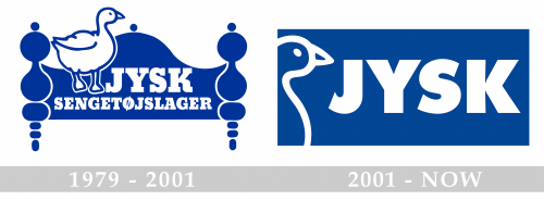
The very first Jysk logo was created in 1979 and stayed with the company for more than twenty years. It was a blue and white logo with the goose, an image drawn in the upper left part of the banner, executed in the shape of a bedhead. The solid blue banner was complemented by bold white lettering in a heavy serif typeface, supporting the color and size of the white goose in a blue outline.
2001 — Today
The redesign of 2001 has modified and strengthened the Jysk badge, keeping the main elements, such as the goose and the color palette unchanged. The banner now features a clean horizontally oriented rectangular shape, with a solid blue background, a minimalistic white goose contour on the left, and a bold white sand-serif lettering. The clean lines and strong color contrast make the Jysk badge look very professional and stylish, at the same time showing the company’s connection to its history and the value of its roots.
Font and color
The bold and stable uppercase lettering from the official Jysk badge is set in a strong geometric sans-serif typeface, which looks pretty similar to Futura Futuris Black or Futura TS Heavy. The modern and perfectly balanced shapes of the glyphs in this inscription add progressiveness and excellence to the qualities of the brand.
As for the color palette of the Jysk visual identity, since the very first years of the company, it has been based on a combination of blue and white, which stands for reliability and trustworthiness, and shows the company as a strong player in the international market.


