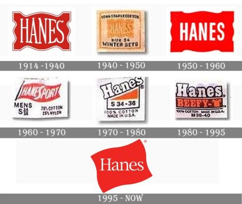
The logo of the clothing brand Hanes has gone through numerous modifications throughout its more than 120-year history.
Meaning and history
Hanes is the last name of brothers who in 1900 founded two knitting factories, Shamrock Mills Co. and P.H. Hanes, where they began to produce the then progressive men’s underwear, consisting of two items – shorts and a tank top.
In 1910 the Shamrock Mills Co. factory was renamed the Hanes Hosiery Mills Co. and underwear for women was added to the range. By the 1920s the factory was cutting back on men’s knitwear and concentrating on the growing market for ladies’ goods.
The introduction of nylon thread technology enabled Hanes Hosiery to gain market leadership in the 1950s: the company invented seamless knitwear production, which revolutionized fashion.In 1965, the two family-owned companies merged to form Hanes Corporation, and in 1985 the company launched a line for women, Hanes Her Way.
What is Hanes?
Hanes is the name of a well-known American brand offering high-quality lingerie and home wear. The company was established in 1900 and is named after its founder, John Wesley Hanes. Today it is a globally known brand, which sells its products internationally.
1914
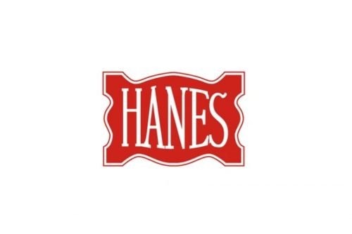
The original Hanes logo on the tag was based on a “flag” with gaps (or waves) along its borders. In the center, there was the word “Hanes.” While the color of the flag and the number of gaps have varied over the years, this theme has been used very often in the brand’s visual identity.
1940s
The flag here is yellow and has a wavy outline. The word “Hanes” looks pretty large. The glyphs are elongated.
1950s
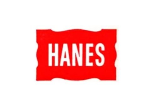
Over the decade, the design has been modified not less than three times. While all the versions were based on a red flag, its look was not the same. For instance, you can come across a rather broad flag with “shallow” waves. There were also versions featuring a higher flag with a smaller word “Hanes.” There was some playing around with the weight of the typeface.
1960s
In addition to the red flag tag, which looked very much like one of the previous versions, the company also used a black flag with the writing in white. Also, during this period, the company introduced a logo where the flag was more realistic and there was even a pole for it. This logo was developed for the HaneSport line.
1970s
For the first time, the black flag with gold trim was used. Also, you could come across a version where the word “Hanes” was written diagonally. Here, it was given in a rather heavy type. Below, there was a red triangle, which appeared to be part of the red flag from the previous versions.
Also, during this decade, the company introduced a blue flag logo. Here, the word “Hanes” was white and looked very similar to the version featuring a black flag with gold trim.
1980s
While the logo used during this period was inspired by the one with the red triangle, the writing “Hanes” was now positioned horizontally. Below, there was the name of the product or range in red and dark blue.
1995
While the updated logo is heavily based on the brand’s visual legacy, it also introduces a new approach, due to which the design looks livelier and more dynamic.
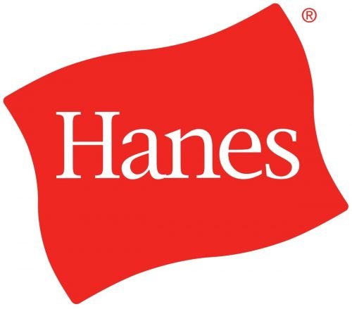
The red flag, which is the centerpiece of the design, was inspired by the flag featured on several old versions of the Hanes logo from the 1950s to 1960s. However, it is the first time that the flag has been rotated diagonally. This move creates a dynamic feel.
The type does not copy that of any of the previous logos – it is a rather light, traditional serif font. Only the initial is capitalized.
Font and Color
The elegant and lightweight title case lettering from the Hanes primary logo is set in a traditional serif typeface, which adds a very tender touch to the bright and intensive color palette of the badge. The closest fonts to the one, used in this insignia, are, probably, Garamond NR 2 SH Book, or Bernstein Serial Light, but with some slight modifications of the contours.
As for the color palette of the Hanes visual identity, it is based on a powerful combination of red and white, where red stands for passion and progressiveness, balancing the nostalgic typeface of the lettering, and white adds a touch of reliability and loyalty to the whole composition.


