

![]() Cartier Logo PNG
Cartier Logo PNG
Cartier is the name of one of the most luxurious jewelry and accessories brands in the world, which was established in 1847 in France by Louis Francois Cartier. Today the company, which became a part of Cue Financiere Richemont Group in 1964, distributes its high-end products all over the globe and is considered to be one of the most reputable and desirable brands ever.
Meaning and history
![]() Cartier is one of the not so many labels, which still uses its original logotype, created in 1847, right after the launch of the brand. Its visual identity concept is all about heritage and legacy, which in this case are synonymous with quality and elegance.
Cartier is one of the not so many labels, which still uses its original logotype, created in 1847, right after the launch of the brand. Its visual identity concept is all about heritage and legacy, which in this case are synonymous with quality and elegance.
The Cartier logotype is usually written in black and placed on a white background, with an oval emblem above it. Sometimes the color palette switches to gold and burgundy, which is a sophisticated and chic combination, brilliantly reflecting the purpose of the brand.
Symbol
The monogram, enclosed in a vertical oval frame, was adopted by the brand as its signifier in 1900. Designed by the brand founder’s grandson, the emblem was first introduced during the World Exhibition, which took part in Paris. Two intertwined letters “C” in a handwritten wishbone-style font, have become iconic and instantly recognizable across the globe.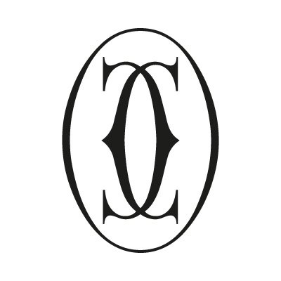
Two “C”s stand for the name of the label, with no hidden meanings, just a simple and very elegant brand’s representative, which is usually drawn in black on a white background, but sometimes can be seen as a gold three-dimensional emblem in gradient shades and with a glossy surface.
Font and color
![]()
The elegant cursive if the Cartier logotype is custom, yet looks pretty similar to Werdet Script Demi Bold, just with the contours of the “C” modified. The first letter of the wordmark looks edgy and stylish due to the distinct cut and serif in its upper parts, which adds sharpness and strength to smooth and delicate lettering.
As for the color palette, the official combination of the label is black-and-white, which is a representation of timeless beauty and elegance, along with the expertise and authority of the brand. There is also a secondary palette, which consists of a burgundy background and white or gold lettering, and in this case, the logo looks fancy and luxurious, as this combination of colors is usually associated with royalty and nobility.


