 Greenville Swamp Rabbits Logo PNG
The Greenville Swamp Rabbits is the name of an ice hockey team whose location is in Greenville, South Carolina. The franchise has been known since 1987 under the names of Johnstown Chiefs, Greenville Road Warriors and since 2015 Greenville Swamp Rabbits.
Meaning and history
The Greenville Swamp Rabbits, an ice hockey team, were founded in 2010, originally known as the Greenville Road Warriors. The rebranding to Greenville Swamp Rabbits occurred in 2015, named after a historic local train nicknamed “The Swamp Rabbit.” Throughout their history, the team has been an affiliate of various National Hockey League (NHL) teams, including the New York Rangers and, more recently, the Florida Panthers.
In terms of achievements, the Swamp Rabbits have made notable strides in the ECHL, a mid-level professional ice hockey league. They have garnered attention for their tenacious playing style and have been a part of several playoff seasons, bringing excitement and competitive spirit to the Bon Secours Wellness Arena, their home ground in Greenville, South Carolina. The team’s impact extends beyond the rink, contributing to the local community through various outreach programs and charitable efforts.
Currently, the Greenville Swamp Rabbits continue to play an important role in the ECHL. They are recognized for their resilience and dedication, contributing significantly to the sports culture in Greenville. The team’s current position reflects a blend of nurturing young talent and aspiring to greater heights in upcoming seasons, all while maintaining a strong connection with their fanbase and community.
What is Greenville Swamp Rabbits?
The Greenville Swamp Rabbits are a professional ice hockey team based in Greenville, South Carolina, competing in the ECHL.
1988 — 1994
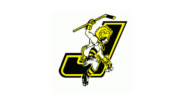
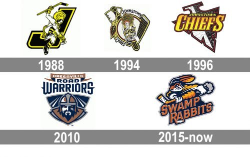
The first logo was created for the club in 1988 when its name was Johnstown Chiefs. It was a black and yellow badge with the image of the Native American man jumping and holding a hockey stick. The image was placed on a background with the enlarged bold letter “J” on it. The letter was executed in solid black and outlined in yellow and black.
1994 — 1997
The redesign of 1994 made the image more detailed and added some dark red accents to the composition. Now the man was placed on a circular background with a double yellow and red outline, and the large “J” was replaced by a hockey stick in black and yellow, with a striped pattern. The upper part of the stick had an ax fixed on it.
1996 — 2010
The logo of Johnstown Chiefs, created in 1996, was more minimalist and modern, than two previous versions. It was a gradient slanted wordmark in two levels, with the “Johnstown” in all capitals, executed in plain yellow letters, set above the “Chiefs” in a fancy serif font with the first and the last uppercase letters enlarged. The bottom line of the wordmark had its letters outlined in dark red. The background of the badge featured stylized elements resembling a stone arrowhead in black, white, and gray, with a dark red and black outline.
2010 — 2015
The redesign of 2010 was made after the name of the team was changed to Greenville Road Warriors. It was a fancy stylish badge with the lettering in three lines placed above the graphical part, executed in a shape of a crest with the warrior’s portrait on it. The image was executed in a copper, dark blue, and silver-gray color palette, which looked powerful and confident. As for the inscription on the logo, it featured two styles: “Greenville” was written in white capitals over a thin copper ribbon, while “Road Warriors” in the uppercase boasted tall bold letters in a custom typeface with sharp elements, in dark blue on a white background. It was classy yet looked very modern and chic. This logo stayed with the club until 2015 when the name of the club got changed again.
2015 — Today
While the name “Road Warriors” was to please the 150 companies of South Carolina related to the automotive industry, the current name of the team arose from the nickname of a local historic railroad ‒ “Swamp Rabbit”. The intention was to make the team’s ties with the Greenville community even stronger.
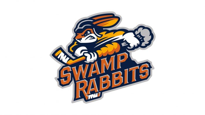
The new name gave birth to a fantastic logo. The current Greenville Swamp Rabbits emblem is an image of a vigorous rabbit, a hockey player. He is holding a bandaged hockey stick and it is evident that he is attacking. The hockey stick looks like a carrot and its leaves are for some reason gray, maybe to produce a stronger effect.
The team name is written in block orange letters with a gray fringing. The lettering is placed against a navy blue background. The letter “R” is stylized to make it look like a hockey stick, also bandaged.
The color scheme is rather diverse. It includes orange, navy blue, silver, gold and white.


