The American Hockey League team Milwaukee Admirals is the affiliate of the NHL’s Nashville Predators. The Milwaukee club has gone through a series of logos throughout its more than 50-year history, each new logo being scarier and scarier.
Meaning and history
The Milwaukee Admirals, a professional ice hockey team, were founded by a group of investors led by Erwin J. Merar in 1970. Initially, the team began as an amateur club, but their journey towards professional status was marked by significant milestones. In their early years, the Admirals played in the United States Hockey League (USHL), where they achieved considerable success. They transitioned to the International Hockey League (IHL) in 1977, marking a significant step up in competition and prestige.
Throughout their history, the Milwaukee Admirals have achieved notable successes, including winning the Calder Cup in the 2003-2004 season. This triumph remains a highlight in the team’s history, showcasing their competitive prowess. Additionally, the Admirals have been a consistent force in their league, often making playoff appearances and providing a platform for players to showcase their skills and advance to the NHL.
In recent times, the Milwaukee Admirals continue to hold a respected position in the American Hockey League (AHL), which they joined in 2001. Their ongoing commitment to excellence is evident in their consistent performance, community engagement, and development of talented players. The team, currently affiliated with the NHL’s Nashville Predators, remains an integral part of Milwaukee’s sports landscape, drawing in fans with their exciting brand of hockey and community involvement.
What is Milwaukee Admirals?
Milwaukee Admirals is a professional ice hockey team competing in the American Hockey League (AHL). Affiliated with the Nashville Predators of the NHL, they have a storied history, including a Calder Cup victory, and continue to be a significant part of Milwaukee’s sports culture.
1971 — 1973

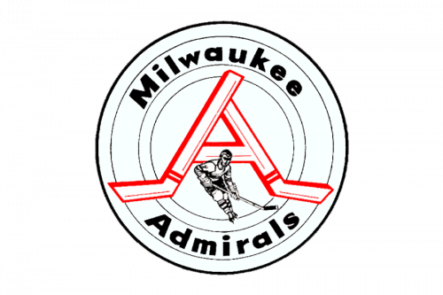
There was an original ’71 emblem that depicted a white circle with some black scattered inside. The centerpiece was a red letter ‘A’ made from two hockey sticks. Right in front of them, they’ve out a tiny hockey player. The team’s name was written in black sans-serif letters along the edges of the circle.
1973 — 1977

The next design used the same hockey player image as the previous emblem. This time, the man was blue and put inside a more rectangular shape with blue-white-red background. The name was also written along the edges in this logo, on a big white outline around the center. They used red and blue for these words, and they were separated by two stars on the sides.
1977 — 1981

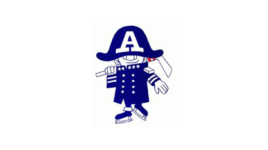
The original Milwaukee Admirals logo, which was introduced in advance of the 1977/78 season, featured quite a friendly and fun guy in a military uniform and with his hat over his eyes. The guy was holding a hockey stick.
1982 — 1997

The character probably lacked the competitive spirit required for a sports logo as it was soon replaced by a determined and aggressive “admiral” with a prominent nose and chin. He was wearing a saber.
1997 — 2001

In 1997, a logo with only the admiral’s head and the name of the team was adopted, which was replaced by a skeleton’s head logo in 2006. The current Milwaukee Admirals logo is a new, more professional take on the skeleton theme.
2001 — 2006

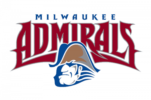
In 2001 the Admirals logo was slightly refined, making the contours of all elements cleaner and neater. The graphical part of the emblem became a bit smaller, which created a better balance between the admiral’s head and the burgundy wordmark.
2006 — 2015

In 2006 the Milwaukee Admiral’s visual identity was completely redrawn. The admiral’s head was replaced by the skull in a black and blue head with the white anchor on it. As for the inscription, it was also redrawn in a custom narrowed typeface with all the letters in the same size and a new color palette — black with a light blue stripe coming through the middle of the wordmark.
2015 — Today

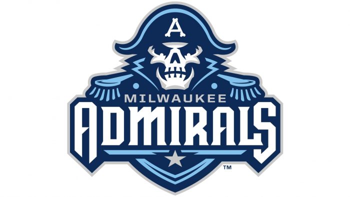
The redesign of 2015 introduced the new Admirals emblem and it is something in between the version created in 2001 and the one from 2006. The new insignia of the sports club features a blue and white color palette, a fancy custom inscription, and an image of the admiral with the skull replacing his face. The logo looks professional and aggressive, brilliantly reflecting the spirit of the team.


