The ice hockey team the Tulsa Oilers was formed in 1992 and since then the place of their location has been Tulsa, Oklahoma. They are often referred to as the “Ice Oilers” as there used to be a baseball team with the same name and the nickname helped avoid confusion.
Meaning and history
The Tulsa Oilers, a professional ice hockey team, were founded by Paul and Ray Miron in 1928. This team, initially part of the American Hockey Association, has a rich history marked by numerous achievements and transformations. One of their most notable early successes came in the 1941–1942 season when they won the AHA championship. Over the years, the Oilers have been affiliated with various leagues, including the Central Hockey League (CHL) and the ECHL, showcasing a resilient and adaptable spirit in the ever-changing landscape of minor league hockey.
Their journey through different leagues has been marked by significant milestones. For instance, during their time in the CHL, the Oilers clinched the Adams Cup in 1993, a notable achievement highlighting their competitive prowess. Another peak in their history was the 2015-2016 season in the ECHL, where they reached the playoffs, demonstrating their continued relevance and competitive spirit in modern hockey.
Currently, the Tulsa Oilers are part of the ECHL and maintain their presence as a competitive team in the league. They play their home games at the BOK Center in Tulsa, Oklahoma, and continue to foster a strong fan base. The team’s ongoing participation in the ECHL not only exemplifies their enduring legacy in ice hockey but also represents their commitment to providing thrilling sports entertainment to their supporters. The Tulsa Oilers remain a significant entity in the world of minor league hockey, continuing to build upon their storied history with each passing season.
What is Tulsa Oilers?
The Tulsa Oilers, a professional ice hockey team in the ECHL, have a storied legacy dating back to 1928. Known for their competitive spirit and historical achievements, they continue to be a prominent team in minor league hockey.
1992 — 1994

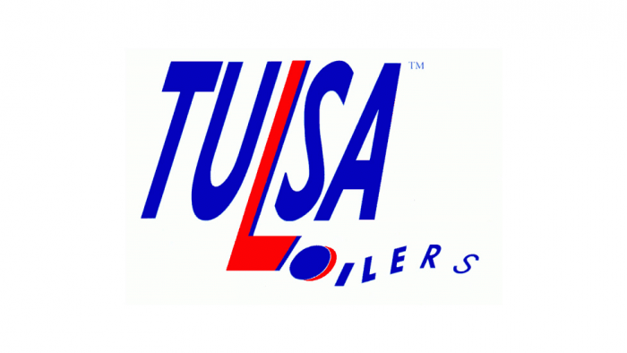
The first team identity was registered in 1992. It is a wordmark in slant font consisting of the team’s name with a hockey stick instead of the letter “L” and a hockey puck instead of the letter “O” positioned next to the stick. The color scheme includes blue and red.
1994 — 1997
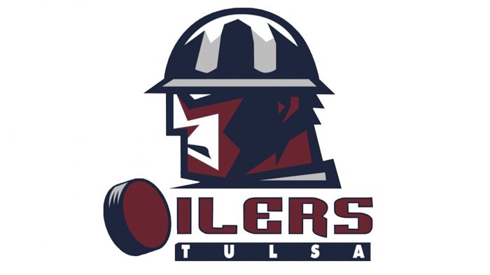
The logo consisting of a stylized profile of an oil worker’s head wearing a hard hat appeared in 1994. The letter “O” in the word “OILERS” is again represented in the form of a hockey puck.
1997 — 2004
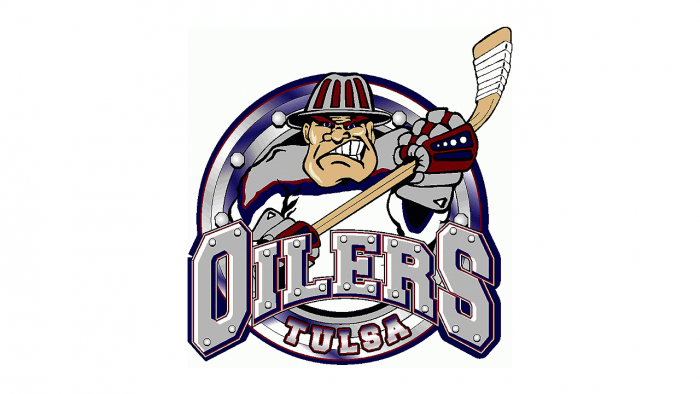
The next Tulsa Oilers logo was intentionally made to look like a caricature. An intense-looking hockey player with a hockey stick in his hands is coming out of an oil pipe.
2004 — 2013
The 2004 logo is just a stylized wordmark “Tulsa Oilers” in blue trimmed in red and white. The dot above the letter “I” is depicted like a drop in red color.
2013 — Today
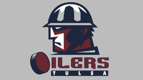
In 2013 the Oilers actually switched to the 1994 version but recolored it using maroon, navy blue, silver and white.


