Great Wolf Lodge is an American brand of family hotels. The famous resort company was established in 1997 and became famous due to its water parks and numerous other activities for the whole family.
Meaning and history
Great Wolf Lodge, an illustrious name in the world of family resorts, was founded by brothers Jack and Andrew Waterman in 1997. This venture marked the onset of an innovative concept in the hospitality sector, combining a hotel and water park under one roof. The Waterman brothers’ vision was to create a unique family getaway, which was first realized in Wisconsin Dells, Wisconsin, often regarded as the Water Park Capital of the World.
The journey of Great Wolf Lodge is characterized by significant milestones and achievements. The company distinguished itself by focusing on providing a comprehensive, family-friendly experience, which includes themed rooms, interactive activities, and various dining options, all complemented by an indoor water park. This unique blend of amenities rapidly gained popularity, leading to the expansion of Great Wolf Lodge resorts across the United States and Canada. The company’s innovative approach to family entertainment earned it a reputable position in the hospitality industry, making it a go-to destination for family vacations.
In its current position, Great Wolf Lodge continues to thrive as a leader in the family resort sector. It has not only expanded its geographical reach but also continually upgrades its facilities and services. The company’s commitment to providing an engaging, safe, and enjoyable environment for families is evident in its ongoing efforts to enhance the guest experience, from incorporating new water attractions to introducing novel entertainment options. Today, Great Wolf Lodge stands as a testament to the vision of its founders, continuously evolving to meet and exceed the expectations of its guests.
What is Great Wolf Lodge?
Great Wolf Lodge is a renowned chain of family resorts, uniquely integrating an indoor water park with hotel accommodations. This innovative concept offers a variety of themed rooms, dining options, and activities, catering to a memorable family vacation experience.
1997 – 2000

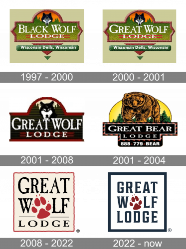
The original logo design was styled as a classic Midwestern signboard with a round extension in the top. Much of it was green to resemble the foliage. This bit had the brand’s wordmark (then – ‘Black Wolf Lodge’) made from white serif letters. The round bit accommodated some tree outlines, as well as big wolf’s head.
Below them, there was also a wood-inspired green plaque with the address – Wisconsin Dells, Wisconsin – conveyed in a bold white writing.
2000 – 2001

In 2000, they somewhat brightened the color scheme and also replaced ‘Black’ in the wordmark with ‘Great’.
2001 – 2008
In 2001, they introduced a plainer, rectangular signboard shape, squeezed it from the sides and also darkened the colors through the logo. The wolf’s head got bigger, and everything below was gotten rid of.
2001 – 2004
The logo is a visually rich emblem for Great Bear Lodge. The central figure is a detailed, formidable bear set against a full moon, invoking the great outdoors and wilderness. Surrounding the bear are pine trees in a forest setting, reinforcing the lodge’s connection with nature and wildlife. Below the imagery, the name “GREAT BEAR LODGE” is boldly presented in a rustic, slab-serif typeface that complements the rugged theme. The color scheme of earthy tones, deep greens, and gold suggests a natural and luxurious environment. The overall composition of the logo is one of wilderness charm and warm hospitality.
2008 – 2022
The Great Wolf Lodge’s visual identity is confident and eye-catching. The hotels’ logo is composed of a square frame with a wordmark and an emblem inside.
The black bold inscription is built in three levels and executed in a decorative typeface, which is Carlson Antique, created by Berne Nadall. The unique style of the lettering is complemented by a bright spot in the middle of it.
The red Great Wolf Lodge emblem is a wolf’s footprint, which replaces the letter “O” in “Wolf”. The color of the image balances the red framing of the logo and makes a great accent.
It is a strong and recognizable visual identity concept, which is instantly associated with the brand and looks strong and modern due to the use of interesting typeface and a bright color combination.
The Great Wolf Resorts’ main company also uses a wolf footprint as its symbol, but its executed in a light blue and has a shape of a water drop, to represent the main group’s activity — water parks.
2022 – Today
The logo represents Great Wolf Lodge, featuring a clean, modern design that centers on the brand name in a bold, block-letter font. The words “GREAT WOLF LODGE” are arranged in a staggered formation, which adds a dynamic quality to the design. The centerpiece of the logo is a stylized paw print in a deep red hue, set in the center of the “O” of “WOLF,” which cleverly integrates an aspect of the wolf theme into the text itself. The use of a navy blue and red color palette conveys trustworthiness and strength, consistent with the strong and noble image of a wolf. The entire logo is framed within a navy blue border, reinforcing the structure and reliability of the brand. This logo’s simplicity and the use of clean lines suggest a family-friendly, approachable, yet confident brand identity.


