Graco is a label of the American company Newell Brands. It was established in 1942 as a producer of baby and kids goods. Today Graco is one of the world’s most famous manufacturers of strollers and car seats.
Meaning and history
The Graco logo is sharp and modern. It is composed of a strict wordmark with a bold and powerful emblem above it. Executed in a blue and black color palette, it looks universal and strong.
1977 – 1985
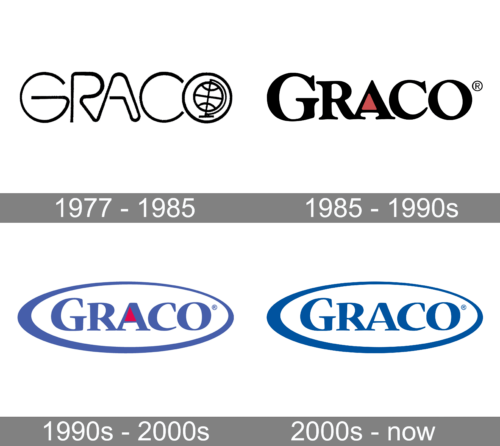
The very first Grace badge was designed in 1977 and featured a cool monochromatic composition with a stylized uppercase inscription in a custom sans-serif font. The negative space of the letter “O” was decorated by an image of a globe, also contoured in black lines of the same thickness as the main characters. This progressive and stylish badge stayed with the brand for eight years.
1985 – 1990s

The initial logo was created for Graco in 1985 and was composed of a bold black logotype in an elegant serif typeface, with all letters in the uppercase, and the first “G” enlarged. The “R” had its tail a bit elongated and playfully curved, while contours of other letters were pretty traditional, with the sharp distinct serifs. The logo boasted a minimalist yet stylish colored element — a red triangle filling the upper part of the negative space in the letter “A”.
1990s – 2000s
The redesign of the 1990s has brought a few changes to the Graco visual identity. First of all, the color palette has been switched to blue and red, which made the insignia look smoother yet very professional. Secondly, the lettering was now set inside a horizontally stretched oval frame, executed in different thicknesses. And the last but not the least change was the typeface of the logotype. It was strengthened and refined compared to the previous version, and the sharpened serifs made the whole inscription look more modern and cool.
2000s – Today
The Graco nameplate in all capital letters is written in a bold and smooth sans-serif typeface with a straight cut of the letters’ ends. The simplicity of the shapes is balanced by the black color, which makes it look like classic elegance.
The Graco emblem, placed above the lettering, takes the biggest part of the logo. The geometrically stylized letter “G” boasts straight lines and sharp angles. Composed of two parts, black and blue, the Graco “G” looks contemporary and creative.
The first feeling the Graco logo evokes is stability. Its strong shapes and minimalist color palette shows the company’s power and authority, the logo represents the expertise and value of quality, as well as creating a sense of security and loyalty. The perfect list of characteristics for the baby products brand.


