GNC is an American vitamin manufacturing company, which was established in 1935 and today is one of the leaders of the supplements and sports nutrition market across the globe. The name of the brand, GNC, is an abbreviation for General Nutrition Centers.
Meaning and history
In 1935, David Shakarian opened the first GNC health food store in Pittsburgh, Pennsylvania.
The business immediately went uphill, in the first month the founder was able to turn around. This was due to the unique products that were really able to prove to be highly effective. A few months later, a second store was opened. And in 1936, David Shakarian officially registered his brand under the name GNC.
During the next five years, he was able to expand his business, during this period 5 stores were opened. There you could buy GNC vitamins, nutritional supplements, herbal extracts, sports drinks, and many other useful products with a natural composition.
In the 1960s, the demand for health food products increased. It was through this that David Shakarian was able to expand the chain even further, where he worked until his death in 1984.
Today General Nutrition Corporation has a huge network of stores around the world. There are almost 6 thousand of them in the U.S. alone, and more than a thousand in the other 49 countries. And the number of stores increases every year.
What is GNC?
General Nutrition Corporation, or GNC, is a popular American brand of sports and health products. The company was founded more than 80 years ago, its products are very popular among fans of healthy lifestyles around the world. GNC manufactures vitamin and mineral complexes, sports supplements, and a number of other health products.
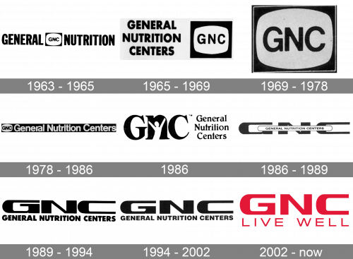
1963 – 1965
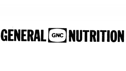
The 1963 logo depicts the company’s shortened name – ‘General Nutrition’ – written in tall black letters with an emblem between them. This emblem is the acronym ‘GNC’ put into the blank space inside a black rectangle.
1965 – 1969
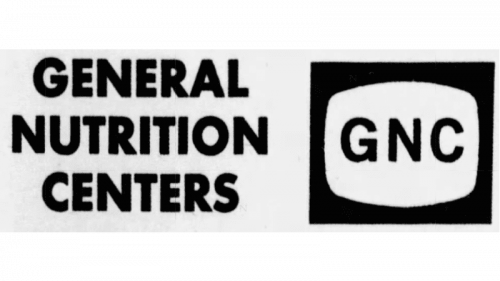
In 1969, the positioning was changed. The central emblem grew in size and moved to the right, while the rest of the logo settled on the left part of the logo. It now said ‘General Nutrition Centers’ in the same style, but in three lines.
1969 – 1978
The next logo was instead just the rectangular emblem almost exactly as it was on the previous designs, except with higher resolution.
1978 – 1986
In the 70s, the logo changed to this: a long black rectangle with the 1969 emblem on its left and the company name (written in white) on the right. Notably, the font of the latter changed, and it now featured lowercase letters as well as uppercase.
March – August 1986
In 1986, they came up with this short-lived logo. On its left, the looming black acronym is written in serif letters. To the right, the company name is written in three lines in a similar font and style. The blank space inside the ‘N’ (in the acronym) is also shaped like a happy person.
1986 – 1989
In 1986, the acronym was made extremely squat and wide. The full name was written on a white oval almost the width of the acronym itself. The fonts were now a more mundane variation of sans-serif.
1989 – 1994
In 1989, they got rid of the oval part and simply put the name in bigger letters beneath the three big letters.
1994 – 2002
In 1994, they somewhat changed the font of the writing below and switched the black to grey in the entire logo.
2002 – Today
The GNC visual identity’s individuality is in its typeface. The text-based logo features a very strong custom font for the company’s name inscription.
The “GNC” lettering is executed in a bold and futuristic sans-serif typeface with rounded angles of “C” and inner part of “G” and shape sides of “N” and outer contour of “G”.
The nameplate looks powerful and dynamic, especially in the red color, which is the main in the brand’s color palette. Red is a symbol of energy and passion, and this is what the companies main characteristics are.
The “Live Well” tagline features the same color, but different shapes. Its all-caps lettering is written in a thin strict sans-serif, which is simple and basic.
The GNC logo is minimalist yet stylish and powerful. It shows an influential and strong company, which is passionate about what it does and is progressive and innovative.
Font and Color
The stable and bold lettering from the primary GNC logo is set in an extended geometric sans-serif font with distinctive and confident characters. The closest typefaces to the one, used in this insignia, are, probably, Vartek Expanded Black, or Aspire SmallCaps, but with some significant modifications of the characters’ contours.
As for the color palette of the GNC visual identity, it is based on a crimson shade of red, a very intense and deep color, which represents power, energy, and at the same time warmth and care of the company, and its attention to the wellbeing of its customers.


