

![]() GMC Logo PNG
GMC Logo PNG
GMC is a subsidiary of the larger General Motors, a big automotive conglomerate. GMC, formerly General Motors Truck Company, is the manufacturing branch that focuses on SUVs, pickup trucks, trucks, motorhomes and similar bigger vehicles. Besides their own cars, GMC owns the brands Denali and Hummer EV.
Meaning and History
![]()
The company was originally created in 1900 as Grabowsky Motor Company, although in 1911 it was purchased by General Motors are included into their wide family of brands as a producer of trucks. The company’s new name was ‘General Motors Truck Company’ until 1943 and then ‘GMC Truck & Coach Division’ until 1998.
The current name is simply ‘GMC’, which stands for ‘General Motors Company’ – not to be confused with the actual General Motors, which is this manufacturer’s parent company and owner.
What is GMC?
GMC is an American automotive company and a branch of General Motors that focuses on building trucks, pickups trucks, crossovers, motorhomes and similar vehicles. The company was originally created in 1900 but went on to join the GM family in 1911. The most popular contemporary cars include pickups Sierra and Canyon.
1911 – 1947
![]()
The original logo was a roundlet that resembled a tire. It had a black center with a thin white outline, and the layer around it was orange. The former incorporated the company’s acronym, which was ‘GMC’. They wrote it in white and used an orange border for it. The characters had an elegant, somewhat gothic appearance.
The orange layer around it was used for the company’s full name, the ‘General Motors Trucks’. The three words were written in a curved sequence, where the first two words occupied much of the upper half of the ringlet, while the word ‘Trucks’ nestled in the bottom. They used a more ordinary serif font with black characters.
1947 – 1960
![]()
The logo was visibly simplified come 1947. It was essentially the acronym ‘GMC’ in a design similar to the previous one, except blockier and less elegant. The letters became a lot bolder, while the letter ‘M’ had comparably longer lines that seamlessly merged with the thick horizontal line directly below the acronym.
Further beneath was the word ‘Trucks’, written in a similar font but with smaller letters. The entire logo was bright red.
1960 – 1967
![]()
The 1960 logotype was a graphic depiction of their car emblem at the time, which was just the acronym. It was written in overly wide letters of a generally simple style. The overall appearance was silver in color and texture, with a measure of volume – there were specks of light and shading all over the place.
They commonly put it against a plain black rectangle to stand out.
1975 – 1979
![]()
In 1975, GMC adopted a cleaner look for their logotype. The new design looks like a plain red rectangle with two thin borders of white and black. In the middle of this figure, they placed the company acronym. They colored it white and gave it a new look. The characters are wide, but not as wide as in the previous design. They have an angular style to them, although the general appearance is of simple sans-serif font.
1979 – 2014
![]()
The following logo largely used the previous design of the company’s acronym. They simply got rid of the surrounding rectangle and kept the letters. They repainted them red, with edges that looked metallic by origin but were practically black and white in uneven patterns. The letters themselves also had a degree of gradual shading, making the entire emblem look volumetric.
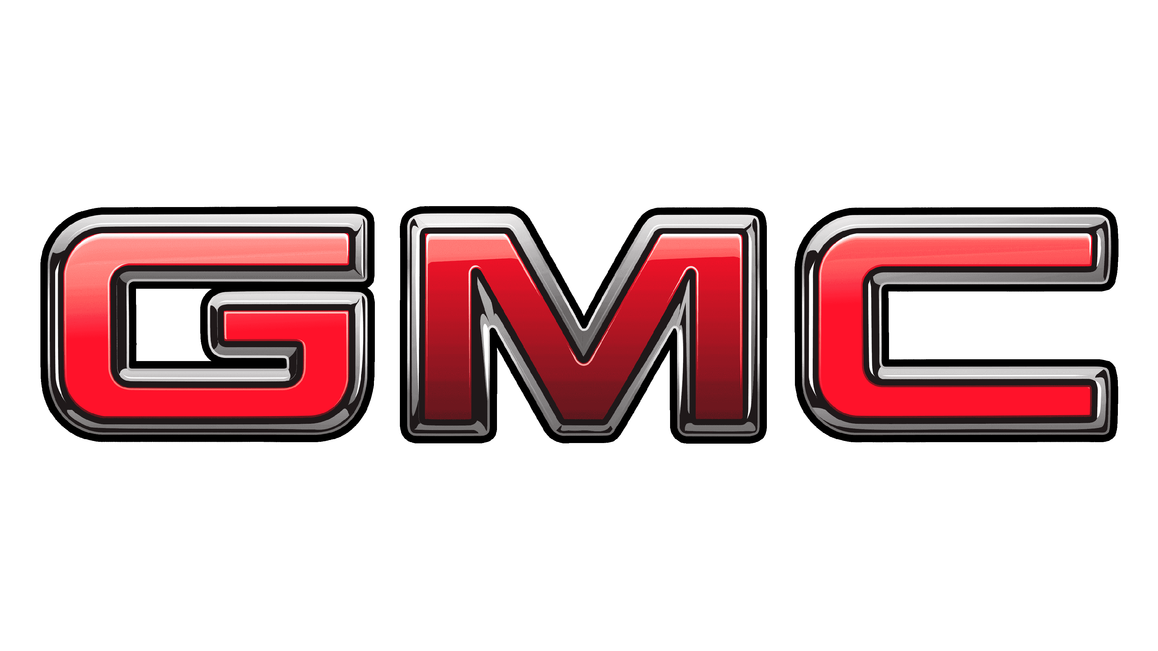
2014 – today
![]()
In 2014, they increased the intensity of shading in these letters, making them on average darker. The borders were also increased in width, while the letters themselves were stretched to be a lot broader.
Font
The font GMC used since the 70s was the same geometric style with squared angles and a generally wide appearance. It’s not an ordinary sans-serif style, it’s been chosen to be associated with geometry, engineering and strict shapes. The turns in these characters, however, are not abrupt, but rather smooth and gradual.
Color
The primary color for this brand has been red since the 40s. It’s become particularly prevalent in the 70s, especially in its current shade (a moderately dark hue). Other common colors include white, black and a metallic grey in certain parts of the logo to make it appear more automotive.


