GM, also known as General Motors Company, is one of the hugest worldwide and the biggest in America vehicle -manufacturing corporations. It was established in 1908 and today the brand has production plants in more than 30 countries across the globe.
What is the symbol of General Motors company?
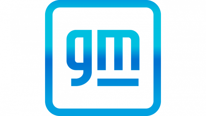
The symbol of General Motors Company is based on a stylized letter “M” in the lowercase, which represents the company’s transition to the electric vehicles market, as the character looks like an electric plug. The symbol is a part of the lowercase “GM” abbreviation, drawn on a plain white background and enclosed into a thick square frame with rounded angles.
Meaning and history
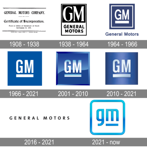
Being an umbrella brand, managing and producing the most famous American cars, GM has a clean and simple visual identity, which had only two major redesigns during the company’s history.
1908 – 1938
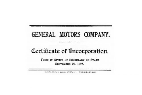
The original logo for General Motors was created in 1908, right after the company’s foundation. It was not really a logo, but a Certificate of Incorporation, which the company used for all the documents during the first thirty years of its existence.
It was black lettering on a white background with the nameplate on top, executed in all capital letters. And the “Certificate of Incorporation” inscription in a Gothic typeface, located in the middle.
1938 – 1964
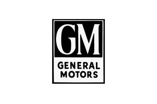
The first real logo was designed in 1938. It was a vertically located rectangular in a monochrome palette, divided into two parts. The upper and bigger part with a black background contained the “GM” lettering, while the lower one, in white, had a “General Motors” inscription on it.
The “GM” wordmark was executed in a classic serif font with confident and elegant lines and pointed corners, while the “General Motors” in all capital letters used a more modern and smooth sans-serif typeface, balancing the traditional style of the nameplate.
It was a minimalist and laconic visual identity, which showed a powerful company and evokes a sense of authority and stability.
1964 – 1966
1966 – 2021
In 1966 the GM logo was redesigned. It became even simpler and more minimalist. Now it is a blue square with rounded angles and a white underlined wordmark on it.
The wordmark is composed of just “GM” lettering, executed in a traditional Helvetica typeface.
2001 – 2010
In 2001 the GM emblem was made three-dimensional and the blue color of the background was made more intense. The frame of the square was strict and visible.
2010 – 2021
In 2010 the logo was refined and simplified. It got a more even tone of the background, which gained a matte-metallic blue color. The wordmark is now shadowed with black, which makes the letters more dynamic.
All the logo lines are confident and distinct, which makes this simple and modest logo look luxury and elegant.
The blue and silver-white color combination reflects the brand’s professionalism and trustworthiness, representing expertise and confidence.
2016 – 2021

Additionally, the company used a simpler wordmark. Here, there was the full name of the brand in a minimalist sans with slightly rounded letters.
2021 – Today
The GM logo adopted a friendly and tech touch. For one, the square frame with rounded corners makes it look like a button or an icon. Also, the lowercase letters work for the casual, personal impression (it’s like using a nickname instead of the full name).
Font and color
The bold stylized lowercase lettering from the primary logo of the General Motors company is set in a heavy and voluminous custom sans-serif typeface with interesting futuristic contours of the characters. The closest fonts to the designer one, used in this insignia, are, probably, Venus Envy Regular, or Deportivo a regular, but with some modifications of the contours.
As for the color palette of General Motors” visual identity, it is based on glossy gradient shades of blue from deep and dark at the bottom of the letters, to bright and vivid sky blue at their top. Blue is a symbol of confidence, reliability, and security, the color, which is most often chosen by technological and medical companies due to the associations it evokes.


