The primary logo of the University of Georgia’s sports teams has been remarkably consistent: it hasn’t changed, even in the smallest detail, ever since it was introduced in 1964. The secondary logos, though, underwent considerable transformations.
Meaning and history
The University of Georgia varsity athletic teams bear the name of Georgia Bulldogs. The school sponsors nearly twenty sports. The official mascot or the university’s athletic programs is an English Bulldog called Uga.
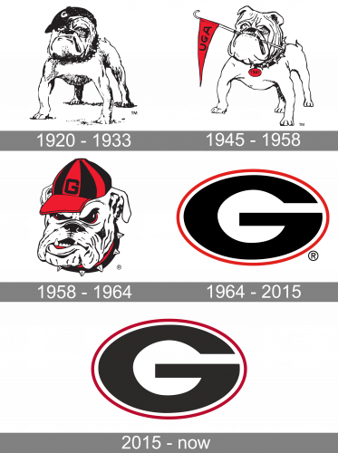
1921 – 1933

The 1921 logo depicts a bulldog, drawn in black and white. They gave it a vaguely proud expression with a lifted head and a prominent lower jaw. The dog wears a black cap with the white ‘G’ on it.
1945 – 1958
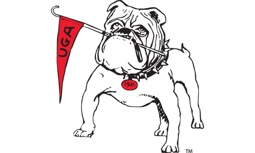
The next logo largely uses the dog from the previous design attempt. It’s now smoother, the black is evenly distributed along the body, and there are also minor changes. The cap is gone, but there’s now a small red flag that says ‘UGA’ in black on it. It’s kept in the dog’s mouth. There’s also a red badge attached to its collar with ‘1921’ written on it.
1958 – 1964
One of the alternative logos features the front view of a bulldog wearing a black and red baseball cap and a collar with spikes. Introduced in 1958, it’s still in use.
The athletic program uses the so-called Bulldog mark as its secondary logo. Here, you can see the head of a bulldog with a collar. The beast is facing forward, and its jaw looks especially prominent. The sharp fangs add some aggression to the already menacing emotional background of the image.
1964 – 2015
The club’s main logo is a black letter “G” in a red oval. The background is white. The logo has never been modified throughout its more than 50-year history. Prior to it, the official Georgia Bulldogs emblem was a block “G.”
The oval “G” made its debut on the Bulldog’s red helmets in the opening game in 1964. The idea of the logo was introduced by Head Football Coach, Vince Dooley, while the person who actually developed it was the wife of one of former Georgia players.
2015 – Today
In 2015, Nike designed another emblem. While also featuring the front view of a bulldog, this version is simpler and not overloaded with details. You can refer to the Georgia Bulldogs logo images below to compare the two versions.
Emblem Georgia Bulldogs controversy

If you take a look at the emblem of the professional American football team the Green Bay Packers, you will notice that it looks very much like the Georgia football logo.
According to Georgia’s explanation, they noticed the similarity and asked NFL for permission to use their logo. Originally, the logos were not as alike as they are now – strangely enough, the Green Bay Packers modified their emblem several times, as the result of which it became even more like Georgia Bulldogs symbol.
However, even today, the Bulldogs logo isn’t an exact duplication of the Packers logo neither in shape nor in the colors, although you need to take a closer look to distinguish between them.
Basketball
During the time the Lady Bulldogs were coached by Andy Landers (1979 – 2015), they got seven regular-season SEC titles, four SEC tournament championships, and twenty 21-win seasons, as well as five Final Fours.
As for the men’s basketball program, it has been somewhat overshadowed by the accomplishments of the women’s team. And yet, it has had more than one pretty successful season, for instance, a run to the 2008 SEC Championship and berth in the NCAA tournament.
Football
The Bulldogs’ football team home arena is the Sanford Stadium. They are proud of the two national championships they have claimed so far: the first was in 1942, the second in 1980. In addition to this, they have won 13 Southeastern Conference championships, including the 2017 championship.
Baseball
The team nicknamed the Diamond Dawgs has been pretty successful in the 1990s and 2000s. They won the 1990 College World Series and made the trip to Omaha six times. The head coach is Scott Stricklin. Their home arena is the Foley Field stadium.
Font
There’re two main athletic wordmark logos, each available in a variety of colors. The wordmarks feature bold contemporary letterforms. One of the distinctive elements is the way the “E” has all its bars cut in a way that they better fit the “O.” The wordmarks were designed by Nike.
Why is the Georgia logo the same as Green Bay’s?
There were a lot of talks about the similarity between the Georgia Bulldogs and Green Bay Packers logos. The Bulldogs’ badge was introduced a bit earlier — in 1963. Both logos are based on the first letter of the teams’ names — the “G”, which is pretty logical.
When did UGA get the G logo?
The athletic program of UGA got its famous “G” badge at the beginning of the 1960s. The Georgia Bulldogs teams have been very consistent with their visual identity, as the bold stylized “G” in a thin oval frame hasn’t been changed even slightly since the date of its introduction.
Did Georgia get their logo from the Packers?
No, the Georgia Bulldogs logo was designed a bit earlier than the Green Bay Packers one, in 1963. However, those who don’t know the correct timing, think that the athletic program from UGA has copied the badge of the famous NFL member.
What do Georgia fans yell?
The Georgia Bulldogs fans’ favorite chant is known as Calling the Dawgs, and sounds like “Goooo Dawgs! Sic ‘em!”. As for the teams, their battle cry is “Glory, Glory!”.
Colors
BULLDOG RED
CMYK: (3, 100, 79, 12)
HEX COLOR: #BA0C2F;
RGB: (186, 12, 47)
PANTONE: PMS 200 C
ARCH BLACK
HEX COLOR: #000000;
RGB: (0, 0, 0)
CMYK: (0, 0, 0, 100)
PANTONE: PMS BLACK 6 C
CHAPEL BELL WHITE
HEX COLOR: #FFFFFF;
RGB: (255, 255, 255)
CMYK: (0, 0, 0, 0)


