

![]() Maryland Terrapins Logo PNG
Maryland Terrapins Logo PNG
The evolution of the Maryland Terrapins logo is the way from a cluttered cartoonish logo to a more minimalistic and sleek one.
Meaning and history
![]()
Originating from the University of Maryland, College Park, the Maryland Terrapins were formed as the university’s athletic teams, a tradition tracing back to the early 20th century, following the university’s establishment in 1856. The Terrapins, often affectionately called the “Terps,” embarked on a journey that would etch their name in collegiate sports history.
Central to the Terrapins’ storied legacy are their remarkable feats across multiple sports disciplines. The men’s basketball team carved a niche in history by clinching the NCAA National Championship in 2002, a crowning achievement symbolizing their competitive spirit and prowess. In the realm of football, the Terrapins have demonstrated consistent excellence, marked by their participation in several prestigious bowl games, reflecting their enduring competitive edge. The women’s lacrosse team, a powerhouse in its own right, has amassed an impressive array of national championships, underscoring the depth of talent within the Terrapins’ ranks. These milestones, achieved over decades, showcase the amalgamation of skill, dedication, and strategic acumen inherent within the teams and their coaching staff.
In the current athletic landscape, the Maryland Terrapins continue to fortify their esteemed position. Since joining the Big Ten Conference in 2014, they have navigated new challenges and rivalries, sustaining their reputation as a powerhouse in collegiate sports. The Terrapins’ commitment to maintaining a culture of athletic excellence, coupled with academic integrity, ensures that the legacy of the University of Maryland’s athletic teams continues to thrive and inspire.
What is Maryland Terrapins?
The Maryland Terrapins are the celebrated athletic teams of the University of Maryland, College Park. Known for their dynamic presence in NCAA sports, they particularly excel in basketball, football, and women’s lacrosse. Their rich history is marked by notable achievements and a commitment to excellence in collegiate sports.
1967 – 1970
![]()
The very first Maryland Terrapins badge was created in 1967 and stayed with the club for three years. It was a black-and-white hand-drawn image of a turtle, which was depicted running to the right, and happily smiling. The additional curved lines on the right from the turtle added a sense of motion and speed. The emblem had no accompanying lettering on it.
1970 – 1983
![]()
Around 50 years ago, the emblem featured a tortoise in red, black, and white. The creature was standing on its rear paws, and his mouth was open. To the right, the letter “M” in white could be seen.
1983 – 1988
![]()
The logo of the club, introduced in 1983, was someone new and stylish. It was a red and white badge, composed of a stylized enlarged “M”, formed by several red horizontal lines in different lengths and thicknesses, getting bolder from left to right, and an uppercase “Maryland” inscription; set under the emblem, and executed in red, with the thickness of the bars getting bigger from left to right.
1988 – 1996
![]()
The Maryland Terrapins logo, created in 1988, used the emblem from the 1970s, with the smiling turtle standing on the left from the red uppercase “M”, but made a few changes to the composition, adding a flag to the turtle’s hands, and a two-leveled black “Maryland Terrapins” inscription in a heavy geometric serif font under the emblem. The flag with a thin long handle was divided into four segments, where two of them were yellow and black, with a checkered pattern, and the other two were set in white and red and featured heraldic symbols drawn on them.
1996 – 2005
![]()
This logo stayed with the team from 1970 to 1996, when a more professional version appeared. Here, the tortoise was light brown and more stylish. The emotional background of the design was more obvious and sporty.
2005 – 2006
![]()
While the tortoise remained the same on the 2005 logo, it grew larger because the name of the team disappeared.
2006 – 2012
![]()
The redesign of the Maryland Terrapins logo, held in 2006, was more of a refinement, as the concept and the contours of the elements remained untouched, and only the colors were modified. The new badge was set in slightly darker shades, with the dangerous turtle getting a more masculine look, and the whole mood of the logo turning more serious and brutal.
2012 – Today
![]()
Eventually, in 2012, only the “M” with an underline remained on the Maryland Terrapins logo.
Maryland Terrapins basketball
![]()
The men’s basketball team of the University of Maryland, College Park, is coached by Mark Turgeon. They have made an appearance in the NCAA Tournament on 26 (27) occasions and in the National Invitation Tournament on eight occasions. They became the NCAA Tournament Champions in 2002.
The women’s team became the NCAA Tournament Champions in 2006. They have made 27 NCAA Tournament Appearances.
Maryland Terrapins Uniforms
The uniforms of Maryland Terrapins teams don’t have many details — they use color as their main weapon. This minimalistic design approach works well for the players and makes them more visible on the fields.
Maryland Terrapins Basketball Uniform
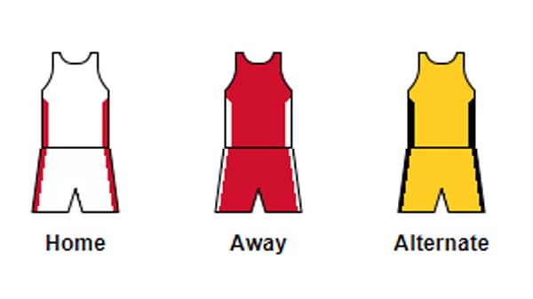
The uniform of the Maryland Terrapins basketball teams has three options: solid white with red stripes on the sides for home games, solid red with white stripes on the t-shirts and shorts for the games away, and the alternate uniform with yellow as the main color, and black stripes on the sides.
Maryland Terrapins Football Uniform
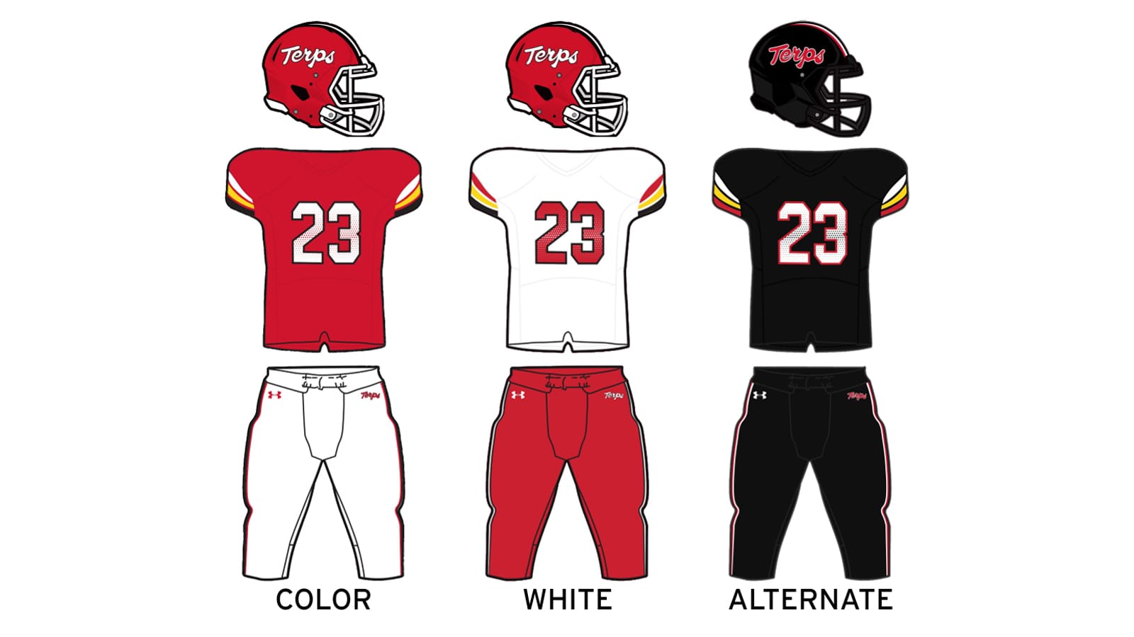
As for the football uniform, Maryland Terrapins also have three options: the color one with red jerseys, white, yellow, and black stripes on the sleeves, and white pants; the white one with the red pants and red detailing on the white jerseys; and the alternate uniform, which is totally black, with white, yellow and red stripes on the sleeves and white and red players’ numbers.
Maryland Terrapins Soccer Uniform
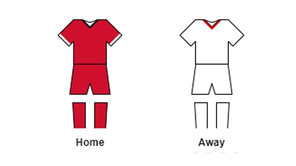
The soccer team of the Maryland Terrapins athletic program has a super simple uniform design: for the home games the players wear solid red t-shirts and shorts, with delicate white stripes around the sleeves, and a black collar line; when playing away, the team uses solid white uniform with a red triangular collar line. The gaiters always feature the main shade of the uniform.
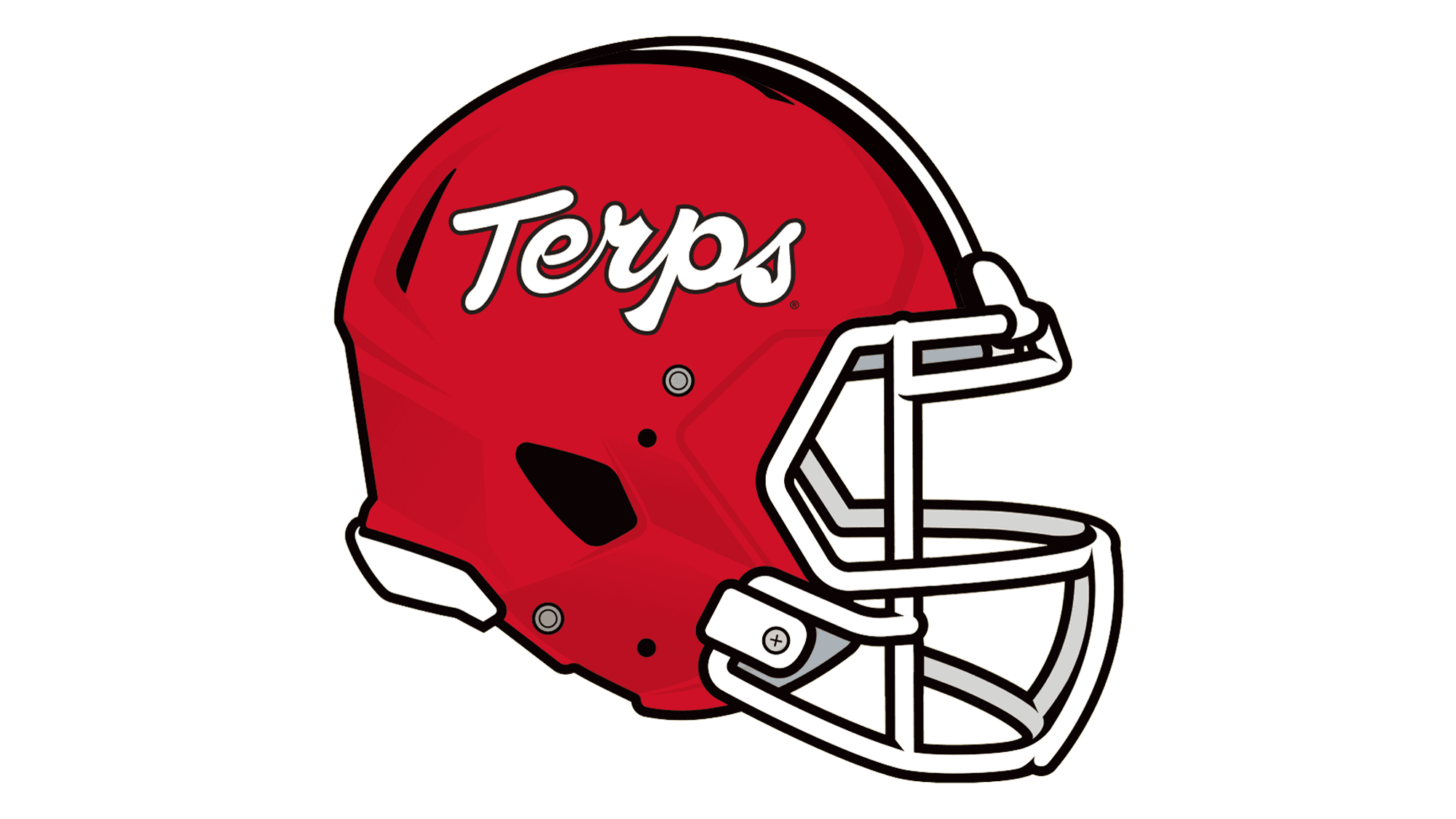
Maryland Terrapins Helmet
The Helmets of the Maryland Terrapins players feature a bit more creative design, than the uniforms. And in some way, it balances the look of the players on the field. Terrapins have two possible helmet designs.
White Helmet
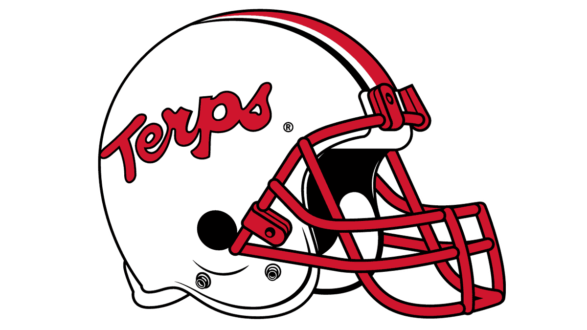
The White Terrapins Helmet has a solid red grille, a bold red “Terps” lettering on the side, written in a custom script font with a thin black outline, and a wide striped ribbon coming through the center of the helmet. It is composed of a thick red line in the center, two whites, which are narrower, and two black on the sides, which are the thinnest.
Red Helmet
The design of the Red Terrapins Helmet is a bit different from the white one. First of all, the white grille here is larger and more geometric. Secondly, the striped pattern is more laconic — with a wide white one, and two black on the sides. Thirdly, the white “Terps” lettering is set in the same typeface, but is slightly smaller, and placed a bit higher.
Maryland Terrapins Stadiums
The Maryland Terrapins athletic program consists of twenty men’s and women’s teams, which compete in 14 sports disciplines, and the university provides its athletes with all the possible conditions and facilities for training and playing.
SECU Stadium
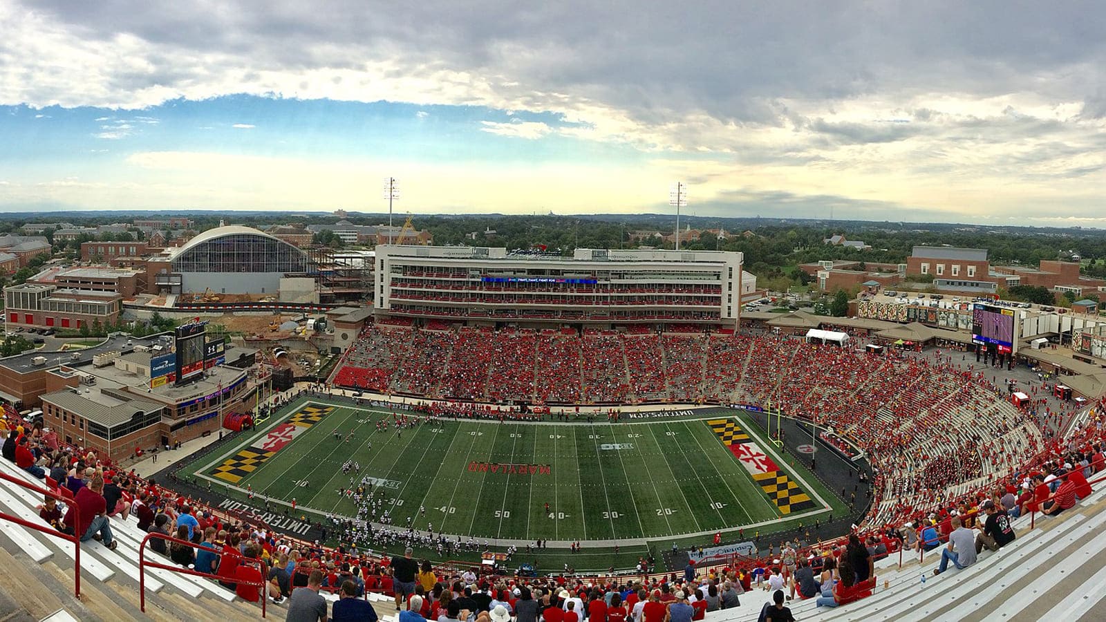
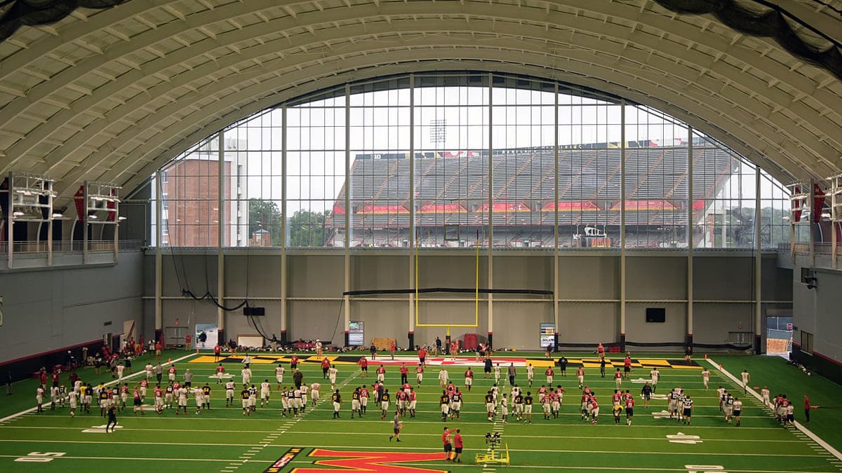
The SECU Stadium has been a home ground for the football and lacrosse teams of the Maryland Terrapins program since the opening of the facility in 1950. In 2002 the capacity of the stadium, which got its current name only in 2022, was enlarged to more than 51 thousand seats.
Xfinity Center
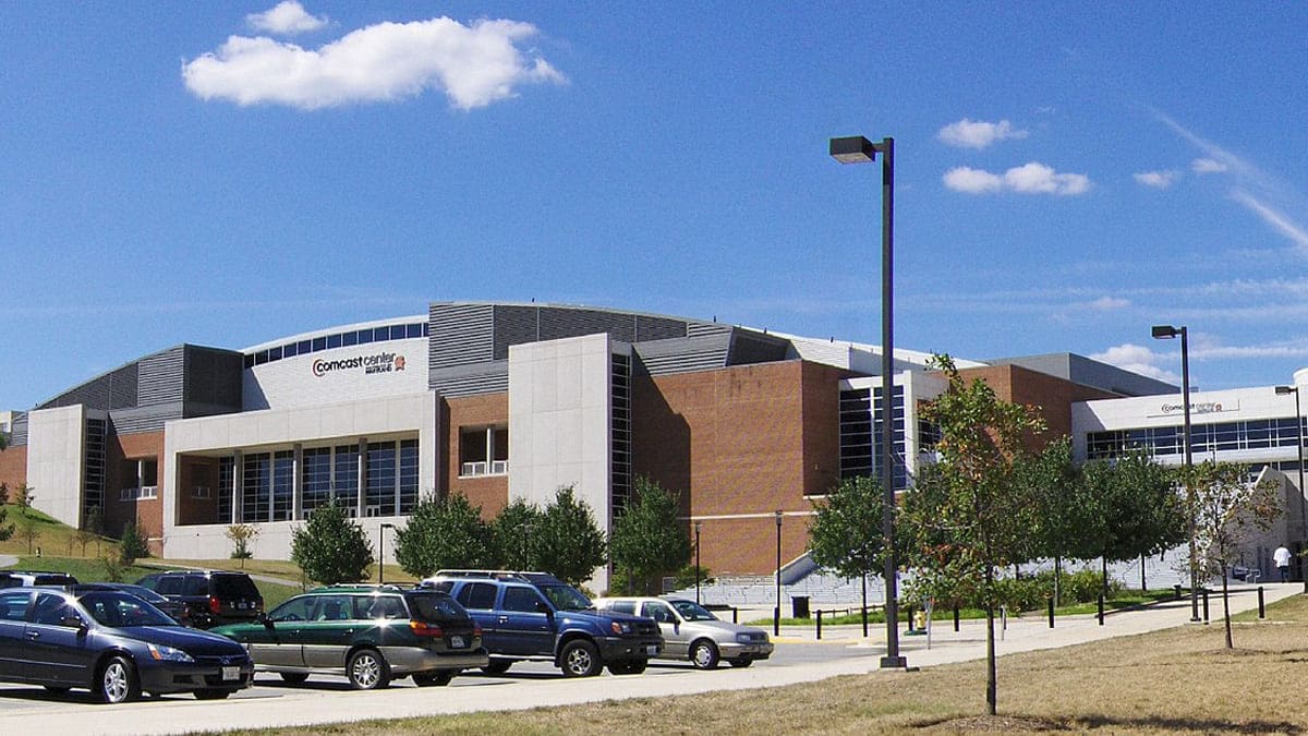
The XFINITY Center, which opened its doors in 2002, serves as a home ground for Maryland Terrapins basketball teams, both men’s and women’s. Also, the volleyball and wrestling athletes train there. The arena, which got its current name in 2014, has a capacity of almost 18 thousand seats.
Bob “Turtle” Smith Stadium
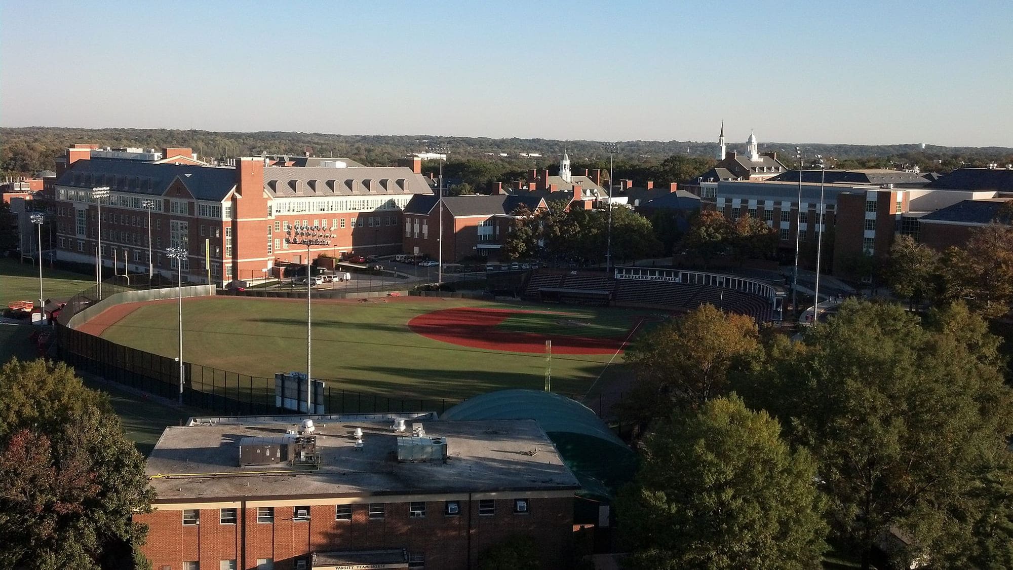
The outdoor Bob “Turtle” Smith Stadium has been a home ground for the Maryland Terrapins men’s baseball team since the very beginning, in 1954. Throughout the years the stadium was twice renovated. Today the capacity of the outdoor arena is 2,5 thousand seats.
Ludwig Field
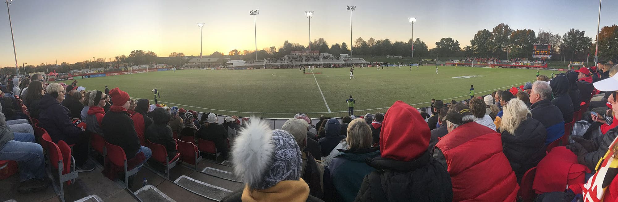
The Ludwig Field stadium was built in College Park in 1995, and since its first days, the facility became a home for soccer and track and field teams of the Maryland Terrapins athletic program. The open stadium has a capacity of 7 thousand seats.
Jones-Hill House
The Jones-Hill House, built in 1955, has been a training ground for various Maryland Terrapins teams, including basketball, until 2002. It is a covered complex, which had a capacity of 15 thousand seats up to 2015, but then the center was transformed.
Maryland Terrapins Colors
RED
HEX COLOR: #E03A3E;
RGB: (224, 58, 62)
CMYK: (0, 91, 76, 6)
PANTONE: PMS 186 C
GOLD
HEX COLOR: #FFD520;
RGB: (255, 213, 32)
CMYK: (0, 15, 94, 0)
PANTONE: PMS 116 C
BLACK
PANTONE: PMS BLACK 6 C
HEX COLOR: #000000;
RGB: (0, 0, 0)
CMYK:(0, 0, 0, 100)
WHITE
HEX COLOR: #FFFFFF;
RGB: (255, 255, 255)
CMYK: (0, 0, 0, 0)


