GE Healthcare is an American manufacturer and distributor of diagnostic imaging agents, a subsidiary of General Electric. It was founded in 1892 after the Edison General Electric Company and the Thomson-Houston Electric Company merged to form the General Electric Company. The company was incorporated in 1994 and operates in more than 100 countries.
Meaning and history

GE Healthcare is a renowned provider of a wide range of medical equipment and services. The company provides hospitals around the world with high-quality diagnostic imaging equipment and IT solutions such as MRI and ultrasound machines.
GE Healthcare not only makes stationary and mobile equipment for medical diagnostics. The company also has a fast-growing natural sciences division, which accounts for about a quarter of the company’s sales.
What is GE Healthcare?
GE Healthcare is the name of a global American manufacturer of advanced medical equipment and digital solutions. GE Healthcare is a subsidiary of General Electric, a New York-based American multinational conglomerate headquartered in Chicago, Illinois. The company was registered in 1994 and operates in more than 100 countries.
1994 – 2004

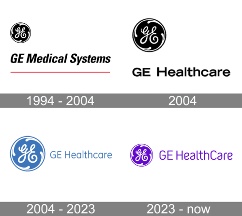
They used their long-time emblem since the beginning. In 1994, they came up with a black round logo featuring an old-fashioned hand-written ‘H’ in its center. Inside, and along the edges of the logo, there was also a white line with several drop-like extensions protruding out of it from all cardinal directions, representing the balance.
There was also the company’s own name – ‘GE Medical Systems’ – written in black serif letters on the right of the emblem.
February – July 2004

In February 2004, they moved the name to beneath the emblem, while also changing was it says. It now spelt ‘GE Healthcare’.
2004 – 2023

The GE Healthcare logo reflects the brands balance between being dynamic and relevant with remaining true to its core DNA.
The brand logo is a round-framed white monogram on a blue background. The famous GE Monogram was created and trademarked in the 1890s. It is an elegant hand-written lettering, which first appeared in monochrome.
The Monogram consists of four parts: the solid circle, the stylized circle, the solid background, and the rounded script.
The custom GE Healthcare typeface, GE Inspira, was conceived from the Monogram. Designed in 2004, Inspira was derived from the rounded curves and precise nature of the brands mark.
The GE Healthcare logo offers a strong, relevant, and distinct visual representation of the brand. Its hand-drawn and rounded forms make it feel human and agile. Its balance references precision and technical expertise.
2023 – Today

The company introduced a violet version of its logo when the healthcare division became a separate company. It is often considered to be a color of wisdom, but GE called it the “Compassionate Purple”. Nonetheless, considering the advanced technology the company is developing, it does require a lot of intelligence. The font has also been updated and features more rounded forms, which create a friendlier, caring image. Moreover, the letter “C” in the name was capitalized to stress the fact that the company is focused on both.
Font and Color
The modest lightweight lettering from the primary GE Healthcare logo is set in the title case of a simple sans-serif typeface. The closest fonts to the one, used in this insignia, are, probably, FF Mark W1G Narrow Light, or R-Flex Light.
As for the color palette of the GE Healthcare visual identity, it is based on a smooth and pleasant shade of blue, with white accents. Blue is known to be the color of reliability and confidence, this is why is it the most common choice for the businesses, connected to health services and insurances.


