Gaumont is one of the most famous European film studios, established in 1895 in France. The company is considered to be the world’s oldest filmmaker and today has its subsidiary in the USA, which specializes mainly on tv-series.
Meaning and history
The oldest filmmaking company Gaumont was established in France in 1895 and started the production of movies already in 1910. In 1895, Léon Gaumont headed the company Comptoire General de la Photographie, specializing in the sale of photographic materials and equipment. As early as 1896, Gaumont produced his first apparatus, the Chrono, and established a studio and workshops at Beauty Chaumont.
In 1905 Gaumontwas reorganized and became a joint stock company, financed by Swiss and French banks.In 1910, the biggest cinema in the world with 3,400 seats, Gaumont-Palace, is built on Place de Clichy in Paris with Léon Gaumont’s money.
In 1925, Gaumont together with Metro Goldwin Mayer creates the company – Gaumont Metro Goldwin, which was functioning until 1928.With the advent of sound cinema, Léon Gaumont left the company. It was headed by Louis Aubert, who merged Gaumont with the Franco Film Aubert in 1930. In 1934 the company claimed itself as bankrupt and got its second life in 1938.
What is Gaumont?
Gaumont is the name of a French film studio, which was established in 1895, which makes it one of the world’s oldest companies in this segment. The European filmmaking studio today specialized mainly in tv series for different ages and has two offices — in France and the United States.
1895 – 1903
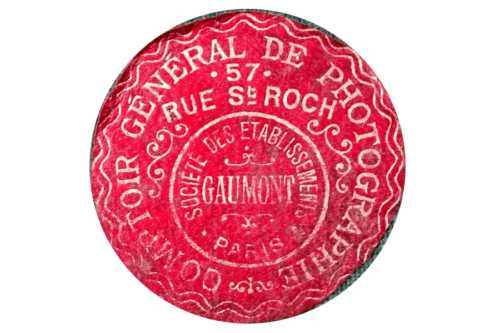
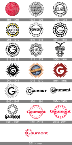
The original Gaumont logo was created for the company in 1895. It was a very elegant red roundel with lots of vignettes and lettering, set all over the circle in medium-weight silver lines, with a part of inscriptions executed in Sans-serif, and a part — in an elegant serif typeface. The internal double outline of the roundel featured two wavy lines, which resemble the flower shape of all the following Gaumont badges.
1903 – 1906

The iconic Gaumont flower was adopted with the very first logo of the company, when it was called Elge, in 1903. The logo of that time featured a sunflower in monochrome, with a nameplate set in the central part.
1906 – 1908

The badge got more minimalist in 1906, by removing the pattern from the flower’s middle part and its petals. Now the composition looked cleaner and the lettering on the emblem got more visible.
1908 – 1910
The petals turned yellow and black in 1908, and in the same year, the name of the company was changed to Gaumont, so the new inscription in a new typeface featured “Gaumont” in the center, with “Film” arched above it and “Cinema” — under.
1910 – 1915

The monochrome color palette got back in 1910, and the inscription on the flower was simplified to only “Gaumont”. The font remained almost the same — a unique fancy handwritten typeface with smooth lines and slightly curved ends.
1914 – 1918

The “Gaumont” lettering was replaced by an enlarged modern letter “G”, which was written in a strong bold black line repeating the circular shape of the inner part of the emblem. The petals were also strengthened and now the emblem looked as powerful as never before.
1918 – 1919

In 1918 the monochrome palette was softened and now the black contours of the emblem were set on a tender peach background, which added elegance and lightness and made the flower look like a flower.
1919 – 1924

The redesign of 1919 changed the smooth and fine emblem to an abstract stylized star with lots of rays and a circular badge in the middle. The “PAX” inscription was the only element inside the circle and was executed in a fancy curly font, which looked playful and chic.
1930 – 1940

In 1930 the iconic Gaumont badge was back but got some additions. Now the flower was placed under an image with two globes and an eagle on top of them. It was a representation of the company’s expansion and global orientation, which was drawn very detail and featured a special “old style”.
1940 – 1944

In 1940 the flower was replaced by the sharp black star, and the globes with an eagle were removed from the logo. The “G” changed its contours too and became bolder, with its lines slightly shortened and strengthened. The new logo looked modern and very progressive.
1943 – 1970

The Gaumont logo was redesigned again in 1943. Now the colorful badge boasted a globe with a diagonally placed banner in light red, with the “Gaumont” lettering in the uppercase on it. The globe was enclosed into a light red, more peach, frame with lots of rays of the same length coming out of it, resembling the previous “star” version of the logo.
1944 — 1945

Another version of the badge used by the company in the 1949s was a solid red star with sharp long rays, and a bold white letter “G” in the middle. Though this badge wasn’t used for too long, it was definitely the brightest and the most powerful of all designs ever created for the company.
1945 – 1947

In 1945 the bright Ted was switched back to monochrome, the main color became white again, and the very thin outlines — black. The “G” was now the most visible element of the whole logo, with its thick black line and rounded shape. The inner part got a circular outline again. This version of the logo was used by Gaumont until 1947.
1970 – 1980

In 1970 the company decided to come back to its roots and returns the iconic flower, but now it only replaced the first letter of the “Gaumont” lettering, which is set in the uppercase and executed in a bold modern sans-serif typeface with the massive letters placed on quite a significant distance from each other.
1980 – 1985

The Gaumont logo from 1980 was very similar to the one the company used in 1910, with the only change — this time the logotype was placed not on the flower, but under it. The typeface was refined and the letters became bolder, getting its lines elongated and their ends curved a bit more than they were on the old version of the emblem.
1974 – 1995

The logo from 1970 was lightened up in 1974, drawing the flower in white and only adding a very thin outline to its petals. With a minimum of black detail, make the nameplate look brighter and more confident. The typeface of the inscription was changed to a bold serif font, with smooth sleek contours of the letters.
1995 – 2011
The red color comes back to the Gaumont visual identity in 1995. This time red is the color of the Gaumont flower’s outline and the lettering, which is again set fight on the emblem. The typeface of the logotype was changed again and now the brand started using a bold and extended serif font, with its massive and stable letters complemented by long distinct serifs.
2004 – 2011
The redesign of 2004 was more a refinement. The contours of the flower were cleaned and strengthened, while the logotype was enlarged and now looked more balanced on a smooth and fine drawing. The color palette remained untouched — white as the main color, Ted for all the details and inscription.
2011 – Today
The Gaumont visual identity is classic and elegant. Composed of a wordmark with a delicate graphical element, it looks timeless and sophisticated, reflecting a true French style.
The Gaumont wordmark is executed in a smooth sans-serif typeface, with its letter slightly extended. The softly rounded lines of the inscription create a harmonized and pleasant feeling.
The tagline “Depuis que le cinema exists”, which translates from French as “Since the cinema exists”, is written under the nameplate in the lowercase lettering and uses a simple sans-serif font.
The ok not ornament of the Gaumont logo is a flower-line circle around the letter “G”, which resembles a Sun, or a color specter. It even makes you think of a circular camera lens.
Whatever the original meaning is, the Gaumont logo looks actual and fine. Its smooth lines and the calm shade of red reflect the company’s passion for filmmaking. The logo represents the brand as professional and progressive, the one that values quality and expertise and tends to make the best movies for their loved audience.
Font and Color
The smooth and stable title case lettering from the official Gaumont logo is set in a modern sans-serif typeface with extended contours of the characters and softened corners of the bars. The closest fonts to the one, used in this insignia, are, probably, Canapa Medium, or House Soft Expanded Bold, but with some modifications of the contours.
As for the color palette of the Gaumont visual identity, it is based on a dark and bright shade of pink, which is close to a smooth fuchsia hue. This shade is a symbol of passion and elegance, which also makes the whole badge look professional and confident, representing the company as a strong and stable one.


